This looks really good!
But you ask for constructive criticism so I will provide. Just keep in mind that a lit of it is nitpicking and you don't have to take any of the advice if you don't like it.
Aight, here we go.
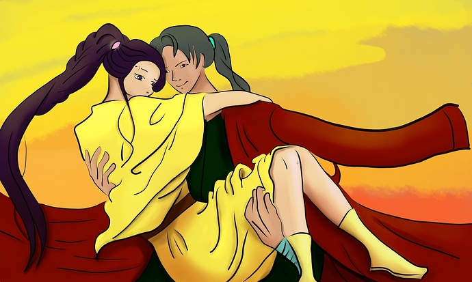
So the first thing is color choices. While they aren't bad, they could improve a lot when you consider the atmospheric lighting! It's a sunset, so the colors will be a bit less saturated (that's actually always a good first step, esp reds blues and yellows. Less is more, having them on full saturation, makes them clash easily) and a bit more tinted so they are warm.
Yellow is not a warm color, but neutral. So to get it warm, it needs to lean a bit in the orange direction.
The shading itself is placed well, but it blurrs a lot.
While it's true that there's a lot of soft shadows, esp in an artwork with heavy lines, the kind of airbrushing quickly looks out of place.
Consider if you want to do painting or flat shading. They both have different strengths and need different line art!
Give hard shadows a go if you want, by coloring everything in solidly, and then make selections for where the colors need to go, and bucket tool fill them in.
Having them a bit bigger and more defined will probably help, rather than having, like on the sleeve of the coat, a long strip of darker blur.
The shadow colors so far seem fine to me.
What also stands out is, that you are inconsistent with the shading.
. There's some parts you haven't shaded at all, like his hair and right hand, also some of the folds on the yellow top look unshaded.
If you want I can practically show you my suggestions on the artwork, but that's pretty intrusive, so it's completely up to you if you think that would help you or annoy you.
If yes, feel free to @ me the image without the shading and I'll do a quick thing