1 / 12
Feb 2021

I made the decision yesterday to adapt my future and existing Blue Star Rebellion pages on WEBTOON to a vertical scroll format. I prefer book-style pages, myself... But given how clunky it is navigating single pages on WEBTOON, combined with how the audience there skews younger and typically reads on phones and other small devices, I figured it was a better option to make reading my comic easier for my audience there. (And, not going to lie, I think it has a better chance of being promoted if it conforms to the site-preferred format.)

Thing is, I'll still be drawing each page as a normal page first. I'd like to illustrate graphic novels someday, so page layout practice is important. Plus, I plan to print it for conventions and such. Since page layouts require a lot of careful thought, my primary focus is making sure my pages work really well before adapting each panel for WEBTOON.

And since I end up with two versions, I've decided to leave the Tapas version in page format, change the WEBTOON version to vertical scroll format, and point potential readers towards whatever style they prefer.

I'm just curious... does anyone else do this? If so...

  • Why did you make this decision, given the extra work involved?
  • What's your workflow like?
  • Does it take you much time to adapt each page, and did you discover tricks along the way to speed it up?
  • What's your preference as a reader?
  • Is it different to your preference as a creator?

Finally, what do you find are the pros and cons of each format?

I'd love to hear everyone's different takes! I'm pretty happy with my decision to do this, but I wouldn't be at all surprised if a bunch of people think I'm nuts. :sweat_02:

Here are the two mirrors, in case you want to look at how I've gone about it so far:
Page: https://tapas.io/series/Blue-Star-Rebellion5
Scrolling: https://www.webtoons.com/en/challenge/blue-star-rebellion/list?title_no=5262935

  • created

    Feb '21
  • last reply

    Feb '21
  • 11

    replies

  • 1.2k

    views

  • 7

    users

  • 7

    likes

  • 11

    links

I originally started in page format only, then switched to vertical format for Webtoons only... then eventually decided to use the vertical format6 on Tapas too and keep the page format for ComicFury8. To answer your questions... :smiley:

Why did you make this decision, given the extra work involved?
More than anything else... the way Webtoon itself works. I was originally posting my pages in print format on there too, only with slightly less white space around the panels, but I didn't like it very much. The panels/text still looked a bit too small to me and I had troubles figuring out how much space to leave between one page and another. But more than anything else, I was aware that my episodes after chapter 1 were going to be much shorter (only one-two pages instead of four as I'd been doing up until that point) and that, using a print format, they were going to look even shorter, even if the actual number of panels in each page was going to be higher. So I decided to switch to a vertical format for WT. It was a very painful decision at first, because I really, really didn't want to spend a lot of my time reformatting pages and trying to make everything fit was a huge pain in the butt (I have LOTS of horizontal panels ò_ò)... in the end, however, I was pretty satisfied with the result and I think it does work a lot better for the site :slight_smile:

What's your workflow like?
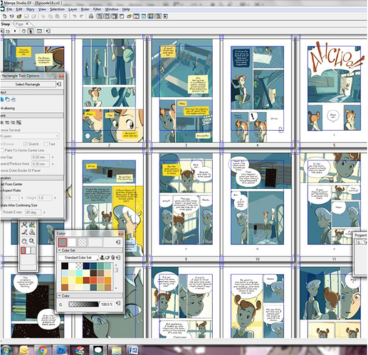
I still make my pages in print format first. I work on an A4 canvas at 300 dpi and always make sure to save a flattened, big version of each page with no balloons on it. When working on the vertical format, I copy-paste my panels from there. I used to switch between Photoshop and Clip Studio Paint to do it, but nowadays I just use Affinity, since it's easy to use and doesn't have the same bug with the font I'm using as Clip Studio has :slight_smile:

Does it take you much time to adapt each page, and did you discover tricks along the way to speed it up?
It IS pretty time consuming, I won't lie. Finding the proper way to make everything fit, redoing all text and sometimes having to split panels to make them work better for the mobile version is kind of a pain in the butt. WT pages are incredibly small, yet they also want you to use a huge ass font so that it's readable on mobile, which means that your panels will need to be pretty damn huge too. More often than not, I just slap a single panel into a "page" and call it a day XD I still try to make sure that they look good in a sequence, but I found it easier to work with one-two panels per page instead of trying to fit a lot of stuff on a single Webtoon page.

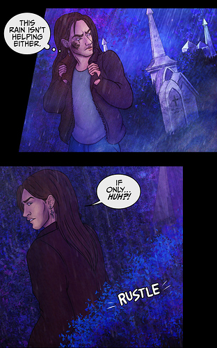
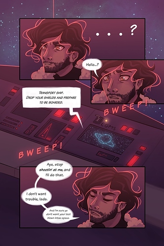
Here's what a single vertical "page" looks like. Same page can be found here8 in traditional format.

What's your preference as a reader?
No preference, honestly. I read comics mostly from my computer, so either format is fine for me. However, I also understand that I'm kind of an exception, as I do pretty much everything on my pc, while most people -and especially readers on both WT and Tapas- seem to use the phone app only, so I tried to go with what would work for the audience of both apps.

Is it different to your preference as a creator?
As a creator, I vastly prefer the page format... looks good on pc, looks good on my iPad, looks good on paper... and if the font is big enough, it can work on phones too. Vertical format pretty much only works on phones and while it has its perks, I prefer the versatility of print format. But alas, looks like most webcomic platforms nowadays don't agree with me :'D

Thanks for chiming in! That was really insightful. I didn't know Comicfury existed, and it will take every ounce of my self-control not to set up a site there and use that as the 'page format' mirror instead... It's very tempting, especially, as you said, a lot of Tapas readers prefer mobile, too.

I'll think on it for a bit. Two sites is already a lot of work.

I like the way your comic looks in both formats! Your pages have an old-school Sandman-ish vibe with the narration boxes, while the scrolling version paces well and has some good energy with the diagonal slices.

I... don't have white space around my panels. :cry_01: I fell in love with how some of the Mass Effect comics use a full-page illustration in lieu of white space a few years ago, and decided if I ever made a comic, I was doing THAT.

Which has made reformatting them involve a bunch of repainting. :cry_02: I'll be employing clever use of layers in the future, so the panels can just be 'turned off'. (And it'll have to be clever, Procreate only gives me 53 layers to work with at this size/DPI.)

Here's that page in scrolling format, for contrast: https://www.webtoons.com/en/challenge/blue-star-rebellion/ch01-p07/viewer?title_no=526293&episode_no=85 You can see where I had to patch it up.

You're absolutely right about how a scrolling page 'feels' longer than a traditional page, even though it's really not. That's probably really important for making the readers feel like each update is worth their time!

No problem! :smiley: Yep, I wasn't very familiar with ComicFury either (actually, I didn't even know about Webtoons up until a few months ago, I only knew about Tapas and Smackjeeves, lol)... I found it when I was looking for platforms that were print-format friendly and fell in love with it. The overall site graphics look a little outdated, but it gives you A TON of options for your comic and it's pretty much the only platform that still allows you to have a custom CSS for your webcomic site, which is a huge pro for me ^_^ but yep, I definitely agree that posting on a lot of different platforms is a lot of work, especially if you plan to upload in multiple different formats D: though, hopefully, having a buffer should help a bit with that! :slight_smile:

And thank you so much, I'm glad you like how my comic looks in both formats! Huge Sandman fan here, so the comparison just made my day, haha :heart_eyes:

And aaaaargh, I feel your pain about full page illustrations, I had the same problem with one of my pages!
...Though, truth to be told, I went the lazy way about it and simply cut parts of the panels instead :'D here2's the full page in traditional format, and here2's the vertical version. Thankfully, none of the parts that got cut were important for the comic, but in your case I can definitely understand the need to redraw parts of the panels D: also yes, I think that layered panels would be a good idea! Rearranging them would be much easier that way, both for the vertical format and for printing, in case there's anything you need to change/fix!

I like how you arranged your panels for the vertical format, and I absolutely love the full-page illustrations! Actually, I think for future updates in vertical format, you could definitely consider using a similar "full-page illustration" approach... not for all pages, of course, but using the page you posted as an example, I could definitely see the starry sky going up a little more and working as a background of sorts for the first two panels, only more space between them, kinda like this:


(Crappy Photoshop example is crappy, lol).

To speed up the process, you could maybe consider having a bunch of backgrounds/textures ready to be slapped on the upper/lower part of a panel in case you need to "extend" it... again, using the stars as an example, you could have an entirely separate illustration featuring a starry sky on a very long canvas, so whenever you need to add more stars, you can just copy-paste them from there into your vertical format page, lol.

I tried doing it with my old comic, but it took just so, so much time for something that just didn't scale correctly that I stopped. It looked straight up pretty bad. My page format comic (https://tapas.io/series/Alchemist-Burn-Outs5) was thin line-art in a more European style and so up-scaling to random sizes was just messing with the line width. I realized that I would have to redraw so much that it wouldn't justify the potential viewership I'd get from the site. Kinda like fitting a square peg in a round hole.

Now my comic was black and white as well, so just a whole lot of reasons why it didn't do well on that website. But, I did a different comic as a short story that was full color and the proper dimensions for a scroll comic and not only did it take way less time, because I only had to draw it once, it grew exponentially more viewers because it was in the format it was intended to be in. Just like wildfire compared to all the work I had done before.

So, eventually I just decided to put Alchemist Burn Outs up as a backlog on Webtoons the way it was originally drawn, but to do 6-8 pages in an update. It still had the length Webtoons likes, although I know it didn't have the phone readers, so it didn't pick up many readers, but I did get one commenter who was like "I like this." and youknow, that was nice for something that was minimal effort. (that and basically no one liked my long format version that I had made before)

So overall it's something nice to try out, but if it's not working, just know Webtoon format doesn't work for every comic and that's OK. Some people do both and have a great time and gain a lot of followers from it, so it really depends on how the comic transfers over.

Man I've thought about doing this... haven't done it yet tho
I can't remember the last time I saw page format on Webtoon, 'cept for mine

@Llyrel

There's a fantastic looking comic I follow on WEBTOON which uses a starry backdrop as a panel border/full length illustration for much of its pages! It works really nicely. Pretty sure the art team behind that one are industry pros, the art style really looks it: https://www.webtoons.com/en/challenge/temerity/list?title_no=3426028

@rajillustration
I can certainly see how the differing line weights wouldn't have worked for that style of illustration. It's definitely something I've noticed with mine, but having full colour illustrations masks the issue somewhat. I also use a slightly thicker line weight for close-ups anyway, so it's not too jarring.

I'm actually quite fond of the way it looks in scroll format so far, much more than I thought I'd be - so hopefully the audience there does, too.

@jamontoast98
I'd been mulling it over for a couple of weeks. It wasn't the easiest decision, since I knew I'd have to go back and re-paint elements of around 11 existing pages. But I figured the longer I left it, the more work I'd have to do in adapting pages which hadn't been painted with easy editing in mind. (I'm still not quite done fixing my upcoming pages, but I can use some weekend time for that.)

Now that I know I'll be doing this moving forward, I can make sure future pages are drawn using layer groupings which allow me to reformat them far more quickly.

I DON'T do this, but I think explaining WHY I don't do this might be helpful to some people curious about making the switch, so I will answer anyways!

Why did you make this decision, given the extra work involved?
See, the reason I don't do this is precisely because of the extra work involved. I try and update my comic three times a week, and then switch over and put it on webtoon as frequently as I can. This means that if I reformatted the comic to webtoon every single day, that it would take up the time I use to actually draw my comic! So in the end I decided that it was more important to make more content than to create a separate version.

What's your workflow like?
EVEN THOUGH I DO NOT DO THIS I still have to reformat stuff for webtoon because of the sizing differences!! So this annoying thing takes a small amount of time where I'm like, re-exporting the images and creating a new thumbnail. This really adds up! When I did do a completely redone version in the past for another comic, that could take hours of cutting and moving the panels around. Then I would have to splice the image for webtoon in photoshop. I ask you; is it really worth the time. I say no.

Does it take you much time to adapt each page, and did you discover tricks along the way to speed it up?
The way to speed it up is to not do it xDDDDD

What's your preference as a reader?
As a reader, I like either way, and I think you will find that readers are much more understanding than you might think. In the end, people want to read a story with content. It's best to focus on making that content as good as possible. Presentation is also important, but unless you intend to go pro making webtoons only, I can't recommend this way of drawing. (On the other hand, if you really want to publish on webtoon professionally, you can always just STOP DRAWING THE COMIC PAGE BY PAGE and switch to a webtoon like format. Tada! Time saved.)

Is it different to your preference as a creator?
Thankfully no.

Alright I hope this helped!! I know that some people will want to do both anyways, but I can't recommend it.

Okay, checked out your scrolling vs. traditional. Super nice comic btw! So, how is your audience receiving the short updates on Webtoon? I've been posting single page updates, and at first was getting people saying they were too short. :unamused:

I draw my comic in the traditional format as I plan to print it but I reformat to vertical scroll for both tapas and webtoon
Why did you make this decision, given the extra work involved?
the larger panel sizes of vertical scroll increases readability for mobile readers. I prefer to upload multiple pages per update and I find traditional format pages can feel awkward and blocky to scroll through, atleast with my art style.

What's your workflow like?
It's pretty much goes (traditional format): thumbnail and sketch out pages on paper , switch to digital (huion kamvas 22 plus and clip studio) for everything onwards starting from panelling, digital sketches and final layout edits, lineart, colouring, text, export copy as png
then for the vertical scroll I create a loooong file, open my pngs and one by one past in my panels, resizing and occasionally reordering as needed, then i export and divide into uploadable chunks

Does it take you much time to adapt each page, and did you discover tricks along the way to speed it up?
it seems to take a couple hours on average but I have some very long chapters that will be split into multiple episodes and I haven't discovered any tricks so far unfortunately but I am new to this

What's your preference as a reader?
No preference as long as traditional layout comics have their text large enough to read clearly

Is it different to your preference as a creator?
I guess since I prefer to create traditional layoutfor print and vertical scroll for online but it's really about what I think works best for my comic in eachformats

@clockworkzari
Thanks for your insights! It'll be very helpful to someone on the fence, especially one who doesn't have much time to spare in adapting their work. For me, I spend enough time per page (around five to six hours, on average) that an extra half-hour spent re-arranging assets to help my audience experience the story better seems worth it to me. (Also, I use the Croppy tool for splitting and re-sizing the vertical comic, so that part doesn't actually take me any time at all.)

@gabriellabalagna
Thank you! I've had a couple of comments about update length, but I'm hoping the moving to a vertical format will help with that. They look longer, even if they're not. :sweat_02: I think the vertical format takes a fraction longer to read through than a standalone page, too.

If I get my buffer to the point where I can more to a two-page-a-week update schedule, I may just post double-length pages to WEBTOON once per week. I think the audience there would prefer that.

@dreamysheep.01
Thank you for your insights! Aside from the paper part, your workflow sounds similar to mine. I work entirely on Procreate with a 12.9" iPad Pro. I finish a page, duplicate it, flatten particular layer groups and then drag elements over to a vertical canvas.

I've taken to really enjoying the flow and pacing of the vertical format for online comics, too! With a page layout, you need to discipline yourself as a reader to not speed through, and to pace yourself so you feel the impact of each panel and the tone of the story. A vertical scroll gives the artist more control over the reader's pace, which I'm really beginning to appreciate.