1 / 14
Nov 2017

I've finished enough strips to get my webcomics up and running but I wanted to add greys to them but I wasn't sure how would that work. I figure I would use three greys: 25% Grey, 50% Grey, and 75% Grey plus Black & White.

So far this what my character for my strip would look like with the greys:

So what do you think? Too many greys or should I use colors instead?

  • created

    Nov '17
  • last reply

    Nov '17
  • 13

    replies

  • 2.9k

    views

  • 11

    users

  • 8

    likes

Depends on what you want to do with your characters.
If you're making a lot of pages, grayscale can make things easier.
But if you can handle coloring everything, go for it.

as vincentprendick said. It depends of how much extra time do you have, and how much extra time does it takes to add color. Your greyscale works well, because your characters have enough things that makes them stand out and be distinguishable from each other, but the color would give a great touch to them and give more life to your comic.

So I have this pet-peeve about greyscaling and its probably because I do it wrong. If I greyscale, I figure that I might as well color it. Or leave it as linework and shade it with hatching. Your work would improve with color I think.

Well for one of my comics everyone is fully one shade of grey depending on who they are in the story. Like the mains get mid grey.

I think that so long as you use shades for the background that don't blend with them too much you can use grey scale and there won't be any issues.
If the background is really light / really dark (depending on time setting) then it will help the figures pop out despite the lack of colour.

I've nearly always been under the impression that if you're going to bother doing greytones you might as well do color. The only reason print conics use greyscale is it's cheaper to print.
Edit: or I guess if you've got some kinda aesthetic going.

You could have a color strip every so often?
Like the daily's VS Sunday strips? (Like foxtrot does theirs?)

Also, you can go midway for your grayscale by taking all of your grayscale layers and applying one color to it,
like so:

Originally Grayscale, but added orange to the value.

I personally like the grays! You just need to make sure your backgrounds are simple and uncomplicated, or else things might start to look washed out. If you do decide to do colors, make sure you establish it NOW, even if you only post colored comics on occasion... If something you color in 75% gray, looks better as a light blue later on, it's going to be very jarring to change for the colored comic.

I do really like vincentprendick's suggestion of going monocolor instead of grayscale! You get the same simplicity but with some more visual interest.

8 days later

Oh okay, I was going to suggest if you're using greyscale to use much higher contrast because 25-50-75 can very easily appear washed-out. Colors are okay, they just tend to be more eye-catching. Your designs are pretty good, they're a little indistinct body-wise, but if you're doing a gag-a-day style strip, they have enough identifying features to be distinguishable.

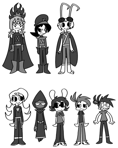
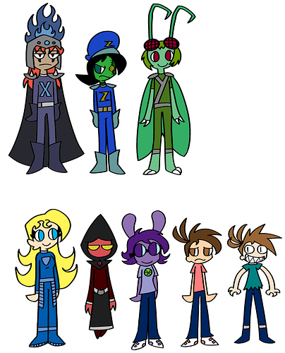
I freaking love greys! One of the big reasons I like manga so much. I like what solhawthorne said: I think more contrast is necessary. To me that means you'll need to add some more grays but also make use of blacks and whites more. So, for instance, use your three grays, but use them sparingly. Then add more black and white. Although, this will give a very different look than you currently have.

It might be a good idea to look at black and white comics that are just made in ink. Everything is black and white and for a "grey" crosshatching is commonly used. In your case, grey would be used instead of cross hatching.