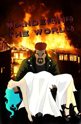
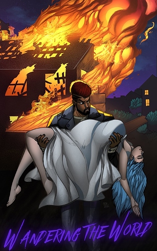
having the whole picture in one consistent art style, is definitely an improvement. One thing that I think was a strange decision, if not intentional; was that you changed they direction your character was facing. In the original, his face was toward the camera which has a focused or driven energy. It's aggressive, but not hostile, it makes the girl look like the secondary priority. A sort of "so what I save the day" vibe. The second version, he's facing the girl, but looking at the fire. The energy has changed to a "who is this lady, and what happened here?" vibe. If that was intentional, then kudos, if not, it still looks great I like the change, it's just a thing to keep in mind during composition.
Another change, that is somewhat significant is that in first, it only shows one building, and its on fire, in the second, it shows a second building, not on fire, which kinda changes the intensity. Now its not the only building here burning down, it's a specific targeted, and limited space burning down. Idk what the context of the portrayed scene is, but I definitely think the inclusion of a separate building, and the energy of life the shrubs add, hurt the urgency of the cover.
The shading is leagues better, anatomy leagues better. The second one is in broad strokes better. The composition is the only thing I felt took a hit. Keep up the good work!!!