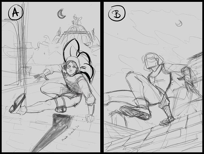
Before anything else, it has to be remarked that these are both beautifully drawn! Fantastic dynamic anatomy and really dynamic angles! 
I think even though B has the more impressive and dramatic angle, that A is the more effective cover, because the character's face is engaging more with the viewer, as well as looking and moving to the right, so the "reading on" direction. I also feel like the cityscape is a more compelling and attractive backdrop than clouds... though the clouds do leave a good space for a title. Something about having the whole body also makes A feel more dynamic, somehow, like we're floating in the middle of the vault with the character, while B somehow the way the leg leads off the page makes it feel "planted"; I'm not even sure I could explain why.