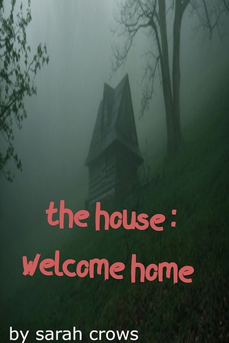
Can you post your actual cover art here in the forum so we can see it bigger than the little thumbnail Tapas gives us? It will be a bit easier to critique if we can see it full-size. Right off the bat, though, I would say that two things could be improved. The first is contrast. The photo you chose for your image is all sort of a very flat monotone grey-green sort of color, with no contrast to lead the eye to any kind of focal point. The whole thing just sort of becomes flat.
The other is the font you chose. It's sort of a very futuristic sci-fi design-y font that doesn't really suit the style of a horror novel. I suggest looking through other covers in the horror section to see what kind of fonts they choose, or just go with something a little more traditional.