Ho boy - sorry for the wait, Was finishing up the end of the quarter but now I'm officially on winter break so I'll be able to get through some more reviews.
Let's start with the good, I love the premise of your comic and the character designs are a lot of fun, they're all very distinct from one another and give a real sense of who they are as people. I also like the style that the characters are drawn in. The quality in general definitely seems to have improved over time - but there are some significant problems at the very core of your work that overshadow all of these positive attributes. I'm gonna go one by one in order of most to least serious.
AESTHETICS
Or rather, the lack thereof. Outside of the way that the characters are drawn in, you've somehow managed to make a comic without any sense of style, and the aesthetic choices that have been made clash with eachother and just leave me completely confused as to what i'm supposed to feel scene to scene.
I realize that "aesthetics" is a pretty vague term, so to showcase what I mean, here are some comic pages that have very strong sense of aesthetic, without any context. Look at these images and notice how they make you feel.
(In order the comics are Hellboy by Mike Magnola, The Legend of Val by Kimberly Fountain, and For It To Grow by 6-Hours.)
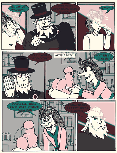
Now... Let's look at a page from your comic.

Do you see the difference? Aesthetics has nothing to do with the quality of drawing (which I think is fine), but rather, it is the sum of all of your creative elements. Shape language, Color theory, Framing, Pacing, Storytelling, font choice, the size of your panel gutters, it all matters. And unfortunately the creative elements of your story have clashed in such a way as to leave me completely confused. This isn't an easy thing to fix or learn. My suggestion on how to improve is to l̶i̶s̶t̶e̶n̶ ̶t̶o̶ ̶v̶a̶p̶o̶r̶w̶a̶v̶e̶ closely study the work that inspires you, find out what makes it tick and try to replicate it, try to replicate specific styles from a variety of artists, try to merge them in ways that interest you, create a synthesis of everything that matters to you and everything you want your work to stand for.
COLOR THEORY
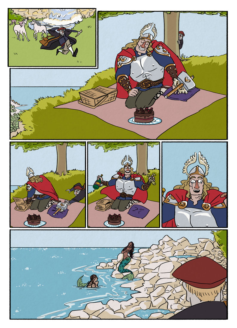
I called out @DaniBoy for using default red and the same thing applies to you. The other thing is that you're using a lot of flat grey values, along with spot coloring, and those spot colors may as well also be default red. What I'm about to do is basically just redlining, so take what I show you with a grain of salt.
What I did here was I took the page from earlier, converted it to greyscale, adjusted the values, and then finally I made a gradient map with a more cohesive color palette. (as a result the gradients that you used on this page ended up looking a bit weird, but my goal wasn't to make a perfect page, just to show how a more carefully constructed palette could fix some of the aesthetic issues.) Honestly, this new palette I've made here isn't that much better. Gradient maps are a bit of a cheat and they have some of their own quirks that I'm not a fan of. Ideally you make a new palette from scratch.
Color packs a lot of meaning, and the pallets you use should be constructed with care. Misusing color can completely wreck what would otherwise be a fine image or story. There's a lot of information out there about color theory, and if you'd like I can send you links to some specific sources of information if you'd like.
COMPOSITION & VISUAL STORYTELLING.
So, first up I wanna say that the flow between panels is good. I was never confused by how I was supposed to read the page. And you also do a pretty good job of varying your shots as far as closeups/mid shots go. The problem here is that all of the "camera angles" that you've decided to use are completely flat. They carry no emotional weight, and as a result everything feels bland. It kinda reminds me of old gag-strip webcomics, which is not something you should be trying to replicate in an action/adventure/comedy.
If you haven't read them before, I highly highly recommend reading Understanding Comics by Scott McCloud, & Framed Ink by Marcos Mateu-Mestre. I've linked them on amazon, but you could also probably find them at your local library if its cool enough. If you really have to you can find free PDF's of both of them online, but they're both books worth owning. They'll teach you about visual storytelling better than I ever could.
Studying film is another good way to learn visual storytelling. A great exercise is to take screenshots of different points in a film and then redrawing them later. I particularly like studying older animated films, but live action stuff is equally as important to understand.
SOME FINAL NITPICKS
These are really easy fixes that would instantly improve the quality of your work if you put them into practice.
1) In your speech bubbles, use a light desaturated color for the background, and use a darker contrasting color for the text. (or just use black...) The improved contrast will make everything easier to read.
2) Stop copy-pasting all of your drawings. If you have to copy-paste, only do it to your base sketch, and then redraw over it. Relying on copy paste so much really sucks the life out of your great character designs.
3) Don't use gradients. They always look gross. If you need a gradient paint it yourself, or add in some texture. An easy trick in CSP (which I'm assuming you use because it looks like you're using its panel tools) is to set the gradient layer to "tone" mode in the layer properties,(also be sure to set the layers blending mode to Overlay or Soft Light, knocking down the opacity is probably a good idea too.)
There are some things that I really like about your work - but unfortunately its all weighed down by some poor creative decisions. I think if you overcome these issues you'll have something really special on your hands. I wish you the best of luck in your creative journey.