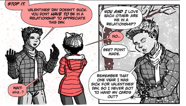
All very good advice!! Something I haven't seen mentioned yet is how the bubble outline can be an excellent way to denote tone: anger, sadness, anxiety, whispering, etc.
It's one of the best ways to emphasize a character's expression. If a character is crying and their bubble outline is wobbly or shaky, it will translate to a shaky voice in your mind.
Here's a sample of what I mean, thanks to one of my favorite comics, Sakana:
(haha go figure, she's got a sample of more than one type on the most recent page)
Another basic tip I can think of: Remember that bubble placement creates page flow; it's just as important as paneling. Our eyes go from bubble to bubble and see the artwork in between.
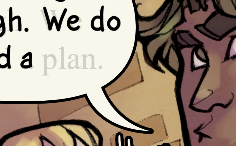
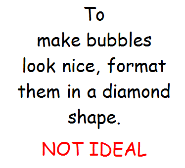
There was a page in my own comic where I made a mistake in lettering that I've since learned to avoid:
For panels 2-5, the bubbles do not assist the paneling. Ideally, according to the panels, the eye should flow down the artwork on the left, shift back to the top of the right 3 panels, only to go back down again. Instead, my bubbles just lead your eye down the center of the page.
This is one of those where the artwork didn't really allow me much flexibility to change the bubble placement, otherwise I would. It was just set up poorly.
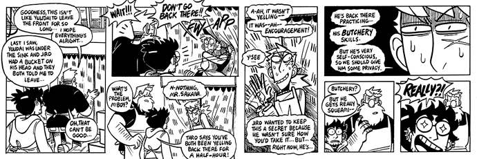
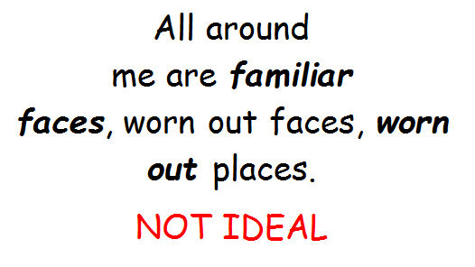
On that note, if you accidentally set it up wrong and it's confusing on which bubble to read first, SOMETIMES you can solve it with a tail connecting the bubbles.
The top one is what I had at first. I struggled with this because I realized that it was confusing--the middle one is most prominent, but it's read left to right, and the left bubble is so far down. The reader has a greater chance of reading it wrong.
I solved this by connecting them like in the second image. This way, at a glance, you know the middle bubble is in fact the second one to be read, so the eye snaps to the left bubble naturally.
Obviously this is a solution to a very specific problem, but it's good to keep things like that in mind!