Yeah if you want to go with a stick figure sort of style, there are a few things you can do to elevate it....
1. Use Thinner Lines
Like @NickRowler said, using a thinner line will make your art feel more mature. The super thick line brings to mind a kid drawing with a chunky marker or crayon, and it tends to feel a bit juvenile. Thinner lines will bring it up to another level. On that same note...
2. Use Clean, Deliberate Lines
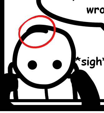
If you're gonna do a stick figure comic, you need to make the cleanest, neatest, most precise stick figures your readers have ever seen. Places like this...

...where the lines don't meet up properly makes it feel messy. If that head was a fully-finished shape, it would feel so much neater and more professional. It doesn't even need to be a perfect circle, just a deliberate shape that makes readers feel like you know what you're doing, rather than just rolling with whatever your tablet/stylus does.
3. Level Up Your Word Balloons
Seriously. People tend to neglect their word balloons, but having professional-level word balloons really ups the overall quality of your artwork. I did a bit of a writeup on this comment with someone's similar art style and how to tighten up those word balloons, and the same information applies to you here. TLDR; use thinner lines on your balloons, use a nice lettering font (seriously dude, you gotta not use Comic Sans, it's kind of a joke in the industry how bad that font is), and give your text blocks that good diamond shape to improve legibility.
4. Composition!
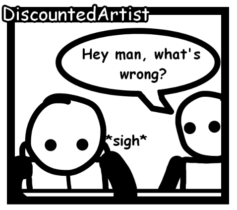
So looking through the couple strips you have up, it definitely seems like you could be utilizing the space inside your panels better. You go back and forth between having panels that are so close-cropped that it looks like an accident...

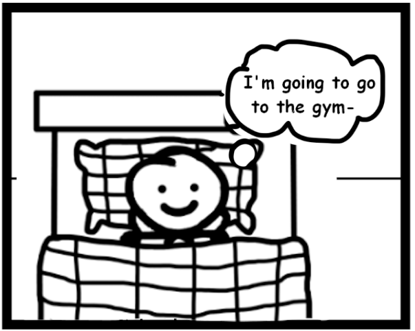
...to having panels where the character takes up so little space in it that there is tons of unused space...
In the first case, there is no reason for the characters to be cut off by the panel -- stick figures are so minimal that you can zoom out to fully show the characters without losing any detail or clarity. And especially in the case of stick figures, you don't want their limbs to be cropped off by the panel borders because the line quality of their limbs is exactly the same as the line quality of the panel border, which makes the image lose clarity.
In the second case, more than half the panel is completely blank space, which is a big waste of panel real estate. Look at how much better the panel space is filled when you do this...

Within that same strip, you do have panels where you have a ton of dialogue and need that space, but you can vary the camera distance from panel to panel to compensate for needing more or less space for word balloons. It'll make it more compelling and use your space a lot better.
5. Reference Other Stick Figure Comics
To see exactly the kind of thing I'm talking about, you should look at other stick figure comics and see what they're doing and try to emulate that. Here are some great examples of stick figure comics that use tight, clean, deliberate lines, professional word balloons, and use their compositional space wisely.
Order of the Stick
Bug Martini
Cyanide & Happiness
Maximumble
Hopefully this helps you out.