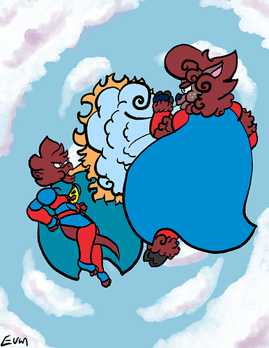
Hmm...exquisite taste~ ^^
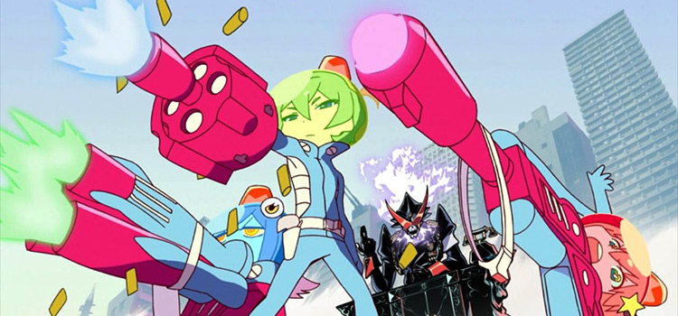
I think the element that makes Trigger stand out the most is probably the aggressive use of perspective on the characters. When a limb is distant, it's exaggerated to look super tiny, and when a limb is pointed at the viewer, it's exaggerated to look super big.
This is already an effective technique for a still illustration, but in animation it gives the viewer the impression that every movement is very powerful, with the way the body parts swing between extreme sizing, and it also makes it feel as if space itself is warping around the character as they move because of how unrealistic it is. The end result? Super dynamic~
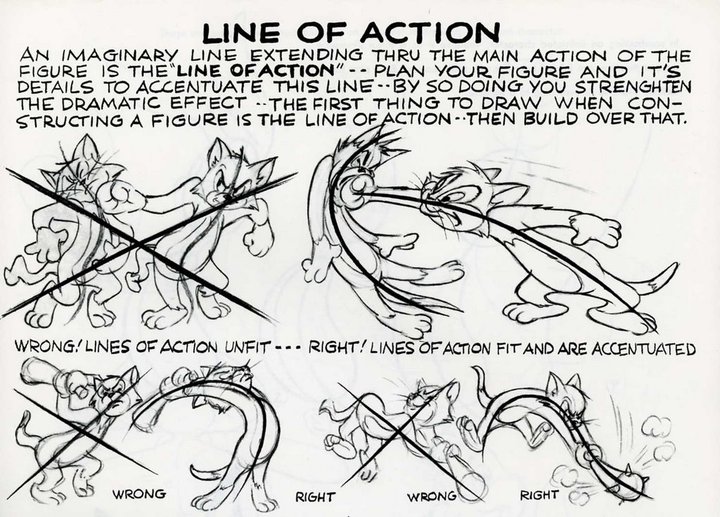
Of course, all the technique in the world won't help you if you don't know how to pose characters in dynamic ways. For me, this boils down to three factors: spacing, direction, and airflow.
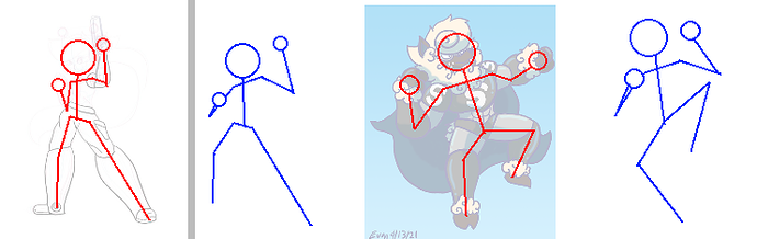
Spacing is how the limbs are arranged. Dynamism is about emphasizing movement, so you want to place the characters limbs to give the impression that they are about to move, in motion, or have just finished moving.
You can get better at this by paying attention to how humans move; where they place their arms and legs when they are about to fall, or hit someone, or swing something. Sports photos are great references for learning the 'language' of movement, which takes a lot of time and study. But here are some general rules:
- Pull the characters limbs away from the torso, especially when the character is in 'active' motion: walking, or running, or flying, etc. When people are trying to get from one place to another, they tend to have very 'open' body language; the limbs spread out to ensure that the body stays balanced as it moves.
- Twist the torso whenever appropriate. A good torso twist will lend extra dynamism to many poses, because it gives the impression that the movement of the lower and upper body are offset by some amount of time, and that one section fluidly 'follows' the other.
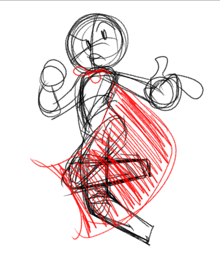
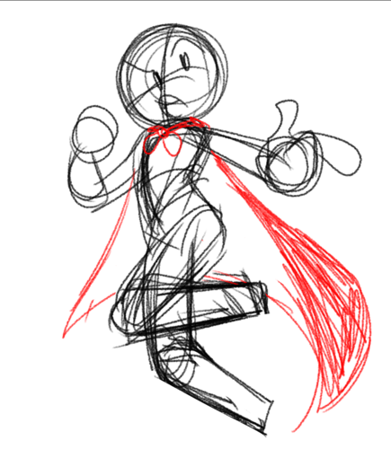
- Speaking of offsets, make sure to offset the position of arms and legs whenever possible. To give an easy visual example:
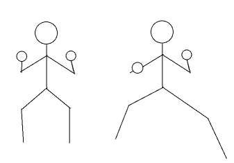
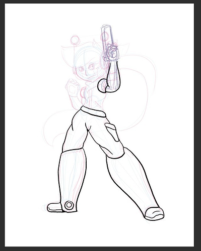
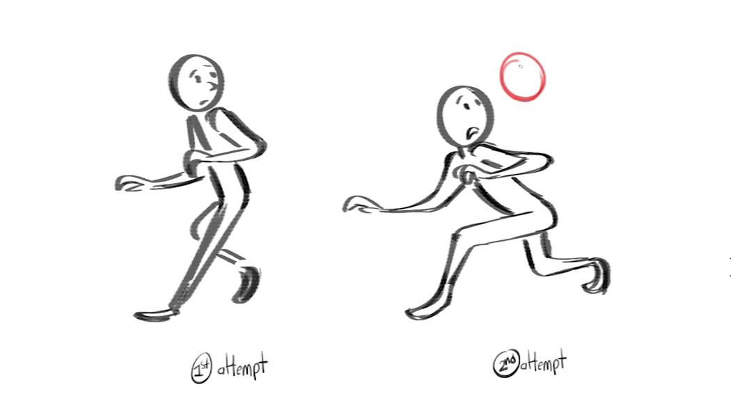
The right stickfig has a much more dynamic pose than the left one, due in part to the offset limbs. Instead of both sides of the body looking like mirror images, we have the arms bent at different angles, the legs bent at different angles, and even the feet placed at different distances from the viewer in space. Not only does this look more natural, it gives the impression that the body is poised to move in a certain direction.
Direction is just that: determining the general direction of movement, so you know where and how to emphasize the shapes of the character.
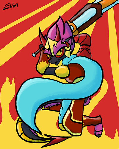
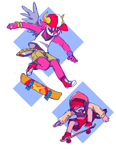
You can have linear direction along one vector...
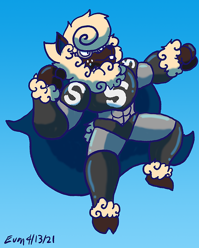
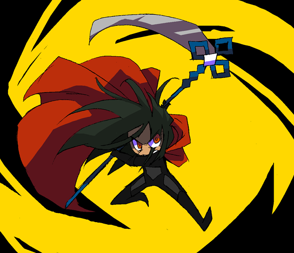
Or you can have 'turbulent' direction, along several vectors at different angles (but usually in a coherent pattern, like this circular motion):
Direction is actually much harder to explain (and to master) than it sounds...it's kind of like when you learn to use gravity's 'down force' to make clothes and hair look 'weighted'...only in this case, you have to choose the direction of force yourself, and apply it to the action lines and proportions of the body.
Understanding the language of movement is also involved in this, because you need to know where people put their limbs in preparation to have them go in the direction you chose...there's a lot.
Last but not least, Airflow is exhibiting the flow of air around your character due to their movements...even movements that don't normally cause much airflow. ^^ This is used a LOT in anime; it's one of those stylistic elements that kind of belongs to it as an artform.
Airflow in still illustrations is a little different from the way it's used in animation, though...when you draw it, you usually use it to give your figures a light, slow-motion quality. You want to lift their clothes up, lift their hair up; take any easily movable element you can get and apply the opposite of your Direction vectors, or at least jostle them around a bit.
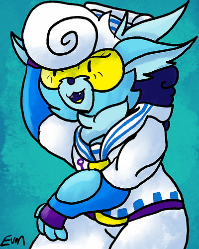
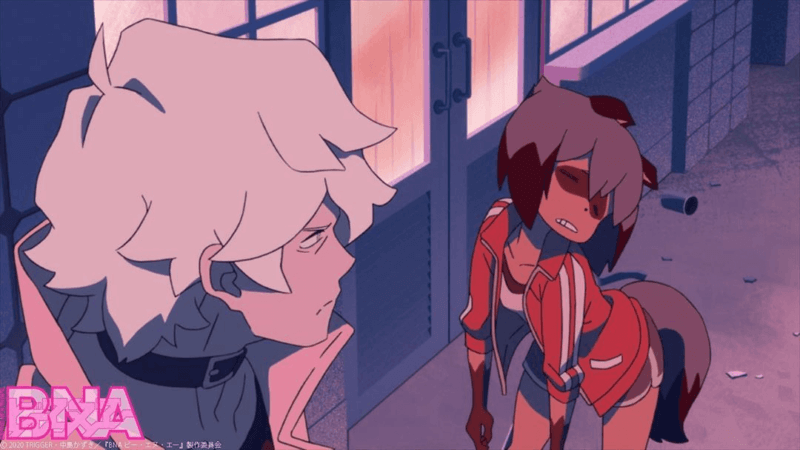
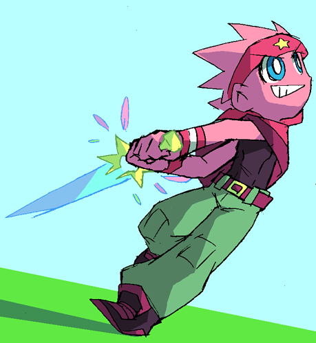
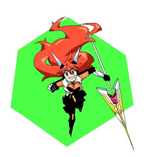
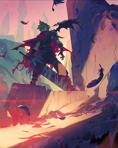
The third pic is an interesting case: the Direction of the drawing is  up, and the Airflow of the drawing is also up...which combines to give the impression that the character has risen in the air and then stopped, as if they're mid-jump. Sometimes the Direction tells the past, and the Airflow tells the present. ^^
Man, I wrote a lot; this was like one of my tutorial threads. But before I go, I want to try to apply some of this theory to a couple of your drawings, just to show how you could improve 'em: