1 / 13
Feb 2017

A while ago when I put my comic up for critique, one of the criticisms I got was that my composition was bland and that a good way to liven it up was to look into cinematography. I know a little bit about cinematography (like using close ups versus bust shots, and using different eye levels) and I sometimes what video essays on YouTube about these kind of things (like the channel "Every Frame a Painting"), but what's a way I could really learn to apply this kind of stuff? How can you use cinematography to make a boring shot more dynamic? Is there a book I could read? I really want to do storyboards one day, so is there info on that I should look up? Any info will be appreciated.

  • created

    Feb '17
  • last reply

    Mar '17
  • 12

    replies

  • 6.5k

    views

  • 1

    user

  • 22

    likes

  • 32

    links

Hmm well maybe this way of thinking will help you?

When I make my storyboards, I think of my comic as an animation first. Just as if I was watching an episode or a movie in my head. The characters are in motion, I can hear the sounds and all. And then I draw the scenes as if I'd pause them and made a screenshot.
That's why I always add speech bubbles as last... (in which in some cases it gets really messy, because I can't squeeze the text anywhere ahaha ^^; blep, don't do that at home kids, unless you don't care).

But I guess it would be a good start if you try to imagine the scenes in motion and then pick the key moments. If thinking big like a whole 25 min episode is too much, just imagine how certain scenes would look like a gif?

Maybe looking at this comic will help you understand what I mean, where certain panels are indeed gifs:
https://tapastic.com/episode/28724789

Well cinematography is basically the composition of each shot in a movie. In theory it should be easier to handle in comics since we're working with static images. Look at each panel and consider where objects and figures are placed. It all goes back to drawing 101 (at least they definitely covered composition in my first drawing class).

Consider a scene where two people are talking. In panel one, it's really square and boring. But shift the camera angle slightly (in-turn changing up the composition of the shot) and you have a much more dynamic scene. The placement of the two figures forms an angle that leads your eye through the panel and this composition can also allude to the figures' personal relationship. Like the left one looks like they're confronting the right one about something.

9

I haven't read it myself, but I've heard Framed Ink is a very useful book on this subject.
28

Heya! While cinematography traditionally refers to film, it's just as crucial to comics! I'm a storyboard artist by trade, and virtually all the rules of cinematography in storyboarding apply to comics as well. :> Learning the foundations of storyboarding will go a long ways toward improving your comics!

Framed Ink as @joannekwan suggests is a good one, though potentially a little lingo-heavy if you're just getting into cinematography. I'd suggest reading up on the basic camera angles and shot types before diving in.

Film Directing Shot by Shot is another good one, especially because it takes an in-depth look at the various types of lenses used in film. I know it sounds weird to think about a physical camera, but lenses are used extensively in film to distort our perception of a scene and achieve specific effects. It's not uncommon to hear animation storyboard artists refer to camera lenses, even though there's no actual filming.

Third, this in-depth essay on the cinematography of the Incredibles51 is super helpful! I found it to be very comprehensive in how it breaks down each moment of the film, explaining why that specific shot or angle was chosen, and how it impacted the visual storytelling.

In general, remember that your camera is a character too! The way you position the camera informs the viewer how they should be feeling about a scene or the characters. Cinematography is all about getting that emotional resonance from your viewer, so the more you understand it, the better you can get people involved in your world and story. :>

Hey! This is a great question that my partner Vince recently went into great depth with on our blog!

http://www.mythopoeia.us/blog/creating-comics-101-story-though-panels29

Beyond the other suggestions in this thread, I recommend the following:

1.) Pick up photography as a hobby. All of the principals of framing apply to photography, and by honing your craft in that medium you will definitely improve your framing when drawing.

2.) Study cinema from a frame-first perspective. Watch the pictures analytically. If you're on a computer, pause the movie on frames that you like and take a screenshot. Why do those shots resonate with you? How do the filmmakers take full use of the frame?

3.) Watch the following youtube series: https://www.youtube.com/user/everyframeapainting21

Especially these videos:

https://www.youtube.com/watch?v=5UE3jz_O_EM3

Hope these help!

I think a good thing to do is critique the cinematography in movies (Good ones of course). Then, you can see the methods in action. Try to sample from a wide variety, from action, drama, suspense, romance. Think of some of your favorites, and if you can listen to the director commentary. That will give you some insight into what they were thinking about when framing shots.

Basically think of your "camera" as adding to the storytelling and not just taking a photo. Can you make someone feel more imposing by viewing them from below, show how emotionally distant characters are by doing a wide shot, show how unnerved someone is by tilting the camera? Part of improving is looking at other people's work and being able to critique why it is effective.

I'm no authority on composition (and still learning myself for that matter) but like @jutawi I also have a 'animation style' process for roughing out my comic where each panel is viewed as if through the lens of a camera. These visualisations cover everything from tone of voice to the height of the 'camera', foreground and background, character positions, line of sight, lighting etc. and most of the time I don't even think about it. The process of composition is entirely involuntary- it just comes out and I know how it's supposed to be- but I believe this is a direct result of actively sitting, watching films and reading comics, and wanting to know how the director/artist did what they did. Like why such and such a scene makes my hairs stand on end, and how my eyes were directed to one, very subtle movement on the screen when there's so much else going on.

Like you I'm not trained or anything, and I don't believe you need to be, but I agree with @joannekwan in that there are basic principals for each of the elements of good composition that you can pick up quite easily simply from watching and learning from what's around you. That in itself is a course you'll have to put yourself through in your own time.

However, if you go trawling through the internet and sea of tutorials, blogs and videos on composition/storyboarding to be found there you'll find lots of basic rules are already in place and commonly used by most artists today- from architects to fine artists, film directors and comic creators like us. Some of these are the 180-degree rule12, the Rule Of Thirds3, and the concept of Headroom10, but every artist and director will take this advice as they see fit...like how this scene from the Shining breaks the 180-rule to promote disorientation (cheers Wikipedia!)


That said, I think the best thing you could do at this stage is go and watch some films. Go watch films that make your eyes pop and read some comics that make your brain explode. I remember watching Samurai Jack, The Prince of Egypt, and reading various comics as a kid that left me with a keen interest in how they were made from a techincal point of view. Not all films do it, some of them leave me totally cold. Here are some examples of films/projects I love that you might like too. Struggles to rein self in. Deep breath.

The Fifth Element directed by Luc besson


3


1


2


The Grand Budapest Hotel directed by Wes Anderson

1


2


1


1

This scene from Samurai Jack is pretty top:

The series Samurai Champloo


2


Hope this helps!

I think a lot of advice about panel composition also overlaps with advice about cinematography. The 180 rule, Dutch angles, perspectives, etc. When you see a movie or a shot you like, think about why you like it and see if you can apply it to your own work.

2
Here's a shot from Ivan's Childhood. The debris points towards him, sort of looming, sort of like an adversary.


Here's a scene from Strangers on a Train where the main villain strangles the protagonist's ex-girlfriend. The use of shadows when they're in the tunnel of love to show the man almost overlapping her when they're actually still in different boats. At 1:35, the strangling happens, but it's shown via the girl's fallen glasses. I can think of a couple different ways to adapt that frame into comic panels.


One of my favorite movies, cinematography-wise, is In the Mood For Love. Here's a video that analyzes the use of enclosed spaces throughout the movie, showing some nice use of foregrounds trapping the characters or shadows cast over them. It also mentions the use of body language, glances, faces being obscured or facing away from the camera.

Just a few ideas. There are a lot of good movies out there! And a lot of videos that will help you analyze them. smile

"Visual feast" films are a lot of fun to draw inspiration from. Some recent ones I've enjoyed were You and the Night, Pasolini's Thousand and One Nights (which is a longtime favorite), and Argento's Suspiria -- some of this will depend on genre, as to whether or not you may find them useful.

But to keep it simple, here's the good stuff from comic legend Wally Wood, 22 Panels That Always Work.

15

You'll want to click and view the image in its own tab or window, of course. In case you didn't know, "Ben Day" refers to ben day panels, which were basically screentone. These panel ideas are a sure way to mix it up and give the reader more visual engagement. Hope this helps!

This thread is really cool! <3 I'm still busy going through all you have posted in detail XD Thank you all for these tips!

I think a good basics book on comic making is How To Draw Comics The Marvel Way10, also available as a video for them what don't likes ta read. wink

Mid page scene transitions should be avoided. If you have to do it, it needs to be tied together with some device (such as the second scene being a place that just got off the phone or radio from the first scene). The colour palette should also stay the same, in order to avoid jarring the reader.

Personally, I try to avoid changing scenes except between an odd and an even page. Changing between an even and an odd, can work, but once again, it needs something tying it together. I have one title where I was changing scenes at the top of every page, but that was the style of the book, so the jarring effect was lessened by repetition.

Establishing shots are important. There has to be something that orients the reader, and does so immediately. That used to be done with a caption "Meanwhile, back at Stately Wayne Manor.." Today, it's done with an establishing shot, which can be thin, but usually takes up the top of the page, and is sometimes accompanied by a caption that helps establish the scene better.

A neat trick is to have the last line of dialogue on the bottom of the Odd numbered page be interrupted and picked up in the first panel of the following even page. The line of dialogue is something that refers to the next scene, and helps set it. As an example, "Right, and you think Han's going to take this lying down? Not a..." "Chance!"
Of course, all of this ties back into pacing of the book, and how you adjust your script to fit what's needed for the story.

There are many techniques used in film that help get mood across. For example, the "dutch angle" shot is often used to make things seem a little bit off, or disoriented:

1

"low angle" shots can be used particularly well with horror scenes. take this shot from the shining. the audience can't see what's behind her at all and it makes us more apprehensive.

Boy, I thought I had some stuff to say, but a lot of great advice has already been covered. I'll do what I can.

Like some of the previous posters, I also see my comic as being animated in my head, so it's really just a matter of taking the most important shots and putting them on the page. And also as someone above mentioned, what you're boiling cinematography down to in comics is composition. It's sort of like a very detailed storyboard of an animated sequence, though you don't want to cram it with every change on screen.

Always start with what you want the focus of the panel to be. Then consider the secondary elements of the shot, and then the tertiary. Once you know what's most important in the shot, consider the tone of it. That will help you decide on an angle, but don't overdo it on dynamic angles. Like a story arc, dynamism in angles should have rising and falling intensity. Consider the emotional state of the character, as well, and the social play taking place in the scene.

A simple example:
If you have a character that is being condescended upon by another, the "obvious" way to handle it is to have the power character's head compositionally higher on screen than the victim, so to speak. Maybe have the victim sitting down and the power character standing up. The film Vertigo plays with this particular notion in one scene very well in how Jimmy Stewart's character moves around in an office with a man trying to hire him to spy on his wife. Lots of power inter-play there.

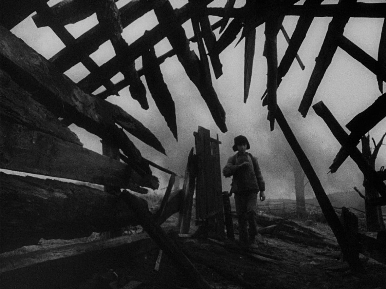
There are a lot of fantastic examples of composition posted in the above comments, but the three I would recommend the most are The Grand Budapest Hotel, Citizen Kane (of course), and just about anything by Stanley Kubrick (but my favorite is The Shining).

I think these three different films have a good variety of cinematography that will show you how tone, cinematography, and mise-en-scene work together to tell the story visually and not just narratively.

Finally, remember that dynamism doesn't just come from cinematography, it comes from color theory and tone (in the visual sense). Lighting is VERY important to tone, so when you go to do your shading and color, know what different types of lighting will do to the scene. High key lighting is used to create a fairly even tone in a scene--it's used often in sit-coms and comedic films. Low key lighting comes in many flavors, but it boils down to contrast. Low key generally means higher contrast, which translates often to drama. Then you've got the lighting angle, which also has a huge affect on tone. Your "cardinal directions" often provide the highest dramatic lighting: directly above, below, in front of, behind, or from either side. Any lighting that hits at a diagonal will feel a bit softer, depending on where it hits the composition.

Hope all that helps! Definitely look into what's been said above, there's a lot of great info. To simplify, look up:

  1. Cinematography
  2. Mise-en-scene (composition)
  3. Lighting (which is technically a part of mise-en-scene)