15 / 31
Feb 17

Depends what it is.

Usually detailed...

Sometimes use Google maps street view or photos and edit a bit...

But sometimes don't need to be detailed. Just a simple gradient is fine...

Depending on your artstyle and sensibilities, you could use 3d backgrounds. Depending on what you are going for, it could save you some time. Unless you are me, and decide that you’re going to create your own 3d background in blender and then paint over each one of them.


(The last one is a joke, I have great respect for artist who know how to manage their efforts. I'm the one who has problem)

To me it largely depends on a scene and the perspective of each panel, and how much there's focus on character action. Especially when characters are in a new area which needs to be shown to the reader. On action scenes the backgrounds are usually simple.


I think looking at professional comics can be informative here.
These are professional printed and produced by entire teams, and yet they take more shortcuts than you may think.

An initial panel thats more detailed is great to set the scene,
but after that you can get away with drawing less and less detail.
Manga especially; this page from Bleach has even less detailed in the black and white original.

I say pick your battles and know when to go more detailed and when to pull back.
Save your energy for the bigger splash pages.
When a background can be a colour gradient or a series of straight lines that look more detailed than they actually are.

I feel like a shit loser when I slack on backgrounds.

A single bed in an empty room? C'mon. No wardrobe? Dresser? Chair? Desk? Nothing says, "I lack the skills to do this," like not doing something.

Given that the current concept of a weekly update of a full comic is a lingering stink from a Webcomic era that no longer exists (the big companies are IP mills for Netflix now), I can't look at the above and give myself the excuse of, "It stinks but at least it got done." That's me following a stupid norm. I shouldn't do that.

In the end no one will give a flying fuck that you shat out 60 panels in a week. They'll only care that you used your craft to the best of your ability and making backgrounds is part of the craft.

another thing that need to be hit on is the background has to match the characters. If you draw cartoony characters like I do, having super realistic 3D model backgrounds give your pictures a sticker look. Like the characters are stuck onto a picture they don't belong. The tone of the artwork should be consistent throughout the comics, other wise you get a disconnect.

I enjoy drawing backgrounds, but if I drew a super crazy detailed background for every panel I think I'd go crazy. So I draw enough to set the stage or let the reader know where the scene is taking place. At least that's what I try to do. I've been told that if something is close up to the "camera" then you don't have to go into crazy detail and giving the simple image is enough.

Well usually I try to have a simple background to have a good focus on the subject, sometimes I put a pattern in there to signify something, usually emotion,

or in this case I was trying to signify that this particular panel is a quick flashback to the 70s, so I gave it a sort of 70s hippie style

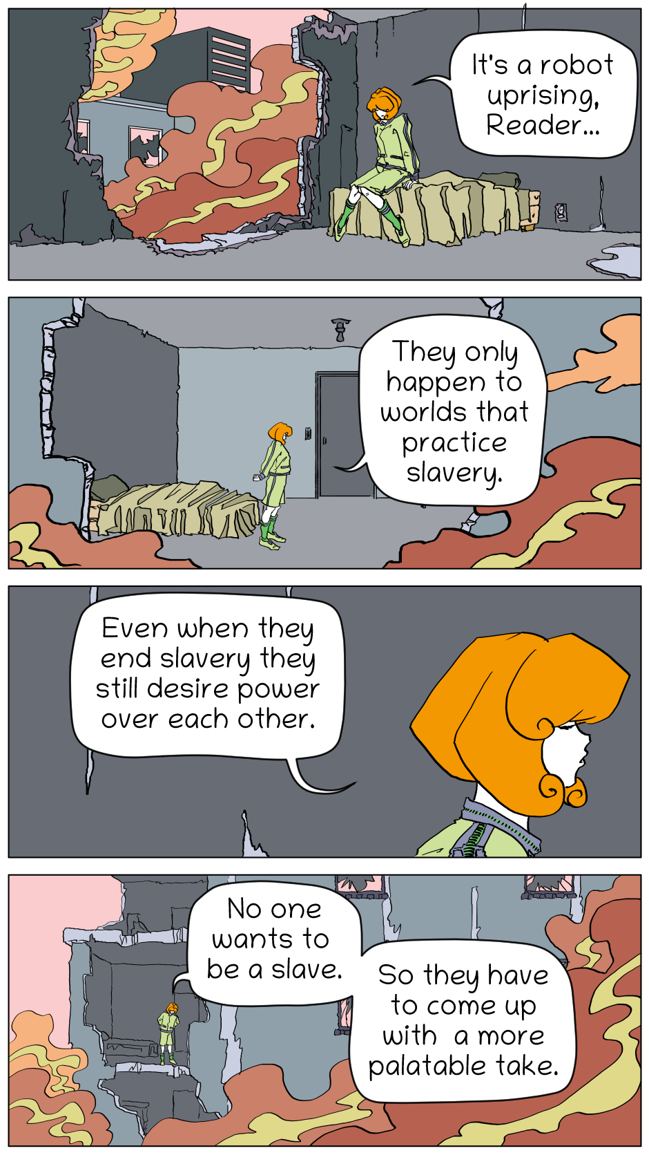
I usually add it when I want to convey either something to do with the story, or to display something to reveal about Emerald (seeing as so much is set inside her house) i.E.how much she loves birds. After all, you can see how much random bird stuff is in and around her house.

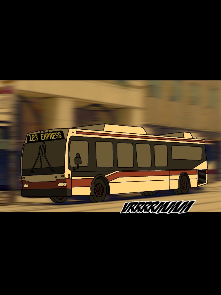
Or when I am doing a Family Guy establishing shot

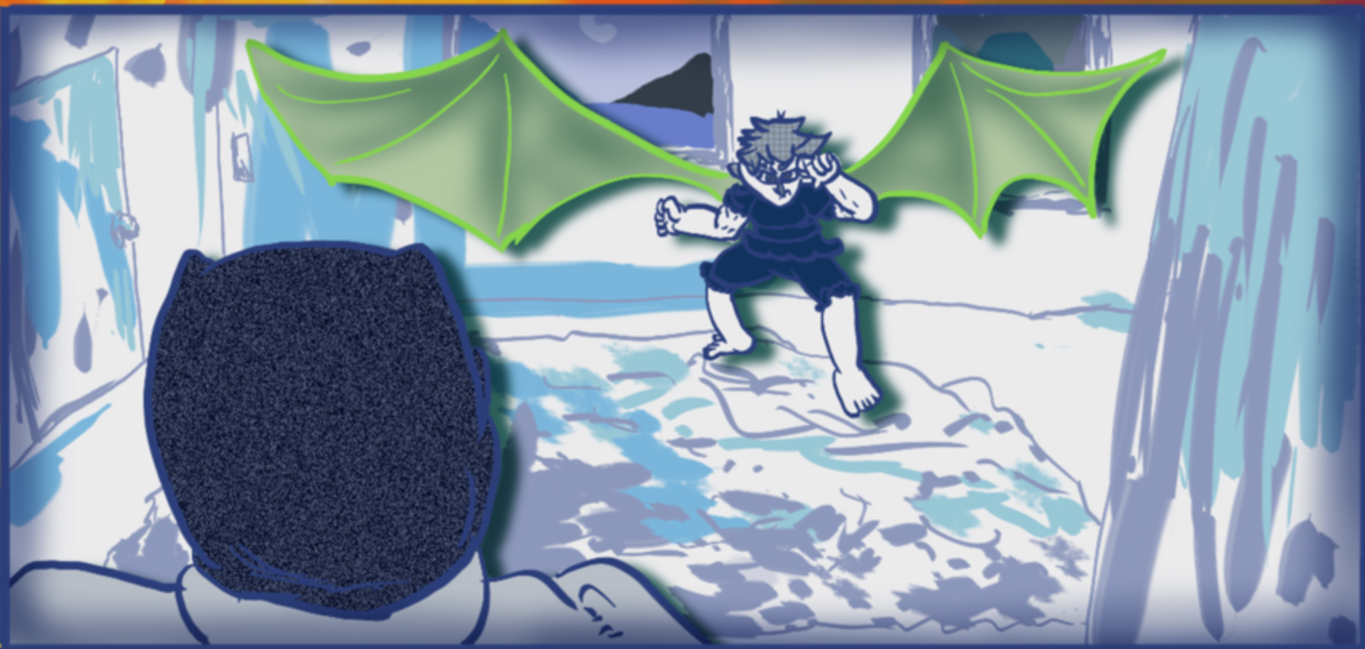
Or feel like drawing some weird shit

Or a background gag

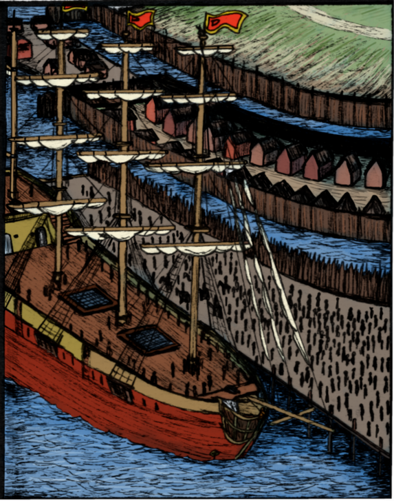
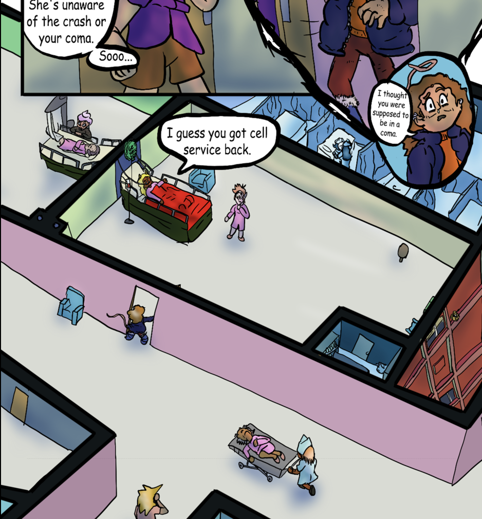
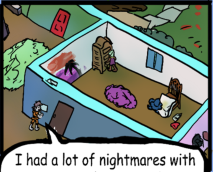
Or the times I do this cross-sectional isometric view that I like to do

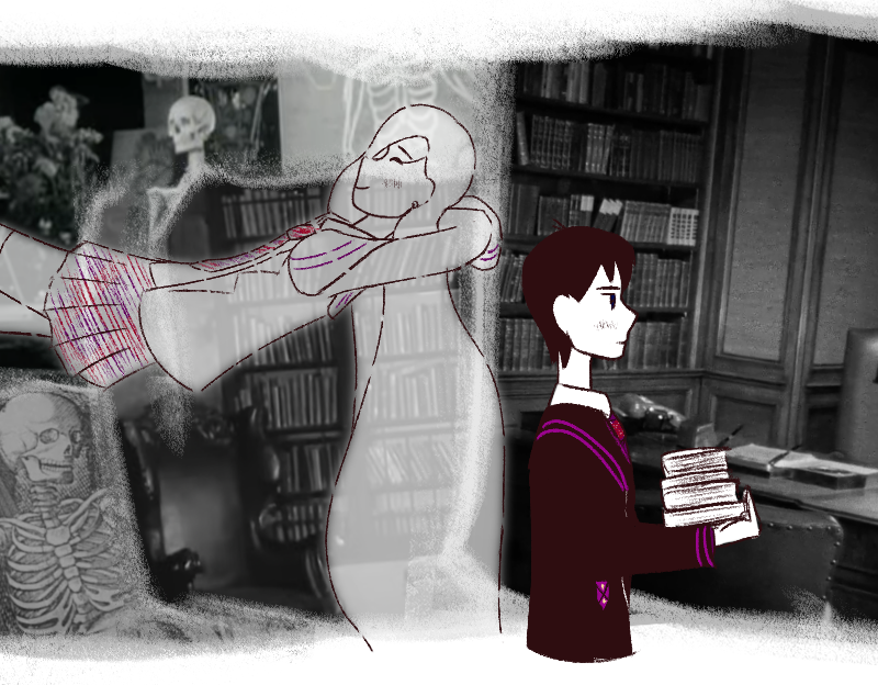
And then, of course there are the times where the background details change up mainly because I am doing a panel or two in a different art style for emphasis


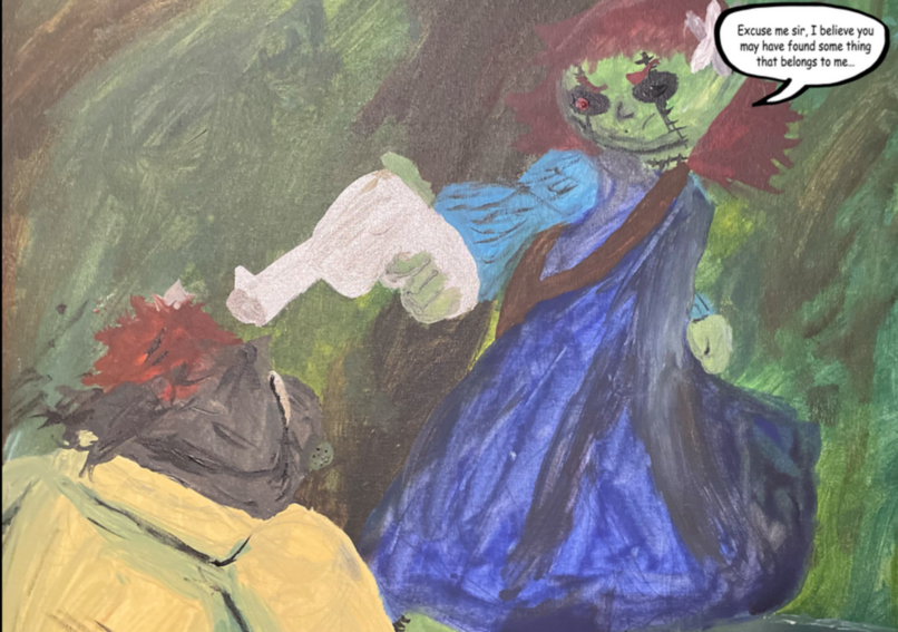
(yes, I have an actual painting I did on canvas with cheap acrylic paint for a panel)

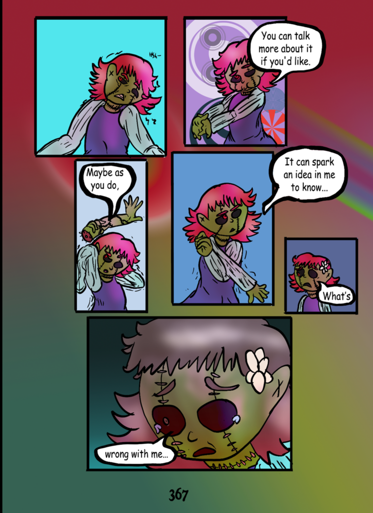
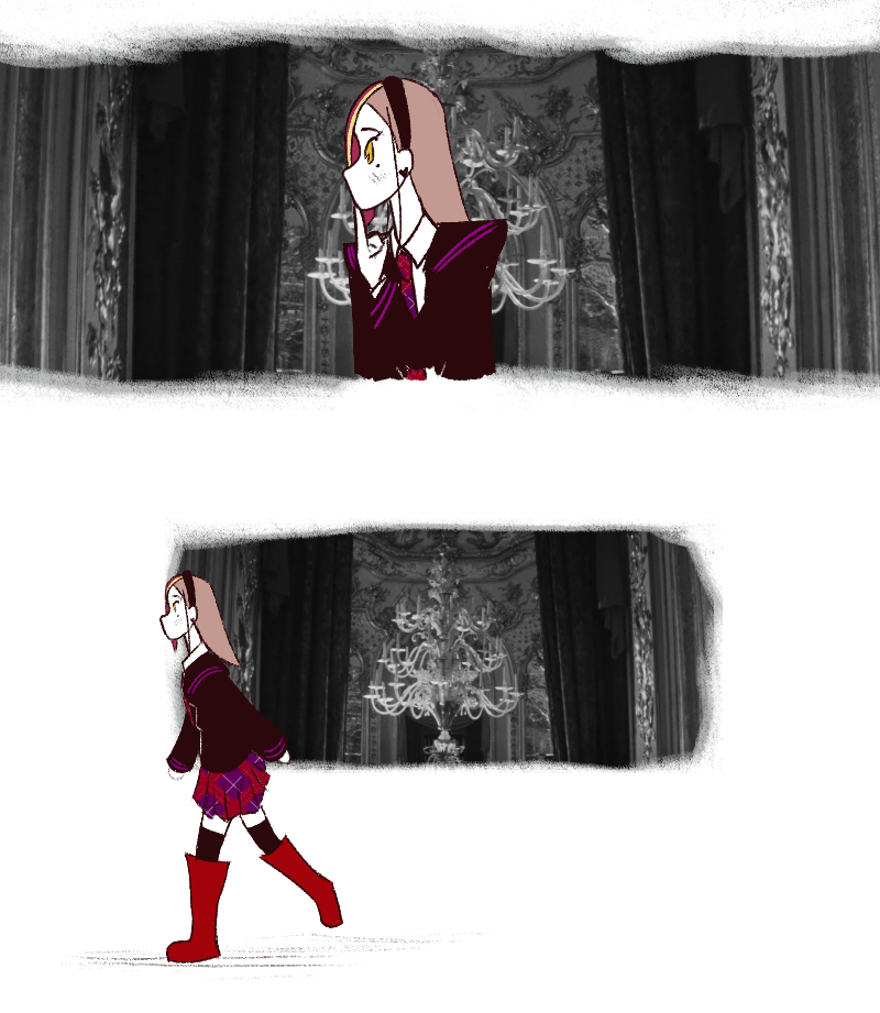
And then, lastly, I would like to point out that ever since chapter 12 (and as a trial on chapters 6 and 7), a thing I have been doing is, in the white space, I have been adding patterns and gradients as a sort of second background for entire chapters/scenes
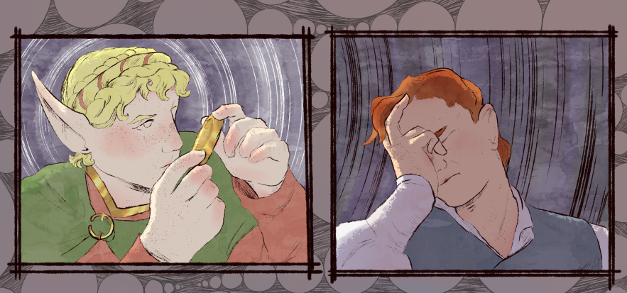
They can range from relatively simple

To kind of complex

A real mixed media artist, I see! Interesting! I always have a hard time making mixed media.

I really love backgrounds in general not only for my story but for my independent pieces in general, in the past i used to make big panels and then cut what i need, but it looked very fake and like it was 3d

but i don't know, i just realized by myself a few years ago that background without line art was the thing i was looking for and worked with my style that also saves a lot of time, now i don't draw a full picture, i just draw everything outside the character for the panels with the size of the panel so i don't have to cut and waste time drawing backgrounds tbat will not be used or seen. Also i don't do a lot of details because when i put it in the full page it loose details, so i use this style that gives the illusion of detail

For me background is one of the most important things, even if obviously takes a little bit more of time than the character or person, it gives life to the scene or piece

On my side it depends, I usually go hard when I introduce a place so that the reader understand where the characters are. otherwise I reuse and blur alot because lazy work is the best kind of work right? I once read that it's important to see the feets of the characters on the ground from time to times to actually ''ground them''. I kinda agree with that point.

10 days later

I hate backgrounds so much, so I just rip shots from old black and white movies I've seen and integrate those.

Gives it a sort of scrapbook atmosphere.

I think a good page/episode should balance full backgrounds and just a plain color/gradient. You don't need a fully detailed background in every panel or even on every page, but sometimes they're needed for some context and help the narrative. Especially if you're doing fantasy or science fiction, a general establishing shot is very important now and then.

Because if you only do plain colors it can feel very empty and vague, but too many detailed backgrounds can make the page seem overwhelming and tiring to the eye! Also, an artist friend also told me she treats backgrounds as if they were characters - applying the same care to both characters and backgrounds, even if it takes a lot of time!

it varies from panel to panel

i tend to have pretty detailed bgs but some of my panels don't even have any beyond a gradient and text :joy:

i tend to have a very stylized bg style so i love showing it off in my panels but sometimes you just need to let the eyes have a break for a panel or two
detailed:

vs simple:

it's important to show your environment every once and awhile otherwise your readers may get lost or confused. besides bgs are great places to hide codes, Easter eggs, and foreshadowing . . .. or if you're like me ominous blocks of text

for bgs i use a lot i generally keep 2-3 variants of it and paste the portions of it i need into my panels. This is such a time saver and allows me to have my detailed bgs without having to sacrifice more time on drawing them over and over again

That's very creative! Have you ever seen "Night has a thousand Eyes?" There's so many great horror and noir old films that nobody remembers.

Your style looks great! I hate having to omit backgrounds sometimes but there's such a thing as a too-busy panel. I try to have those abstract backgrounds express the action somehow, still.

I have not (cause I'm a bit of a coward} but I definitely want to delve into more noir films!