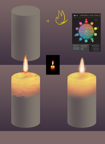
hopefully this isn't too much of a "Draw a circle, now draw the owl" type of explanation but I find it helps to think of what makes up the surface that the light is cast on (light which is, in this case, fire.) In the case of a candle, it's see through--so you aren't drawing so much light reflecting off of things, but drawing it go through things.
So I have a demo but it's like 2 steps so I'll try and explain with words. We start with a candle--and it's unlit (or in this case it's lit by ambient light, just so we can...see what we're working with.) I made it a brownish gray because while the candle is usually off-white, it's in a dim room so we can see the lighting effects. Then I make note of the color wheel. When you add light, you want to start at the color of your light source, and move towards the direction of the color you're drawing on, and as you do, you choose colors to gradate moving inwards--inside the color wheel. So you don't stay on the outside rung, you go into the grays in a smooth transition.
I think that no matter your art program, when you're painting light gradations, you want to do it in a blocking-in pass, where you define what colors go where--and then a pass where you take a smoothing brush and just smooth that sucker out. There's ways to simplify this, too, but even if you just do an overlay layer--the overlay layer won't be as convincing if it's one color, you move across the color wheel, especially with fire light.
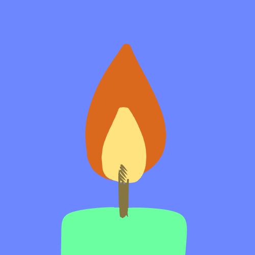
Thing is, because this is a see through object devoid of color really--what we are drawing is the heat of the light source itself. Firelight is red on the edges, yellow in the middle, and then goes white riiiiight where it's very hot. We're going to simulate this--and I'll show a real candle to show what's going on. Thing is, we're not going to draw just like the picture, because our lighting and our base color is different. Instead, we're going to use our color wheel and go from yellow to red to brown. I'm making it sound more complicated than it is--it really is just a gradient.
And I didn't use overlay for this, but if you're having a hard time finding the right color to use--overlay can help with that.
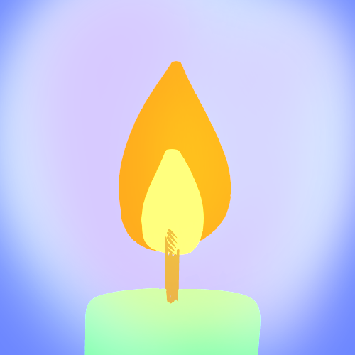
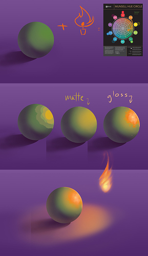
Now if you have light that actually reflects off of a surface that isn't transparent, it's easier to see how the color wheel plays into things. Matte surfaces won't go as far from their base color as glossy surfaces do (often, glossy surfaces like cars will have spots the same color as the light.)
Here I used green with an orange light, so you can see that we're going to go around the color wheel--not through it. (this is also a muncell color wheel so green and red aren't opposing each other anyway, but if you follow a standard color wheel it would be really easy to see this combo and think "Oh, I add these two together and it makes neutral gray?" It doesn't actually. It'll be more yellow.)
I probably made that orange too exaggerated but wtv, it still works although I doubt you'll ever have to draw fire affecting this shade. So hopefully that isn't too confusing. I also find it's helpful to set your brush at 50% opacity if you're trying to find the in-between color, but you do have to be careful not to rely on that, or you might skip some color-wheel steps