Another good tool for those not well versed in colour theory/ art in general:
http://paletton.com/#uid=1000u0kllllaFw0g0qFqFg0w0aF
And you can google "colour palettes". They're submitted by artists/ graphic and interior designers. Using a palette is a good idea because colour plays a huge psychological role - and you don't want to bore or blind viewers. 
Stay away from extremely faded colours (unless in a palette with more saturated colours to compliment it) or highly saturated neons, try to stick to more in the middle. Those I mentioned are more so for painting, by creating neutral, shadowed or highlighted areas in a subject. Design wise for flat colour graphics you want mid-tones generally.
I'm sure artists on Tapastic will be happy to critique your work to make sure it has no glaring issues.
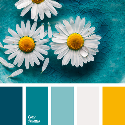
Some simple examples right off of google: