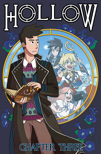
Oh, I love making covers, although I don't really do them for each chapter because of time. Something to consider is that because we're not going to print like a marvel or a DC cover, you want to make sure that it's readable and exciting while still small, and that the cover has to be like 30% title because that's how phones be, they are going to shrink everything so much. So I would take some time, and open the app, open up your genre, and see what the other covers look like--are there any trends that are getting kind of samey? Any styles that are disappearing? Anything that is REALLY standing out? Any colors that you're really drawn to?
And most importantly you want to see if you can predict what's inside the story/chapter from the cover, and what details made you think that. If you got a pair of people on the cover--everyone will be shipping that. If you got a big sword--they expect to see a lot of sword action. If it's dark colors that are very moody--they will expect a tragic tale, possibly with blood. If it's bright colors they might lean a little younger, especially if the art style is quite round and pleasing. so as the mood of your chapters change, you may want to change the types of colors you're using.
But honestly, for chapter covers and even just covers of comics in general--they don't really need to be exactly about what's in those chapters, they're just nicer illustrations that are there to invite you to turn the page and to make your reader ask questions. So I usually just stick to figures and I care way more about lighting and fun shapes than itty bitty bits that will disappear after rendering anyway.
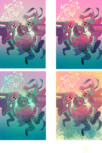
So for me I went through a couple different drafts for the cover of my story Alchemist Burn Outs, really weighing colors and how much they popped.
Before I landed here
(and PS, font is your best friend, I considered hand-painting title font and yo it wasn't even worth it, I just went with font. It's clear, it's legible, it's nice)
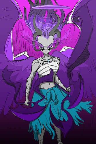
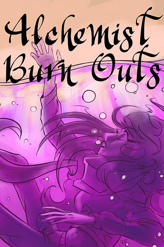
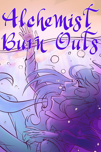
But while that was a cool cover, I felt like it didn't say "fantasy." It felt more slice of life, then it did...YA Modern fantasy, although the jumping figures are a fun staple of the comic covers. So I decided to go back to the drawing board with something darker, a little older (and I'm of the opinion that your cover art does not need to match whats in your comic, so I leaned into that)
And while it had a good flow, and it did draw interest, I still felt like it wasn't very clear when you zoom out. It invites questions to encourage clicks, and to make people care about my character--but youknow...this could be any genre so I didn't use it.
So I went with a portrait I was already making for my current cover. It's less saturated colors and a lot more realism, which I kind of wanted because iridescent lighting is really in right now in YA and fantasy illustration, so I was able to push that trend. It feels magical, paranormal, and kind of dangerous, which are things I have in my story, and it makes you ask questions about who this girl is, and hopefully those questions will lead to clicks. It just fit what my story is more (especially when I switched to doing this story as a novel, because the novel is quite a bit darker than the comic)
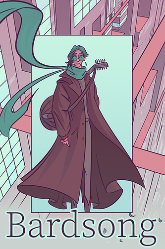
and then I'm gonna be completely honest with you, for Bardsong I just took two panels I liked from the story and stacked them directly on top of eachother.
Boom. This cover took 10 minutes. So it doesn't need to be a science or anything.