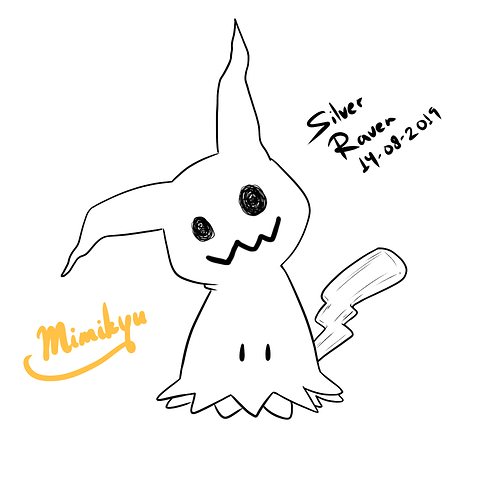
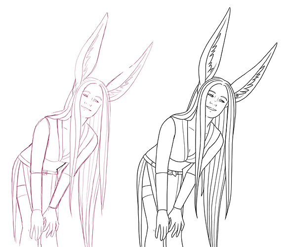
I'm... definitely not good at lineart lmao. I feel like it's one of the weak points of my art overall.
For years I had scratchy pencil lines in my art because I did not have a tablet and it was all I could do - I tried traditional inking but it just never felt or looked right. Only after getting a tablet I started experimenting with different types of lineart, and tbh I'm still/again in this stage now.
I had a complex about not being able to do clean lineart, and challenged myself to try it more. I guess... I got a bit better at it? But I aim to take it further in the thick direction.
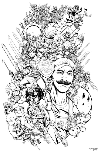
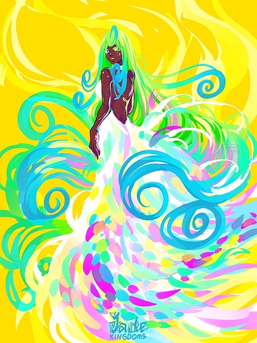
At the end of the day, chonky lines totally top thin lines for me. I'll never have that perfect thin detailed anime lineart look in my art, and I've accepted it. And I also tend to prefer sketchy lines over clean lines in art - I love artists whose messy sketchy line looks so energetic and purposeful (unlike my chicken scratching  ) , and it's a look I want to someday have in my art... Welp, examples upcoming, because I ain't showing my poor art for this
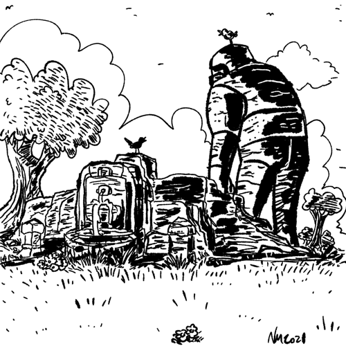
Hayashida Q

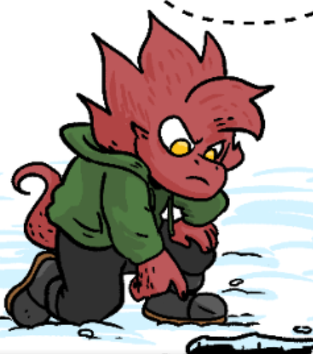
Hajime Ueda

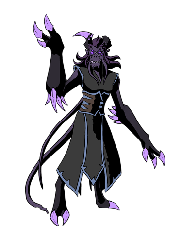
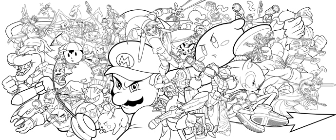
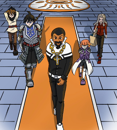
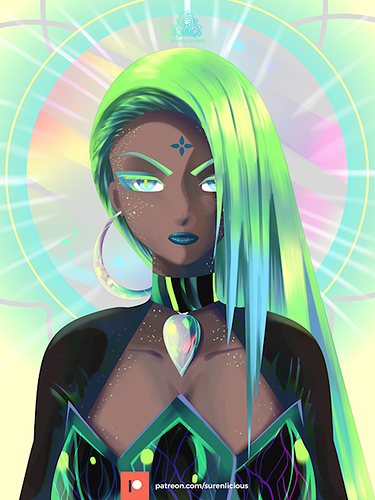
...but on the other hand, I also love a clean, but bold look that is also full of energy, has dynamic shapes and makes the whole picture. can never achieve it lmao
Dowman Sayman