1 / 37
Feb 2021
  • ๐™˜ ๐™ ๐™ช ๐™ฃ ๐™  ๐™ฎ
  • with a reasonable amount of ๐™˜ ๐™ ๐™ช ๐™ฃ ๐™ 
  • ๐š๐š‘๐š’๐š—
  • consistent volume or no volume
  • you do lineless work
  • opacity by pressure on
  • opacity by pressure off

88voters

Choose up to 2 options

In my case, I realized I'm incapable of doing clean lineart, so the less my lineart is noticed the better.
I feel like if I use a thick brush, the overall piece will look really messy. That's why I'm experimenting with thin brushes and with opacity by pressure.
I don't know. Which one do you prefer?
Chunky and bold


Or something more discrete?

  • created

    Feb '21
  • last reply

    Feb '21
  • 36

    replies

  • 2.5k

    views

  • 28

    users

  • 119

    likes

  • 4

    links

Aw, thanks! I guess some expression is lost the cleaner the lines.

I like thick lines and soft lines sometimes I have myself imitating another's way of lining because it sticks out
to me

I have to go with the same as OffBased the second one it just gives me an old vibe, tbh they all give out a certain vibe though


Lol I never heard the word Chunky used that way before :joy:

I'm all over the place. For my comic, I went with CHONKY and clean because it's easier to use the program fill tools to do flats (I hate flats. Using a fill bucket made them way less painful haha).

But for my regular art I... I dunno? I only have super thin brushes and pens so traditionally I do thin lines. Digitally my lines are actually pretty scratchy if I do it "naturally" so I've started to experiment with using different opacities to make it look less yucky.

I do traditional inking with sketch style for my manga-styled comic.
There are a lot of "broken" lines though I feel they looked better & more natural. (most lines are drawn just once, i rarely fix them)

When drawing natural stuff / backgrounds, i like to use certain thin marker, It gives uneven thickness/strokes, I use it to draw trees, grass, soil etc. But when drawing characters I use more solid fineliner pens.

i like adding some hatchings as they brings out the textures (can't rely all on screentones). Also cross-hatching: my preference is 20~30 degree angle, don't like 70ยฐ~90ยฐ. The strokes are short~medium, not long.

My style is wholly project based, so my last project had really thin line work, but it disappeared on phones so--now I'm going thicker to make up for that. Got a size 30 brush now and it's still maybe not big enough all the time.

I don't. I don't like my lineart. There, I said it. :sob:

Lol sorry to be dramatic, I'm going through one of those "everything I touch turns to shit" phases with my art right now.

I have no pen pressure because I do not use one to draw. My line art admittedly is the weakest part of my art, it looks rather stiff and calculated and has less personality. I do not do cross hatching, and in my recent art I have grown lazier (I haven't even drawn any proper art for a while)


Here are the results of my line art on other artist's sketch from switch around meme:


Here is from my own sketch.


Compare with finished one.

I really don't like my lineart. It's rough and zooming in on it reveals just how bad it looks. Usually my colouring helps to offset it a little bit.

That said, I like varying the thickness of my lines.

I've found, paradoxically, the less I care about the lineart, the better it looks.
My sketches always look so full of life because I'm not focusing on making the lines perfect or connected; I'm just trying to get my idea down. So I took advantage of that fact: while it takes a lot longer, sometimes to do lineart I just clean up the sketch!
here's a good comparison:


all I did was make sure all the lines connected and cleaned up any stray lines. I preserve the energy of the original sketch!
the only problem is that when it comes to messier sketches, I end up spending more time doing cleanup than it would take to just do the lineart properly. So I've started treating it like a second sketch pass- I don't worry too much about my lines again, just getting everything down. Then I go back and connect lines, clean up stray lines, and the like.

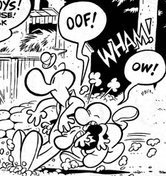
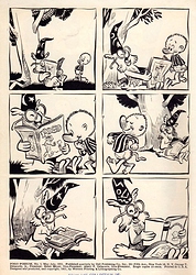
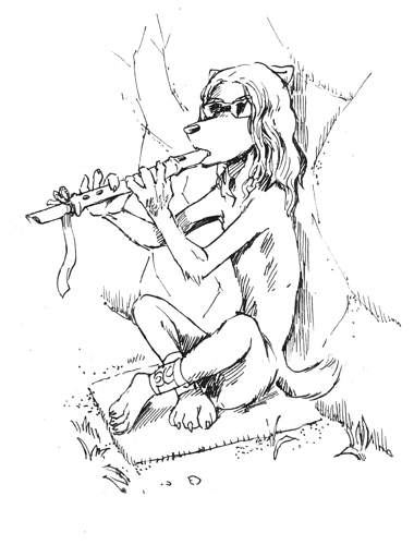
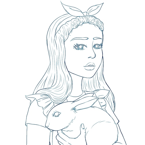
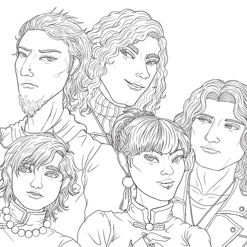
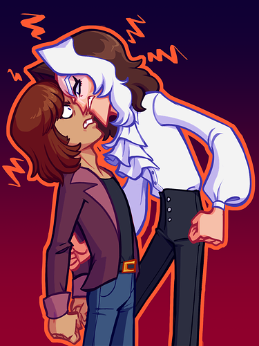
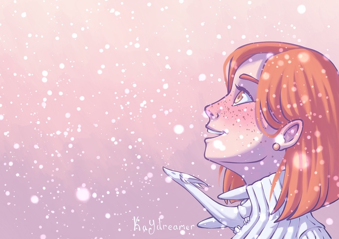
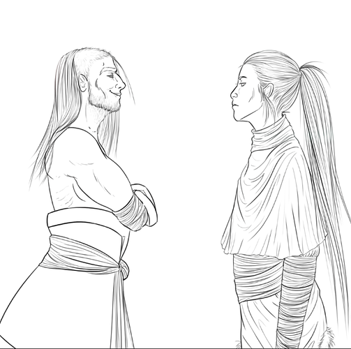
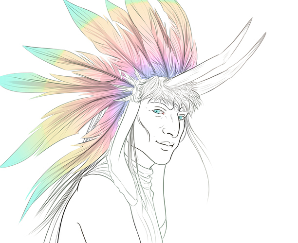
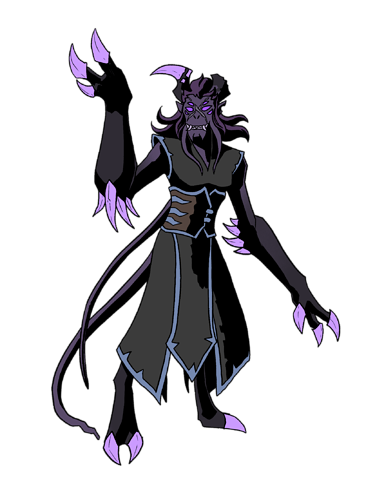
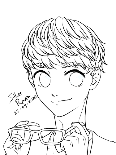
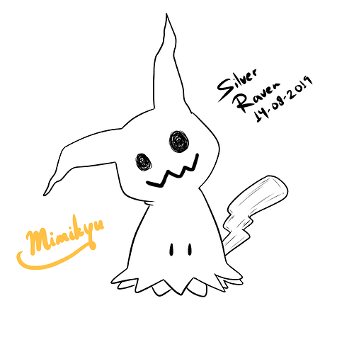
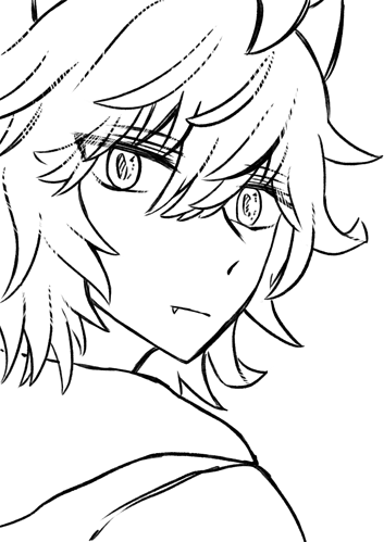
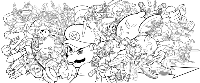
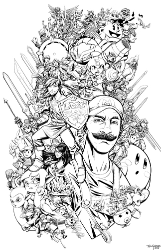
My lineart is kinda medium-thin, but with variation in line weight, tapered points, and a smooth flow. I use long sweeps of the pen as much as possible. I take it a little chunkier on occasion, for cuter, simpler illustrations.

It's quite funny, for many years I hated doing lineart. It's always been my least favourite part of my illustration process. I've tried a number of times to ditch it entirely, or at least make it messy enough to blend more organically with a looser illustrative painting style, but what I want and what I'm good at are two very different things. :sweat_02: And, as it turns out, over my many years of making art, I've somehow magically become really good at clean lineart, despite never intending for that to happen. At all.

It's kinda ridiculous to have the part of your style you like the least be one of the parts which is complimented the most, and to know deep down that it is actually one of your bigger artistic strengths, but still wish it looked totally different.

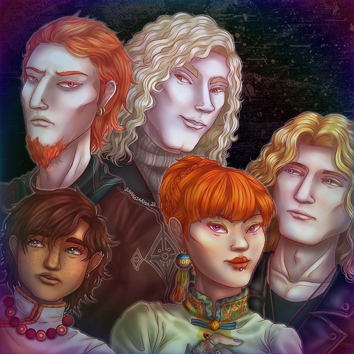
I'm finally starting to embrace it now. Especially as it's clicked with me that the definition and clarity of my lineart is ideal for the style of TV-animation-esque comics I want to make. I'm really loving the way it looks in my comic, and it's a very fashionable style for graphic novels at the moment, so while 'fashionable' was never my intention - hooray for happy accidents! :tapa_pop:

I like my lineart clean, but I have to admit that I don't pay much attention to its pressure: it's usually soft and not colored and it goes with what I feel it conveys at that specific part of the drawing.
This is the part of the comic process I enjoy the most though, because I can add and visualize the details of the compositions :smiley:


Most of the time I have an issue with lineart where I will be super obsessed to make them as clean as possible to the pixels. It bothered me so much I kind of hate myself for it.

When I convinced myself that what Iโ€™m doing is โ€˜clean sketchโ€™ and not lineart, my brain can ignore it a bit but itโ€™s still mostly finished lineart haha. Sometimes I do a thick lines like the western cartoon (?) style but not that often now I guess.

With the picture below, in my heart I still considered it clean sketch. It is undoubtedly lineart at this point but my brain donโ€™t want to accept it. ;v;

I used to obsess over keeping my lines ultra clean, with almost no line variation at all, but it was SO SLOW. Each line had to be perfect, each mistake would stick out like a sore thumb. I had to painfully define every detail, there was zero form to it, it wrung all the energy from the original sketch out of the artwork. It was pretty boring to look at honestly. Since then I've adopted a much much looser style, with more line variation, hatching, and adding form and shadows to the inks. It's so much faster, and looks way better. These were done ten years apart, and you can really see the difference!

2008

2018

I fall into the "medium chunk" category I think :smiley: I like using relatively thick lines, but I don't know if I'm willing to take on the burden of full CHONK.

Sometimes (especially when working on smaller images) I do like to go pretty thick like this:

but I feel like sometimes when I do a larger piece I kinda tone it down by accident

Either way I can't do thin-thin. I tried that for many years, and it stunted my artistic growth xD I've also never trying partial opacity but that may be something I try once or twice just to see how it goes :slight_smile: