It's all about finesse.
A few certain manga's chapter 1 look... very... rough compared to some of their more final work. Saiyuki in particular is known for its Tankoban releases to be sometimes just sketches. And the scene is finalized and arted properly in the manga volume you purchase later. There's one panel from the last few years where a table line goes right through Goku's arm. The audience accepts it because they're just used to that formula from that artist - the tankobans sometimes will be messy and sketchy. By comparison what the US gets as translations in say, Shounen Jump, are not generally tankoban releases, but releases from the manga volumes done later / with better toning shading.
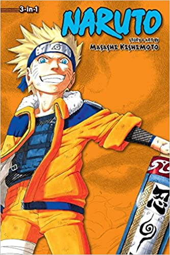
If anything, what medium you chose is dependant on your time. Do you have the time to fully color something nicely? No? You're likely doing it digitally. Do you have time to put down tones from actual tone paper? No? You're doing it digitally. Or you're doing something else as a "cheat method". Keep in mind that the creators of Naruto, One Piece, Dragon Ball, and YuGiOh all have had very different processes for their works, and some are very different from, say, Marvel.
YuGiOh's creator, Kazuki Takahashi, has gone on record saying that in the early days he used basically a giant printer/copier and just used it's brightness contrast settings to erase his sketch lines as he went and went through multiple pieces of paper for one page. All before he eventually switched to digitally working on the manga.
The question is are you going for a certain kind of color aesthetic?
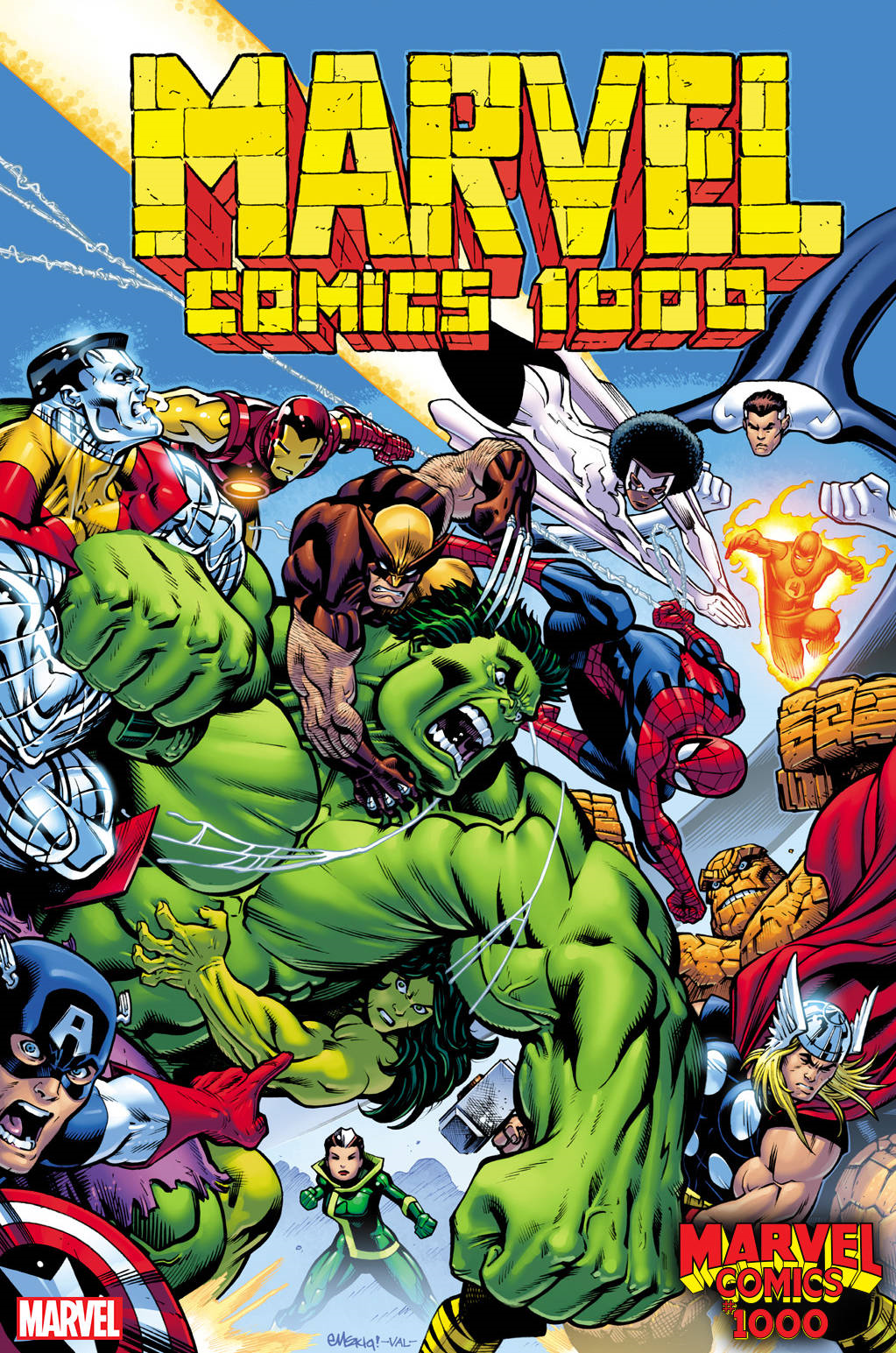
Marvel comics by in large are "painted" to look more bright and flat.
Compare that to another that was done with copics/alcohol markers/traditional media.

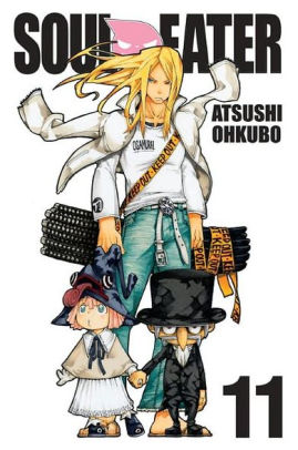
None of the traditional manga covers are not as effective as the Marvel's example. They're just different. (that soul eater 11 could actually be digital, harder to tell when it's so small, and just made to look more pastel)