Hello! For future reference, you can upload images like so.
After uploading an image, a line of text will appear as it does in the example below. This line of text represents where the image will appear in the post among the actual text.
Thank you very much! I don't know how I missed that! For some reason I didn't see the top bar But thanks to you I've fixed it now! I appreciate it!
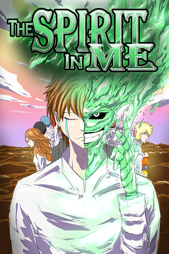
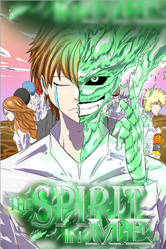
Happy to help! Your cover looks great, by the way! Only thing I would suggest is making the logo pop out a bit more since it blends in with the green flames of your central character.
Still, it's very nice and eye-catching!
Thank you very much! I'll try the dark version I made for the logo and see if that works out better! I appreciate the kind words and the advice!
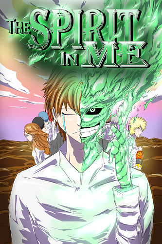
Darken version was added to the main thread, hope you like it better, I think I do!
It's a step in the right direction, but I would actually recommend a simple stroke outline or a drop shadow. The foggy backing can work in some situations, but in your case, I feel like it actually covers up a bit too much of your lovely art and it still ends up blending the logo and flames together since it's all green. Here's a really rough edit just as an example of what you could do instead.
Outline:
Drop Shadow:
I feel like either of these can work without the green cloud.
Thank you very much for the kind tip! I'm struggling to decide what I like better, with the drop shadow or not. That's a great advice, I'll keep thinking about it! Thanks!
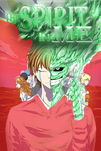
You have a lot of negative space which you could crop out.
I also think it would look better if the title was placed at the bottom (my quick mock up, extend the art up instead of blurring it)
Your art needs some heavy shadows to give it some depth of field and show the others are in the background. They are all colored to be on the same focal plane.
Thank you I'll try to test zooming and putting it in the bottom to see if I like it better.
Thank you! I've had someone else say the same thing about it. I'll test it out with heavier shadows so it will pop out more. Thanks
Thanks my friend! I've tried to add the drop shadow, is it easier to read now in your opinion?
Definitely a lot better! Good job!
Thank you very much for your helpful advice and that you took the time to show me how to do it better, it definitely helped Really appreciate it!
I'm so sorry to say this but the cloth looks odd, and can you make the clothes little bit burn where the flame is. i think that would make senses. it's ok to not burn the clothes but i do recommend fixing the clothes
And again so so so sorry but the tears to make his eyes looks like he's struggling
I think your cover looks AMAZING! Very eye catching, and tour choice of colors was really good.
That's the intent my friend Thanks for your opinion!
Thank you very much! I appreciate your kind words!
This topic was automatically closed 30 days after the last reply. New replies are no longer allowed.