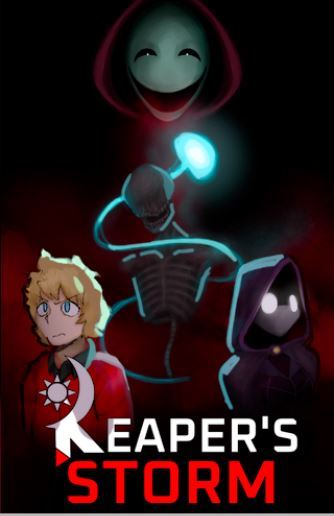
This is some great improvement! It is as people have pointed out that the blonde person looks like they don't fit in with the lighting. I would also exaggerate the light a little bit more, because the cover is going to be thumbnail size when people see it and so everything needs to be easily readable.
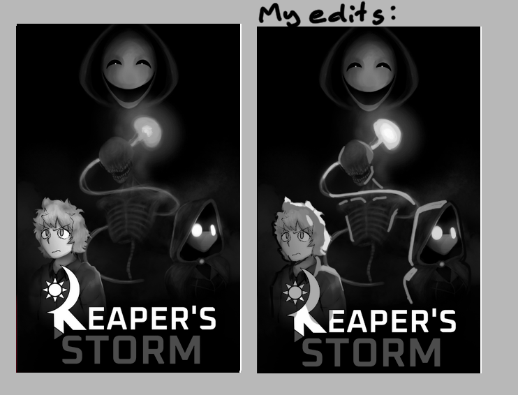
I made this really quick to show what I mean. I put the blond person in some purple shadow and made the blue light brighter. I also gave the person in the purple hood sliiightly less white eyes. I know they glow but I think it helps the overall composition and focal areas.
Also a comparison in grayscale to show how the values were more exaggerated:
But I think your new version is already way better than the first one! I can see way easier what's going on and I get more of an idea of what the story is about! Good job!


