Ok, so this review might be a bit biased, cause i am 1 of your subs and really enjoy your series so far, but i try to go at it as objective as possible...
Characters: I really like your Characters and their design so far. On the first few pages i feel like there were some inconsistency's in Cheshire proportions, but you got better as your series continued, so no problem there. Both Jim and Cheshire look interesting, are easy to recognize and seem to have interesting and unique personalities so far. Your Background cast is cool too, so no problems there on my end.
Plot: I like, that you start with this small actionsequence. Kicks the reader right into action. Leaves also a lot of questions for a reader to stay interested. You start out with lots of text thou... it might be subjective, but i generally like it more when comics start with less dialogue, so the reader can get into the comic via images not via words... this gets much, much better as you go on (especially when we get introduced to Jim and his Roommate you have some amazing panels) so i think it was a wasted opportunity to show your great skill as a writer.
Your humor and how casually you bring it into your scenes is a big + point for me. It never feels forced , isn't overused, goes well with your panelstructure and story and has a unique and refreshing style to it.
Art: Im always very carefull when it comes to tipps on artstyles that are so completely different than mine... but i have the feeling that you have the most room to improve in this category.
Its difficult to tell you how exactly you can improve your art, without influencing your current style. Your lineart itself looks good and interesting, colors are decent (even thou i think you can fine tune them a bit more), my problem is that the art feels... unimpactfull in a lot of cases.
What i think your art is lacking is 'interesting detail', they lack this kind of 'unique' vibe... which is sad, because your characters have this 'vibe' to me. I'd say that they could come to life much more if they were set in a universe which looks as exiting as they look. I also don't think it would destroy your current style to add this kind of detail here and there...
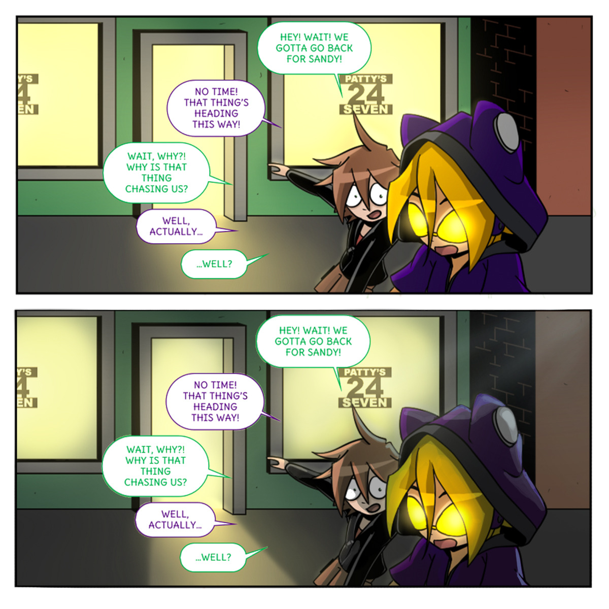
I'll take Page 14 as an example cause i feel this is the page where you have both... a really nice and a quiet boring background.
In the first panel, we see the shop for the first time and (sorry to say that, but)it looks insanely plain. Like any kind of 24h shop could look... now you might say that this is intentional, because those shops are supposed to look similar, but don't forget that your writing a fictional story here and should give your readers something to look at. Now we go inside the shop and have sandy sitting in front of an really interesting shelf, full of quirky stuff, has a box of snacks on his desk and reads a paper. This shot looks so much more interesting and tells me much, much more about that little 24h shop than 20 of those first shots could. And it still goes well with your style!
I hope you get what i'm trying to say here... try to fill your world with interesting stuff and locations. Put more thoughts in your backgrounds. Let your city look like a place where people actually would want to live in...
Hope you don't let that last part get to you to much. Like i said, i really love your series and i think it is amazing, but since you asked, i tried to give some tipps how to improve even further.
I'm really looking forward to Chapter 2 and wish the best for you and your series!
littleBobler 
P.S. i didn't had the strenghts left to reread what i wrote there, cause i am writing for about an hour now  If there is something confusing, or i wrote something wrong im sorry