created
 Jan '23
last reply
 Feb '23
- 16
replies
- 3.8k
views
- 11
users
- 11
likes
- 4
links
I am a 100% self taught artist, so take what resonates with you and toss out what doesn't lol
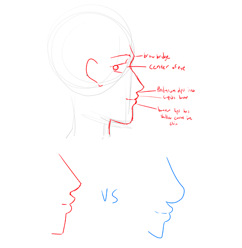
Anyways, here's a kinda quick tutorial sketch for side profiles, if you can't read my handwriting it says from top to bottom:
-Brow Bridge(eyebrows go here)
-Center of eye(for "proportional" faces, the eye is usually centered just above the bridge)
-Philtrum dips into cupid's bow(philtrum is that weird ditch under your nose, you can kinda feel it with your finger how it kinda naturally slides into the cupids bow aka the top of your lip)
-Bottom lip has shallow curve that dips into the chin(compared to the top lip, the bottom lip has a softer "angle" to it)
You can usually play around with nose shape and lip shape from the profile view, it's probably one of my favorite angles to draw(when I have a good drawing day lol)
I made a very very rough comparison of what I usually do for side profiles and what you kinda have so far with yours? I think right now the bottom of the nose curves back up too much so that the phlitrum doesn't naturally slide into that cupids bow which may be why you're having some trouble there? I dunno! So far the proportions looks really good, I think it's just a matter of figuring out which angles and where angles and why angles
Anyways, I hoped this helped, and like I said if it doesn't make sense, pretend I said nothing here lol
This is general guide since every face is different. I sketched this real quick as an example. It in more exaggerated the proportions so think of this more as an example rather than a guide depending on whot you're going for.
The Lips
So there are a few things to keep in mind when it comes to drawing lips in profile: The position of the jaw and the shape of the lips. Generally, most people's upper jaw is set on top and slightly in front of their lower jaw and because of that, the upper lip protrudes out a little more than the lower lip. Because of the cupid's bow of the upper lip, in profile, the upper lip may have a sharper appearance. The lower lip is more inset and sloped.
Overview
Almost always, the nose will protrude out further than the lips and brow ridge. The chin, while still prominent, won't protrude out further than the lips. Again this is very generally, this doesn't account for less conventional face structures. Great explanation @delladz
I'm not the best but here are some things that help me
As many people have said this is different for everyone, for example black and asian people tend to have less of nose bridge, white people tend to have boxy-er foreheads and bigger chins, Indegenous americans tend to have browlines that extend farther over the eyes, so you have a lot of lee-way with this sort of thing.
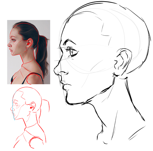
Your best bet is to trace over and study real life references to see where these features typically tend to intrude/extrude out.
Different faces will look different in a side view, so I'd say find one that looks like what you're trying to achieve. If you want more of a cartoon style, look at artists works who do that style, and notice how they've stylised a side profile.
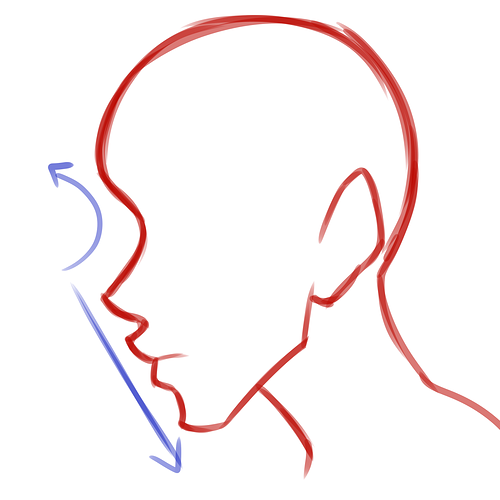
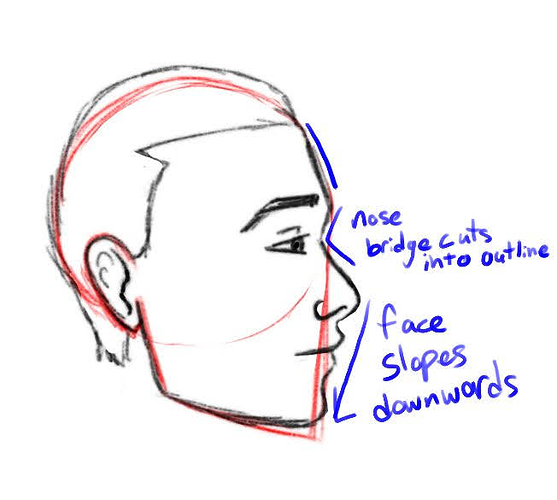
But main things I pay attention to is that there tends to be a curve at the nose bridge around the eye area, an extrusion where the eyebrow is to the forehead, and that lips tend to slope downwards from the nose. Also- don't forget the back of the head! I used to and see a lot of people who tend to put the ear too far back which can make things look off.
Here's a tutorial with video link in description for drawing a profile by Bobby Chiu from awhile ago. In short, use "arrows" to roughly shape eyes, nose and mouth.
https://www.deviantart.com/team/art/Draw-a-Superhero-Profile-with-Bobby-Chiu-90896184524
This is how I think about drawing lips. It´s basically 6 parts, which makes it easier to draw in
perspective instead of one long line. I imagine 2 squished balloons in the lower lip for the shape.
The problem with heads, lips and faces is that you have to be able to draw in perspective to get it to
look really good and that means that you have to learn basic perspective and one drawing method to
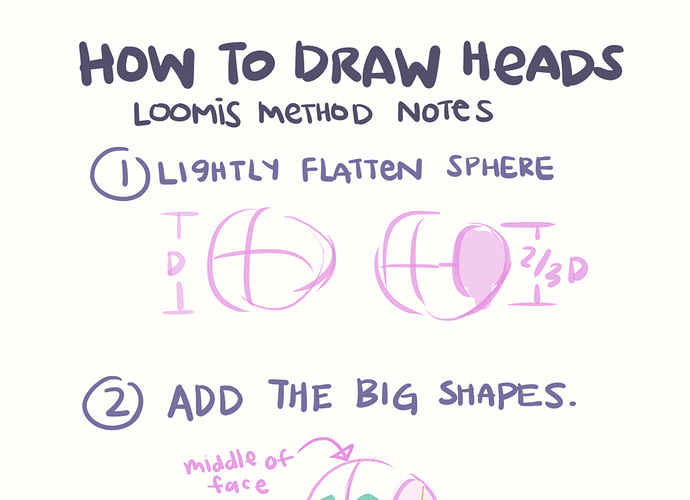
draw the head in perspective. The Loomis method is really popular and recommended by many people.
The Loomis method has it´s limits because it just helps you to draw the very basic head correctly but doesn´t
help much with the features of the face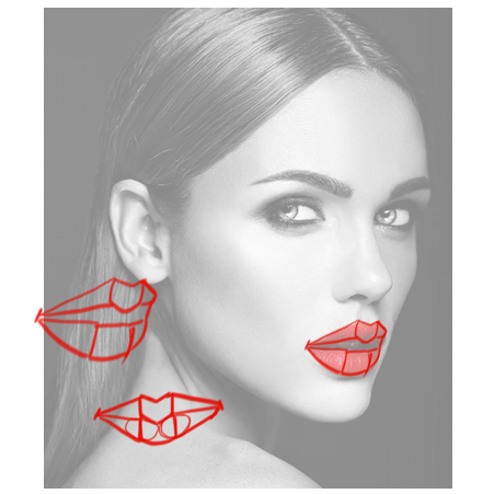
Ah, I haunt deviantart sometimes . . . ?
But related to the thread, this tutorial also might help too for drawing heads:
So putting the two tutorials together for this picture might look like this.
Draw the head via the Loomis method, Draw arrows for nose and mouth.
Use the mouth line from Loomis to break up the arrow, use a middle for sideways "w" which become lips. You can also just omit drawing lips.
Suggested Topics
| Topic | Category | Replies | Views | Activity |
|---|---|---|---|---|
| Are you supposed to start over when making the second draft? | Answered | 7 | 807 | Dec '23 |
| How to tag for tapas contest? | Answered | 1 | 530 | Dec '23 |
| (filler title text) | Answered | 51 | 1.8k | Feb 3 |
| How do you make coloring with markers look polished and professional? | Answered | 19 | 1.5k | Dec '23 |
| I need help with something | Answered | 4 | 202 | Aug 11 |


