I like girl's profile, and it's a right direction that you did it in one basic color. I think you want something similar to SailorMoon logo.
Something like this:
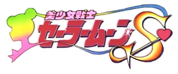
Let's compare your logo and Sailor Moon logo.
Sailor Moon logo has an "action line". Your logo is a bit scattered in different directions. First you look at SailorMoon's profile, then your eyes move with her hair and it leads you to the title of the show. When you look at your logo, you first see the girl's profile, then you see the "imagiCA", starting with "CA", then you have to switch to the beginning of the word, then your eyes slide down, but following that "magic line", and this line is actually a reversed hair line. Solution: write a title in one line, remove distracting details or simplify the image!
Glowing effects and sparkles are always good for Magical girl type shows, so I like it.
Background. You don't need any! Remove that peach pink sprayed color!
Also the font is too similar to Indiana Jones logo. You didn't do it on purpose, but it's actually too similar. Colors, volume on letters, direction, even font though it's different, has some "archeologist's adventures" vibe. If you use another color scheme the similarity will disappear, at least that's what I think.

Summary: I like your logo, it represents your comic really well, it's just overworked and overdesigned. I would probably would put and accent on her eye pupil because it's important to your story.