Okay first, good on you for releasing your comic. It takes a lot of work and courage to do so so congratulations.
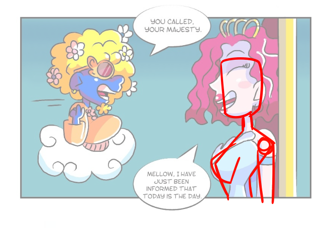
Let's start with the art. So, while I appreciate the whimsy and the variation in the character design, I feel as though you could focus on the construction of the characters, especially the more human characters. I don't mean that the charcters have to be more realistic, I mean that you should be more mindful of the shapes the character are made of. Let's take the queen and a guard for example:
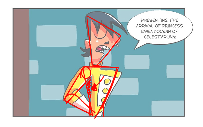
So I red-lined guard so you can see the issues I have with it. The shapes are fine(the two triangles), the problem comes from the placement. It looks like his body is too far forward and it's very awkward to look at. Be careful when your drawing your character so that the still look like people even when their made of shapes.
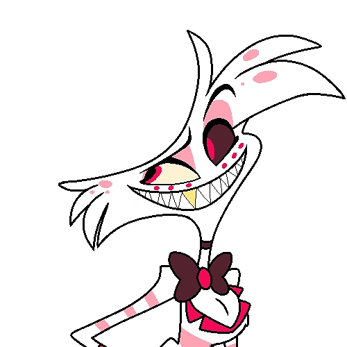
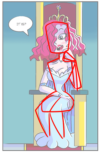
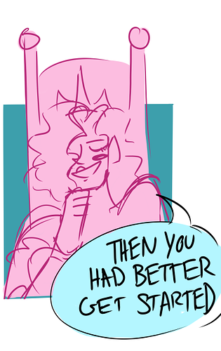
My biggest issue with the design of the queen is a lack of balance. It's perfectly fine if you have a character that has a thin waist, just look at this character:
The thing about them is that the whole design is thin and spindly, with anywhere feeling too heavy. The queen is very top heavy an this includes her bust and her head. It looks like she could topple over at any minute. You can make her waist a little bigger and still get the look your going for. Aloe Vera is a good example of a balanced character that has a similar body shape.
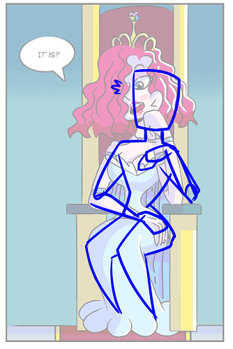
So the red-line follows the original image and the blue line is my adjustment. Your poses tend to be stiff and could be better with more construction an anatomical understanding. You don't have to learn all the in and outs of the human body, but references and more sketching before lineart can help you get out eh kinks in your art.
The last issue I had is with your colors, I struggle with this too. You have a lot of distracting and saturation colors in each panel. These colors tend to clash and are not pleasing to the eye. In the future, consider limiting the color palettes of your panels to 8-10 per location and 5-7 colors per character and that's being generous. Pinks and blues are your main colors. That's a beautiful combination and it can make the comic very atmospheric. Characters like Mellow take away from that, and while I'm say to change his design or colors, consider toning down the intensity.
You can also work on perspective and making characters feel like they are part the space their in, but I really like the way you shade, I prefer cell shading and your choice in color is very interesting.
Okay so I read the whole thing so far, and I don't have much to say in terms of criticism. I like the banter between Gavin and Vera. For me at least it's going to take a bit more for me to like Gwen. She's too whiny for me right now. It's understandable why she is the way she is though. It's and interesting premise: a fish out of water story with the potential for many hi-jinks, (can you tell I'm more of an artist than a writer?) I wish you luck in the future and hope that you see this project to completion. You have a good starting point and it can only get better from here