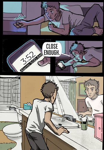
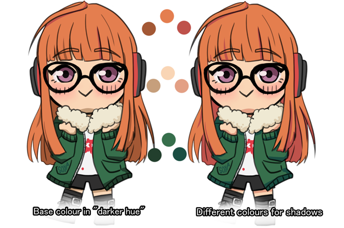
I think it would be good for you to vary your shadow colours a bit more in "well lit" scenes. In the last panel all the shadows seem to be the base colour in a darker hue which is why it may look "Boring" to you.
In your first two panels the shadows are more purple and it fits really well with the blue light of the scene. But in the last panel everything ends up looking a bit gry and "muddy" because you don't vary the shadow colours enough.
For example, skin has a lot of different hues, you could shade his skin with a more orange or purple tone etc. playing around with it and seeing what looks good can definitely help I think.
It doesn't mean you have to do that for every single colour you shade, but every here and there can help make the colours pop! I'd suggest looking into complimentary colours and colour theory to learn a bit more in depth. 
I tried changing the colours on an older drawing I have to give you an idea of what I mean. Hope it makes sense!