I appreciate the Tapas staff listening to the users' suggestions and bringing back infinite scroll, but to be honest I find the new website quite ugly! And I am surprised no one seems to be talking about it!
I was looking through the website with a friend and there are just so many things that bother us both (though I agree with everything here, a lot of these comments are things she thought of, not me, btw).
Are you guys seeing this? Please let me know if I am being crazy or if you agree.
There are so many menus. Top menu, bottom menu, right menu. It makes the screen look so cramped.
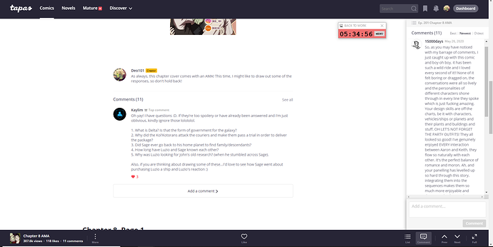
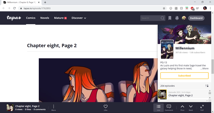
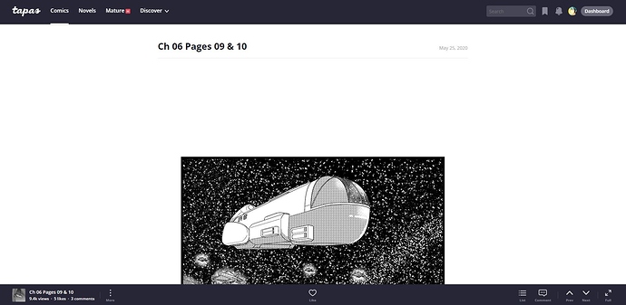
And, though I do think I might be able to get used to it, reading comments on the right like that is quite uncomfortable! Especially long ones like in this screenshot.
Also, when Deo first sent me that screenshot, I thought the right bar was a temporary pop up.
It's not. It's just always there (unless you click fullscreen, which hides all your tabs. And you can't fullscreen while having a window not take up your entire screen).
When I move my cursor too far to the right, it shifts the screen slightly. The screen keeps jumping as I browse. Including the comic page I am reading. It's so janky!
And then there's just all the little visual things. There are so many buttons that do the same thing, making the screen look even more cluttered.
These two buttons do the same thing.
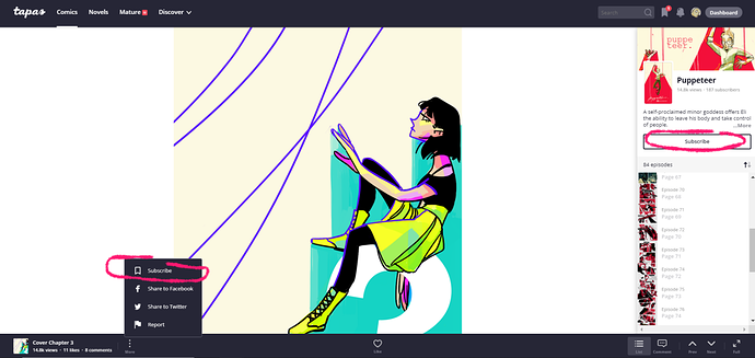
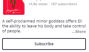
Two subscribe buttons.
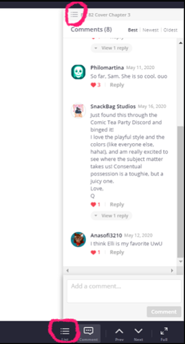
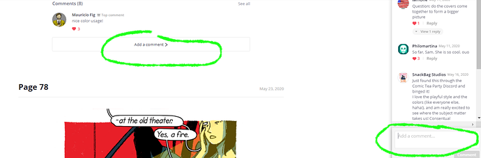
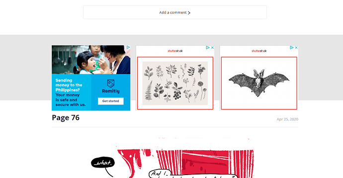
Two "add a comment" buttons. Also, "Add a comment" and "See all" do the same thing.
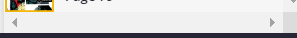
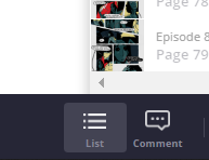
What does this bar do?
Okay, here's something different.
On smaller screens, the menu bar hides the pages. Guys this is an actual problem.
Some more visual things.
What do you think the little "More..." does?
Was it bring up a popup of the comic home page?? Because that is not what I was expecting.

Also, this button? Broken. Even if it wasn't, why is there a "learn more" nestled inside a "more" ??
The heart is not centered on the comic page.
These two buttons pertain to the right menu but are not on the right menu. Nor do they line up with it.
(Even as I am taking screenshots the page keeps shifting left and right as I move my mouse aggg)
So much blank spaaacee.
Another big thing! Lots of broken stuff!

This page comes up a lot!! Like, in every page of my comic on the mobile site!
Also seems to come up occassionally when I hit the back button.
There is no way to get to this page like this anymore except by typing in the url. Small thing, but I wish this page was still where you started reading a comic, instead of on the first page.
Of course, I have no website design experience. This is just how I feel as your average reader/creator. If you think I'm wrong, feel free to tell me I'm wrong. But I think it is possible that there are other people who feel the same way I do, or who have seen things I've missed. If so, please post those below too.
The visual nitpicks may be a matter of personal opinion, but I at the very least think the comic getting cut off on small screens, the broken button, the jumpy screen because of the scroll bar, and the broken pages are worth tapas taking a look at.