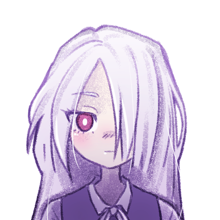
I dig your comic a lot so far! I think the art aesthetic is really nice, and the genre is one that I've been enjoying a lot the last few years. Dropped a sub  A few minor pieces of critique that I would give (beyond what's been said by others) are the following:
1.) This one's really minor, but the word "preliminary" is consistently misspelled as "prelimenary". Unless this was intentional (it didn't seem so), I would consider revising that when you get a free moment. Otherwise the spelling throughout seemed solid though!
2.) This is definitely a personal preference, but I would consider finding a slightly different approach to how you write sound effects. They seem to mostly be done with a semi-transparent textured brush. Most of the time when they're smaller or only have a single pass, they look fine (like this, for example):
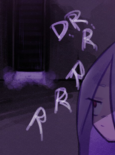
There's a bit of an overlap at the mid-point of the P, but it's small and neat enough not to stand out. Some of these larger, more dramatic sounds that have you going over certain letters several times look a bit messy though. For example, these one stood out strongly (not in a positive way) to me as I read through Ep 2:
They're a tad messy, which the brush texture doesn't help with, and the brighter white areas where some letters have multiple brush passes inconsistently overlapping, like the "R"s especially, look a bit off. The final R in the 2nd picture is perhaps the most notable culprit that caught my eye the most, but then I looked up at the rest of the letters and was like "ah, they're all kinda like that" xD
My recommendation would be to use a full opacity brush and then turn the layer opacity down after the fact if you need the letters to have that semi-transparent look to them. In cases like DRRRRR where you want them to have a rumbling look to them, maybe applying a blur effect, or 2nd less opaque letter underneath would be a good technique. That way the main letters maintain full readability, but you can still do different things with the effects~ I'm not at my tablet at the moment so I'll try to convey what I mean below with a quick mouse drawing 
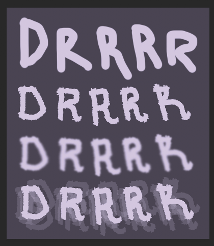
Ignoring that I can't write well with a mouse..., the top example is just a normal round brush. Using that probably yields the best clarity but! I realize that using textured brushes give a different vibe and may work better with your comic (especially with the gorgeous coloring you have going on  ).
).
The 2nd example is just a full opacity textured brush of some sort that I randomly grabbed. By keeping the opacity at max you can still read it easily, although the texture gives the letters a cool look.
The 3rd line is the same writing from 2, but blurred with tools in my drawing program. That's one way to give that rumbling look while still keeping the letters opaque and relatively easy to read.
The 4th line is perhaps my favorite (and not something that I've used before... but might have to now!). The main text is again, just the 2nd line copied down again. But all of the semi-transparent versions behind the letters are just it copied several more times and moved around at about 10% opacity. You still get some of that overlap effect that I talked about above going on below, but the "main" letters at the top are easy to read without any of that obscuring them.
Again, this is definitely just a nit pick though It's not too big of a deal either way, just food for thought!
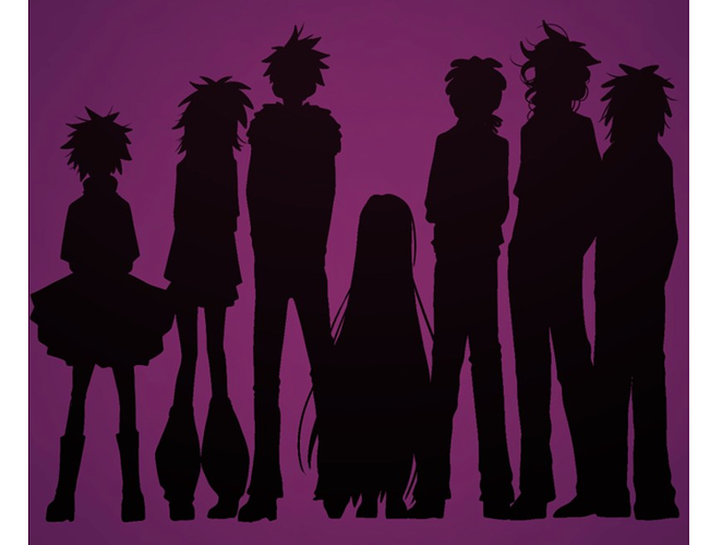
3.) Lastly, this is another nitpick and not so much something that needs "fixing", but just to consider in the future! I've noticed that you at times use these zoomed out shots with character silhouettes which give off a cool dramatic effect! But when I saw this panel in Episode 5 with the whole main cast standing together, it stood out how similar many of their silhouettes are relative to one another:
Ares is very different compared to all the others, but many of the rest have either similar outfit elements or hairstyles or sometimes both. For example, if 2 and 7 in this picture (counting from the left) were zoomed out and talking to one another, I would have a hard time identifying them. 3's fluffy jacket and 1's tutu are good differentiating factors, but both have similar hair to the aforementioned two as well.
Definitely another nit-picky food for thought thing though Generally speaking I like all of the designs!
Bonus comment:
The only thing I would be careful with is using the vertical bars here. At least on these forums where the font is sans-serif, the final part almost reads "I updates every wednesday" where the vertical bar looks like the capitol "i" and makes the sentence read grammatically wonky xD I almost think the original notation with "-(" works a little better, just because those characters are very clearly symbols and cannot be misread as letters.