You have a gorgeous art style! <3 However, if there is one thing I could recommend as a feedback... hm... lemme think... I mean, you ARE good, there's no doubt about it, so I'll be "complaining" on a very high niveau 
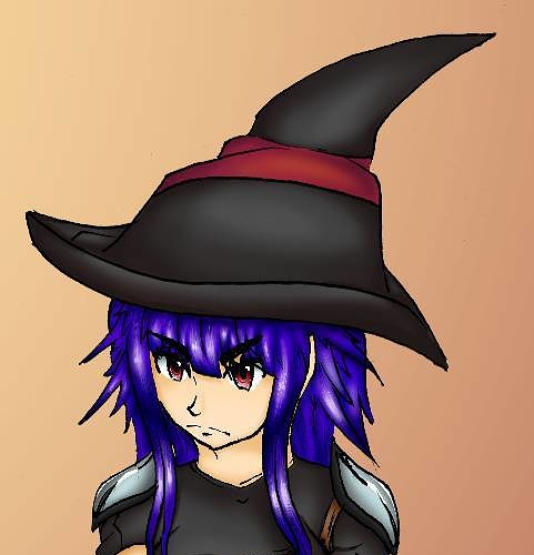
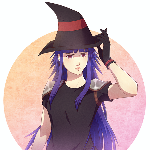
- try for a few white highlights, e.g in the eyes of Cate or on her shoulder pads, just a few tiny dots should make the illustration more lively =)
- watch the shading - the shadow on the witch hat is on the right, while the shadow of the rest of her is on the left side - keep the lighting constant.
- As a suggestion: Make the outline around the character thicker than the lines within, like as if you are just making the silhouette pop out more =)
- and what I recently learned: When you draw characters and they wear, let's say, blue from head to toe: Make the blue darker the more you get to the floor, this creates a more realistic lighting situation, since basically the sun is always above us =)
- I learned very much by watching the Over-Pain videos by BoroCG on Youtube and while I still suck at digital drawing, it helped me improve a lot traditionally since he made me understand lighting, texture and composition =)
Again, those are only details and I would not have pointed them out since I like your style, if you had not asked for tips or feedback  I hope I was able to help a bit - if not, please ignore what I just said, okay?
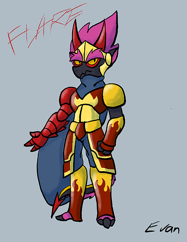
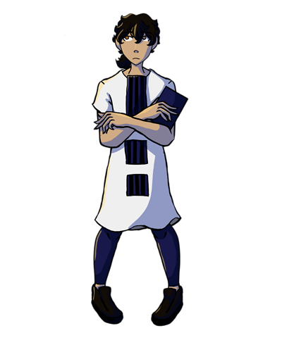
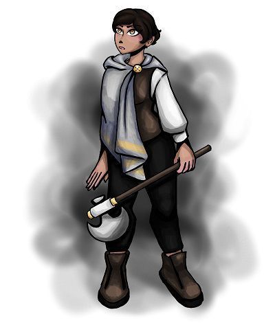
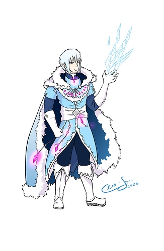
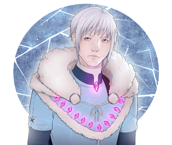
That being said, may I throw my Ice Mage Bounty hunter Faradin in here if you're interested?
Here are some more references of him Please enjoy, if the design is to your liking - if not I'll just lean back and watch all the other things you draw! X3