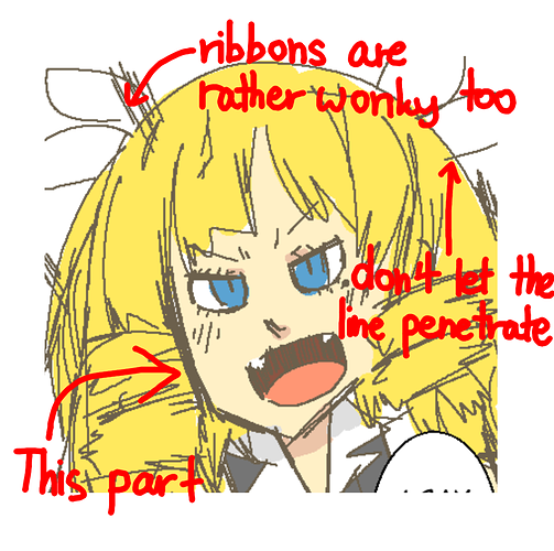
I agree with @ReroOnyx about using black for the outlines. It would not only make it look more finished, but also give definition to the pictures.
On another note, your comic could use shadow to make it more dimensional. Even though I like the manga-esque art style, the comic would look cleaner and neater if you don't overlap the outlines as much. Just draw it in one stroke.
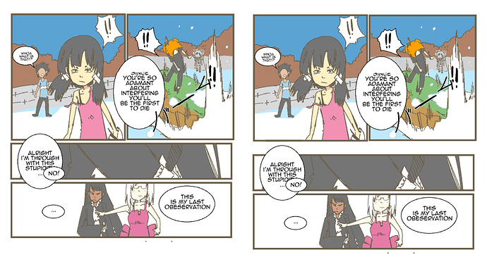
Also, it's rather difficult to follow the story since all the panels are cramped so closely together. Increase the spacing between panels, especially when the camera moves from one place to another. For example:
The right one is my enhanced version of it.
I can't say much plot wise, but at a glance, your characters have a wide variety of personalities and demeanour, which is a pretty difficult thing to accomplish, seeing as how big the number of characters are.
Something that confused me, though, is why the tan man in white outfit (Chapter 5 Part 1) sought help from the two girls when just a few moments ago they were fighting each other.
Extra tip: Mark your episodes with Chapter (Number) Part (Number) or (Chapter Name) Part (Number) accordingly, as to not confuse your readers.
E.g. Chapter 5 (Part 1)
The Curtain is Lifted (Part 1)
Overall, it looks like a promising comic. Now if you'll excuse me, I need to go read the whole thing right away