A couple of things that immediately jump out at me when reading this:
The text is too small. It's not too bad to read on my monitor, but most readers use the app on a mobile device. I'd recommend making the text bigger where possible.
There are a number of quite prominent spelling and grammar errors, like even the word "prologue" is misspelled on the episode title, and there are other ones too like a "dessert island" instead of "desert island" (a dessert island would be...an island made of pudding... I'm not sure that's the intent here  ).
).
Those are the two most pressing fixes.
Other than that, the writing seems decent enough; it's rambly but in kind of an appealing, conversational way where the narrator has a lot of personality, similar to something like Homestuck. It might be an acquired taste, but lots of good comics are. The font choice is solid too.
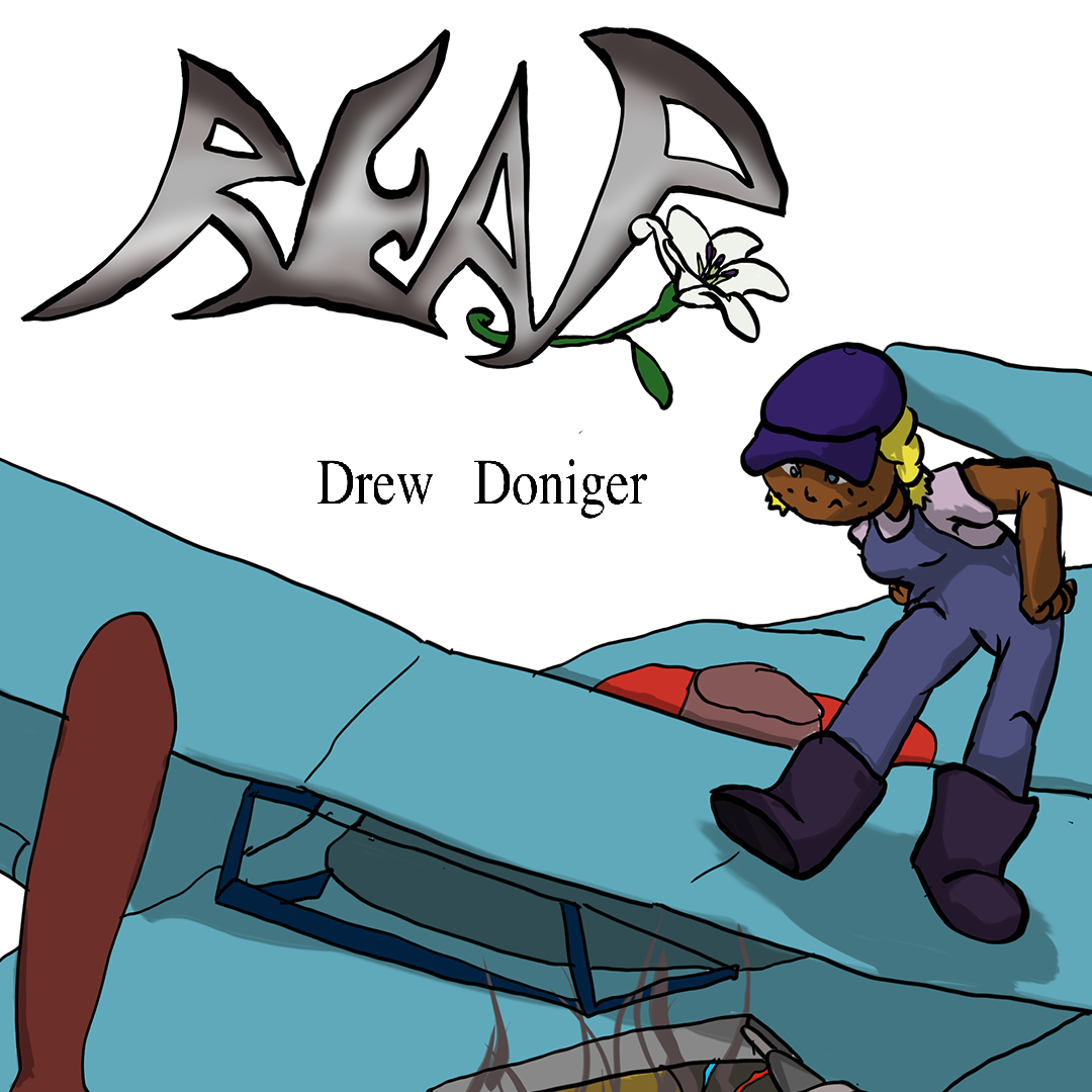
The art is making attempts to draw out full scenes with perspective, and clearly establishing characters in environments, which is great. The line quality is a bit rough, so I'd advise maybe playing around a bit with the line smoothing and pressure sensitivity of whatever line art tool you're using to see if you can maybe get a bit neater and more purposeful lines. The shadows are often a bit random too, so maybe spend some time doing some studies of where shadows fall on objects and people when the light comes from different directions, or where other artists place shadows, perhaps look up some tutorials. Overall, just keep going and challenging yourself!