Okay, there is a lot to unpack here.
ART
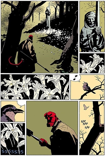
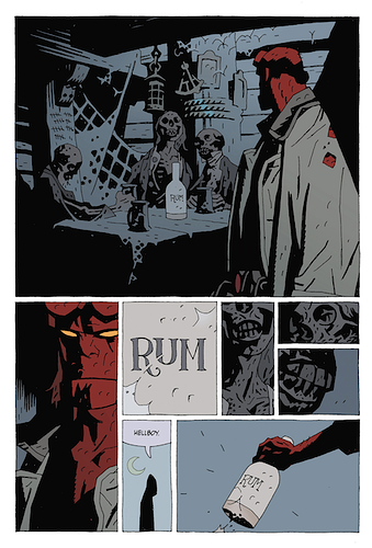
First of all: you have an eye for cinematics. Some of the panels present in the comic depict visual information in ways reminiscent of movies.
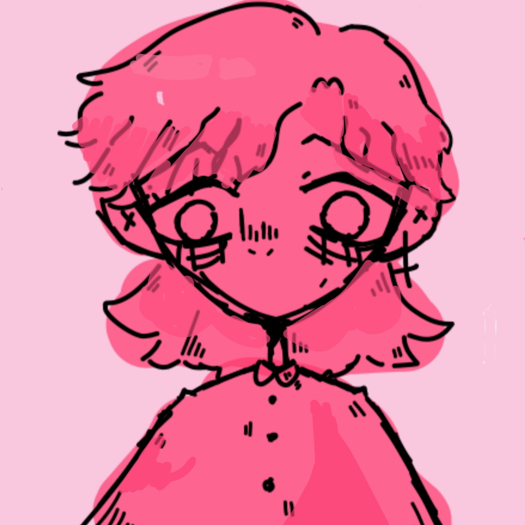
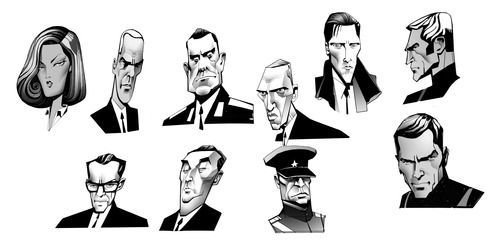
Some of your character designs are interesting too. They convey a world that is not western nor contemporary; they make me wonder if the story setting is in the future. However, some others are a little lackluster, and this, sadly, includes Lyza, your main character. You should try to push every major character's design to make for a more entertaining read. I would recommend reading Killjoys from Gerard Way and Leonardo Romero.
You put a lot of effort into making your comic. Nevertheless, I sincerely think this effort is counterproductive to the final product, as all this detail and shading is not allowing you to work on the fundamentals.
My main issues with the art are as follow:
1. Lack of discernible lineart.
There are comic artists such as Frazer Irving and Jim Murray (to name a few) that render art in a painterly approach. However, they do so in such a thorough way that makes contours unnecessary. I think your comic would benefit from having a bold lineart.
2. Anatomy:
the anatomy of the characters is neither stylized nor very grounded in reality. It looks odd quite often (you even drew a left hand on Ethan's right arm in the first chapter). I think these sorts of mistakes, and the overall oddness in the anatomy of your characters would be corrected if you opted for a more stylized approach to your art. You should put more effort into your sketches and not so much in your rendering. Start doing flat shading instead. I would recommend for you to check the art of Robert Valley, Genndy Tartakovsky, and Mike Mignola.
3. Odd Paneling.
Some panels are too small yet they convey a lot of information. Others are completely unnecessary. If you pay attention to the great comic artists of all time (Think Brian Bolland, Katsuhiro Otomo, etc.), you'll see how they let the readers put the panels together in their head; they don't record second after second of the events on every panel. Shonen manga is really good at paneling too. Check Naruto, One Piece, Jujutsu Kaizen, Dr. Stone, etc. for inspo.
4. Lettering.
I might be wrong, but it seems to me as if you draw your pages thinking entirely about your drawings and not the readability. Please include your handwriting in your sketches to get an idea of how they will look in the final product. Use a bigger and more stylish font.
5. The pages are too full.
You don't need to draw a background for every panel. Most artists don't do that. Just use a solid color. It can even be black or white.
WRITING
My issues with the writing however, are fewer. You can even say that it is only one broadly speaking, yet it is way more severe: there is no setup at all.
After reading your comic (and there's a decent amount of it), I have absolutely no idea what the characters and story are about. I don't know what Lyza wants seven chapters in, not in the slightest. I don't know the first step where their journey is taking them. I don't know anything about this world. I don't even know what these villains want even after all the conflict they have represented.
It all feels superfluous, as if the whole world turned around Lyza, while Lyza's world turned around trying to look cool.
Please consider turning down the fighting and setting some sort of plot and worldbuilding. Do the setup and not just the payoff.
To conclude, I think you should consider changing the direction of the narrative and simplifying the art for greater effect. Either way, the amount of effort you have put into your series is commendable.
Edit:
The accents and slangs make for a difficult read and are too thick.