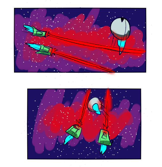
I would remove, make more transparent and blur the red smudge on the backgound because it's hard to see the dynamics because of lack of contrast.
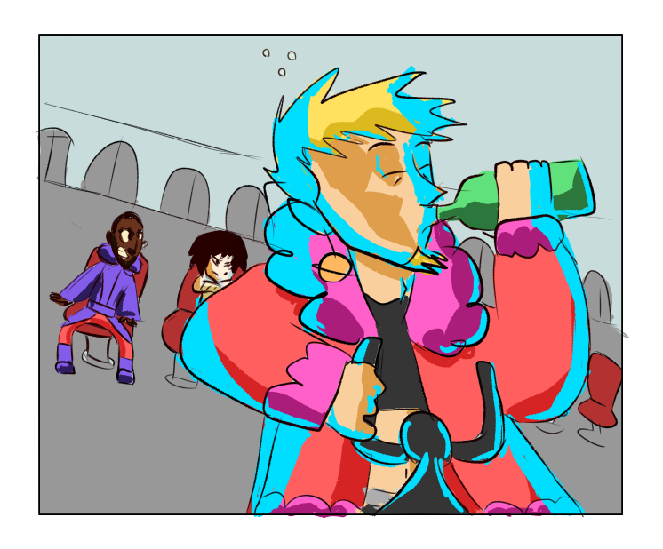
I know it's suppoused to be very stylized, but even then it's better to use references so the poses look more natural. Like on this examle his arm looks twisted because this is not how people would drink from a bottle in this position.
Also there is a big issue with lighting. First of all, if the light comes from the front then it shouldn't be on the edges. Also lighting is too complex and chaotic compared to the simplified shape of the character. And shadow definetely shouldn't overlap lighting!
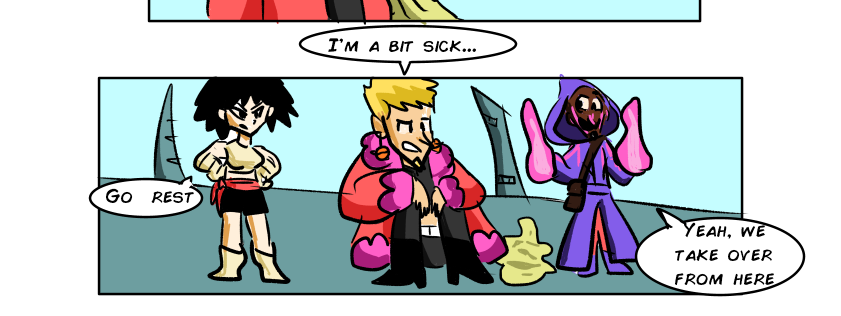
Here, you should give more room for the text in the speech bubbles. The same with the characters, their heads are cut by the border. It's better to cut their knees or waist if you don't want to draw them in full size for any reason.
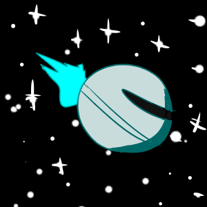
Also there's no transition panell between them being in space and the bandit who harasses the princess. What I mean like a panell with the planet landscape. This would balance the dynamic.
All in all, I'd recommend you to learn about storyboard storytelling, I'm sure there are plenty of tutorials for it.