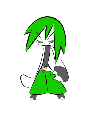
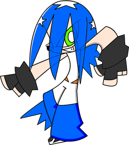
Honestly, I can see why this is confusing; those two deer up there look almost exactly the same. '_' I doubt anyone would really bother to call you out if you drew the second one in a comic or anything, the improvement is just so minor...
Although I can imagine instances where it could be a major problem, if you're really trying to denote 3-dimensionality with your art: I would describe it as failing to let the foreground elements interrupt the background elements.
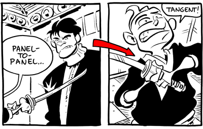
BUT...if you're doing very stylized 2D art, which is honestly what your stuff looks like it's leaning towards...you kinda need tangents to sell the look. The characters are supposed to look like they're confined to the 2D plane, even to the point of unrealistic perspective choices. That's...the point.
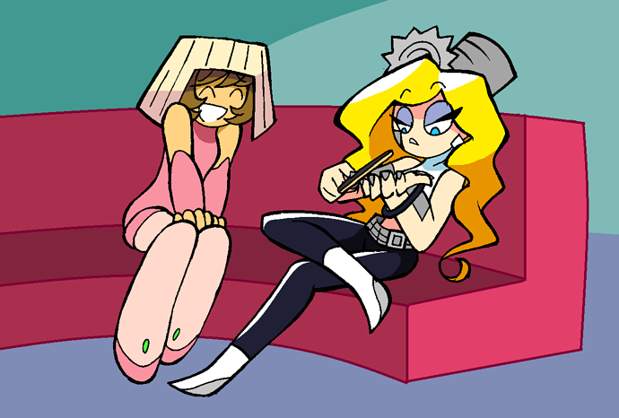
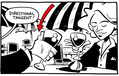
I don't dabble in stylized 2D as much as I'd like, but here's an example that I feel might help explain what I mean:
There's plenty of perspective in the picture, but there are a few areas (e.g. Blondie's shoes, fingernails, top of the couch) where the elements look a little flat and tangent-y. But that's for the purpose of the style, it's not a mistake.
If ^this (or something even more 2D) is the kind of style you're going for, I think you might be barking up the wrong tree by trying to avoid tangents entirely. If not...I guess you can disregard this post. ^^;