
I'm a mix of A + B. 90% A, 10% B The most important to me is art. If the art isn't to my taste, I won't consider it. Once it gets past the art gate, I look at genre. Good art, but horror? Out of my zone - I scare easily. I generally avoid genres like Romance too, so it's a combination of A) Icon and B) Title/Genre for me.
As for the gaaaaaame!!! I picked the FRESH listing since there's rarer and new comics there than the usual Popular and Trending comics.
I'm super picky =_= sorry. I don't have a lot of free time to browse webcomics when I'm already putting most of my passion into official manga and anime.
1 month later
Hey there, I'd love to hear feedback on this avatar for FACTION3? We're definitely looking at some alternatives, and I'll be sure to post them when we have them, but before that, we'd love to get some constructive feedback for the next draft! Thanks in advance, this thread has been so very helpful.
I think I'd place myself somewhere between A and B... perhaps A.5 or something ridiculous like that. Depending on the kind of mood I'min when i visit the site, I'll be more or less likely to give something a chance. My eye will always ALWAYS go the icon first and foremost. Art style and coloring has never been a factor to me, but I feel like a person's icon says quite a bit about them; it's the first view a potential fan has of your series, and that should always be considered in my opinion. What is the first impression you want to make? You can spend a lot of time, pulling apart the psychology of different colors, compositions, expressions, and any number of things to perfect an icon, or play it by intuition. What would pull you in if you were browsing? What represents the theme of your story in an intriguing way?
Next, I tend to consider the title. To be fair, titles never seem to make or break my decisions, but if there is a title that I find particularly witty, mysterious, or clever, I will definitely check it out regardless of art or my usual preferences, just to feel out the creator's sense of story / aesthetic.
I do my best to give everything consideration, as there is just about an infinite amount of ways to interpret any given thing. But I confess, the icon is my main attraction. 
I'm sticking with a symbol from the comic that unifies it since my work is heavily laced with symbols and iconograpy. (top one is from a current comic)
This probably will be the icon to a comic I want to upload once I get it started.
Do people prefer illustrations? I dunno, this makes it easier for me.
Looks pretty cool. Made me want to click and check it out. (Which I did)
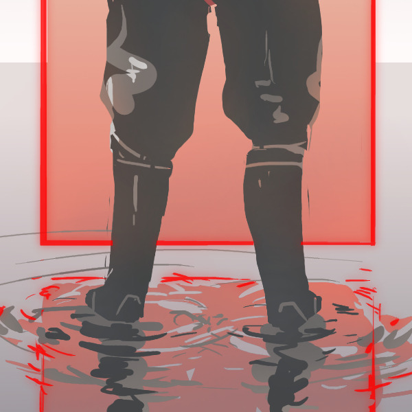
Great contrast between Faction boots and pastel colors.
It represents well your art style.
After checking your comic, I can say you could be showing a bit more of your universe since it's so rich.
But I like it as it is. The squared portal is very iconic already. 
I..honestly REALLY like the one in the bottom. It gives me a trippy vibe since it has the traditional 3D effect and a very neat symbol. It's simple and effective. Maybe it's just me but I AM compelled to want to read it out of pure curiosity.
 (p)
(p)
This is the one I've been using presently, in contrast with
 (1) &
(1) &  (2)
(2)
The original one (1) is still pretty preferable but in a way it might limit what the series would be about? I do like the current one (p) a lot mostly because people seem to be attracted by the character designs when they start the comic, so it already gives a preview of what to expect plus the key players in the story. BUT (1) gives off a sense of mystery and cosmic consciousness behind it >->(\
If I was 100% confident, I wouldn't be posting here sooooo, what do you guys think? Should I go back to (1) or stick with (p)?
Oh I forgot to be specific, I included multiple icons from separate comics and wanted to know if people like simplistic icons haha...
Oh oops!
Well, I still very much think they're good icons |"D(\ second one still being my fav for its simplicity

Thinking about re-doing mine as well.
I like the pose, but the colors not so much. I also think I can do better at line-art now. All I know is that I want to keep that pose and I want to do something with the aesthetic of velvet wallpaper since the story's setting is a fantasy world based on the 1910's (at least on the human side of things). Perhaps I should try something redder for the backdrop.
Just wanted to say thanks for the kind words and comments. Very helpful for us as we move along. Also, I check out Shades of Men, and just wanted to say I love your style. Gritty, but you find a good balance to use colour as well. Excited to see where it's headed.
Hehe Thanks a lot for returning the favor.
It's funny because I think color is not my strong suit.
It's still pretty bold, but it goes with the style of the characters I guess.
Checking this topic makes me wanna change my icon again.
I might if I find a good enough idea! ;-D
I just wanted to say that this was an incredibly thoughtful and kind answer. Your thoughts are valued, and the comment about pillars is something I hadn't thought of that I'll definitely be considering when we do the next draft of our icon. Thank you for the post and the advice!
I can say that I'd be interested just from this icon. The reflective surface really makes it dynamic, but it still has an overall simple feel that reads well at a small size. If I was going to try anything, it'd be replacing the darker grey with black, just to see if the higher contrast made it pop. But it looks amazing as is.
I want to see what else you make for icons, just because you're clearly talented. ^^
1 month later
Most likely A for me. It's like seeing a new person for the first time - you can't help but gather information and take in a first impression, even if it turns out that you're wrong later on. An icon says a lot about what the creator has in mind for the spirit of the series - whether it's an important character, pose, or moment. It's kind of an interesting summary of a story, in my opinion. It also definitely boils down hugely to personal style and preference, though.
Also opening my current icon to thoughts/opinions/simple style criticism. Thanks!
(Outer Spaces1 is a bit of a slice-of-life project on life, differences, and inspiration, painted against a fantasy backdrop.)
3 months later
Thank you for making the discussion about this topic. I've learned a few things from reading the comments. I'm going to design a new icon for my webcomic now.
1 month later