10 / 24
Jul 2019

thank you! don't worry, it gets better, of course. Maybe a bit more confusing though. I'll gladly give yours a read!! thanks!

Nice comics, all of you~

Here's mine!

I need to catch up with your comic but what I've read so far is very interesting!
Here's my comic for anyone who's interested!

Salutations! Well, I gave your comic a read and I figured I'd give you some feedback. :smiley: Before all that your username makes my day. Haha I have to admit I had a little chuckle when I saw that.

Okay, onward! So, story wise I think you've got a good premise here, a young slave girl is rescued (even unbeknownst to her, as she thinks she's just been sold, which is a very good storytelling touch to establish her frame of mind as we start), rehabilitated and shown the world in essence, for the first time, all while holding onto a secret. It's a premise with a lot of promise and so far you've got a good start on it. Your characters are all noticeably different from each other so I know who everyone is upon sight AND I know them all by name, which is also good. You've dropped some hints here and there to start the story off with some intrigue about what Mercy's secret may be, and then given each character a good establishing personality. Nobody feels interchangeable so, good on you!

There are a few technical things that you've run into that I want to share with you so when they happen again, you can catch them. One is the use of the asterisk to denote emotion. Specifically the use of "*Rolls Eyes." Using the asterisk like this is actually very distracting, even if you've seen it used in manga or things of that nature, this is a very visual medium so, you need to SHOW us that Lee is rolling his eyes. You can do this by creating two frames of his face and just show him rolling his eyes using one frame as a starting point and the next as an end or, you can draw a single picture of Lee and show his expression (eyebrows are important with this one) denoting that he had rolled his eyes. (Usually this is done by having the eyebrows slightly down and his eyes looking up into his head) Here's an expression chart1 so you can see how some facial expressions are made which include use of the entire face to tell a story. (There's also some different styles in there!)

Speaking of expression, that's another thing we've run into here: body language! Now, I will say that I think you've done a good job with everybody's body language so far. Mercy is always slouched, has her hands in front of herself as if to protect herself, Lee is cagey with folded arms and a disinterested mien belying what he actually cares about, Mrs. Withers is very open and often puts her hands out to others in that comforting way and of course, Orrick has very open posture which denotes the kind of person he is, so very good job in using soft cues to establish who everyone is personality wise! The trouble comes with the fact that, everybody is still very stiff. Like a rig. Which I did notice you use a lot of 3D models that you integrate with the art which ISN'T a bad thing on the whole, however it's very distracting when looking at a piece and some of it is drawn, while the rest doesn't feel like it belongs there.

This really hampers your ability to get expression out of body language too because 3D models can only go so far, and even if you trace over them at any point, they're still stiff. So my best advice here would be to study figure drawing. This will also go a long way towards helping your expressions out too! It'll make your faces, eyes, smiles, frowns, all feel more substantial and come across stronger, the less you depend on the 3D modeling software you're currently using. Now, that being said I won't tell you not to use it at all, because by doing so you're learning things about perspective, spatial relations, and so on, but what I'd suggest is while you use this software, take time to draw by hand and learn how to draw the objects you're moving around in the 3D space. Hell you could trace over them in your sketchpad just so you can start getting your hands used to drawing them. Just remember that to get your work as expressive as possible, you've a lot of practice that you can do, to really shine up the good work you've got so far.

Now, onto the next thing I think could really help your art: Textures! No, not the back ground kind, hahah. You're doing fine with those so far. I mean for clothes! Everybody's clothes looks stiff, now I know Mrs. Withers cares a lot but she needs to lay off the starch! (I kid, I kid. One man's starch is another man's...well starch.) Anyhow, the 3D models don't really give you a lot of options with regards to clothing and clothing textures and even if they did, they'd never be quite right, since they're in a 3D space and are made to reflect that. My best advice here would be to look at dresses, shirts, pants, drapery, the lot to get an idea of how different kinds of fabric folds, falls, and crumples. Everybody has a look that tells me who they are, but they all look stiff in their clothes and it breaks my suspension of disbelief when my mind keeps getting distracted by how rigid everything is. Don't worry, just like with figure drawing, there are lots of resources for tackling textures too!

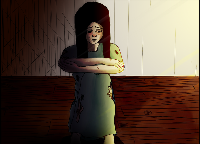
After all that, the next thing that'll make it all come together with a pop is values! Ie. Shading, Lighting, and so on. You do have some shading here and it's a great start, but you tend to have the same lighting for every room of the house during all hours of the day (at least what I've seen), and that doesn't really tell me the mood of the world or the mood of the room. It's easy to shade a character and think that's the end of it but, part of building atmosphere is the shading or lighting of a room or a moment. It gives the audience soft cues as to how intense something is. To this end, I've taken a panel of your comic and given it more lighting and shading to denote Mercy's emotions. Here:

Now, I didn't do anything fancy, these are very quick edits and not to the detail I'm used to working in but, for an example it'll do. See how it changes the entire mood of the scene? Since the time of day is always the same when you show the outside of the house, I decided to run with a sunset vibe for this (primarily because the shading would really give to the feeling that the sun is setting on her previous life and she has no idea where it's going). I wanted to evoke her uncertainty, here she is in a house full of strangers yet again, and the light outside is dying while the darkness on her shoulder threatens to take over. You can evoke fear, sadness, hopelessness and all without saying a word. Lighting can have a profound effect on how a character and indeed, a scene, touches your readers. With a story as emotionally potent as a slave girl getting a new life for the first time, little touches like this can make all the difference. My advice to you here as well is, watch your favorite movie, see how the lighting in that movie makes you feel as you watch, and then you can use those techniques to really bolster your own work.

When we see a character surrounded by darkness and they're all alone, we know how isolated they feel, when we see a character surrounded by bright pleasant light we see how uplifted they feel. It's all these little things that can put a scene together in perspective and you don't even have to say a word. It's all about showing. Here's a tutorial about why lighting matters and how it can be used. While the vid IS talking about movies, it also applies to art very heavily so, I wanted to include it as referential material.

Now, one last thing: Talking V. Showing. Since this is a visual medium I want to get my cues from the visuals, not just from exposition. Mercy exposits a lot in the beginning and as readers, all we get are long swaths of blank space with text bubbles, which isn't very interesting to look at. Mercy explains to us things I really wish I'd seen, like her receiving her new dress. This is the FIRST time in her life she's been given something from someone who wasn't angling to hurt her, use her, etc. The first time she was given a real meal, we didn't get to see the surprise, shock, tears, of joy that she was allowed to eat real food, she just tells us she's surprised, so the scene which could REALLY pull you in with just the look on her face or the way she experiences kindness for the first time, just becomes speech bubbles and removes me, the reader, away from the scene or the emotion therein. You have SUCH a good story here, and I just want to see every small part that makes it a great story.

And while the writing can take you there to a degree (which, by the way, the writing itself is pretty good it just needs some small trimming here and there so you don't inadvertently repeat details and so on) since you're making a comic, I really want to SEE these moments, not just get a report that they happened off screen somewhere. The visual medium is meant for moments like that, more than any other kind, emotional deep moments can pull your whole comic from "good" to "great" in seconds.

Phew, by the gods I think we've hit the end haha. Good on you if you made it this far, I know I had a LONG swath of feedback for you, but I hope that all of it is helpful and that the resources I've provided make for good references for you. Like I said in the beginning, I really do think you've got a story here that will blossom and become something fascinating, and being that your writing is already pretty good, heck you're more than half way there! And, if you don't have a digital art program that you can work with other than the 3D program, check this out: FireAlpaca. This one is free and you can use it to apply shades, textures, etc. You can import images from other programs and draw over them, it's really a great help. I got my start with it and to this day I don't think I'd have learned as much as I did without it. I wish you luck with your comic and I'm gonna sub so I can see where it goes!

In keeping with the thread theme, you're also more than welcome to check out my work. HAH I can guarantee you're in for a lot of imperfections of mine as well! You'll even get to see some of the comic pages I made in FireAlpaca originally so, lol be prepared, they weren't pretty! (I was still new to digital art back then and even now, I've more yet to learn!)

Cheers and all the best,

-Syn.

oh my gosh!!! thanks for showing me that!!! You just made my day!!! awesome! I feel somewhat accomplished now! haha!

you're welcome! I'm glad that it made your day :heart: You deserve it!!

Great! ehehe, I thought, what a better name to use than the woman who beat Sherlock Holmes?! Maybe that's ballsy of me. Or nerdy, whatever lol

I'm so glad the premise is easily understandable and that the characters are easy to tell apart and remember! I am a writer, at heart, and this is my first webcomic, so I'm thrilled about this part! I'm eager to hear about what you think of the story as I post more updates (please subscribe, I've found your input valuable and helpful already, my thoughts/questions on the art part is below...I wrote a lot, sorry in advance!)

I agree with all of these things! I actually have an art degree, and am paying attention to most/all these things as I work, but I'm still figuring out my drawing software and my own style and how to balance efficiency with what looks at least decent (though you are 100% correct on all of these things, and I"m very grateful for the critique) I'm trying to lay off using the 3D stuff for sure, cause I know it doesn't quite fit in, but for the sake of efficiency and just being plain bad at drawing (my degree was in metalsmithing not drawing, so my drawing skills are...not the best, clearly! haha!) and GOD yes about the lighting, right?! I know there are fast ways to make it better, but I just can't figure out HOW to do that. Can you tell me how you got that great dramatic shadow and lighting? Because I want to be able to do more like that and have just been teaching myself because the amount of tutorials out there are literally overwhelming and I can't possibly read them all while still trying to be productive on my comic itself and that kills me!! At this point, the panels have only happened during the day, so that's the reason the lighting has been the same (I do know I need more variations in light still, but how to do atmosphere?!), but there will be panels that take place at night and I need to be able to do that, and I don't know how yet. Struggling artist problems here lol As far as Talking V showing goes, again, I agree (you should have seen this comic on webtoon before I redid all the pages I had up!!! this is my 2nd time drawing my first webcomic, and it's better than it was then hahahaha!!!) The reason I didn't show those things you mentioned, and only briefly mentioned them in passing was because they weren't important to the story. That sounds silly, probably, but Mercy was still numb when they happened. Remember, this has happened to her before, being taken away to a new place and treated well at first, only to have it all jerked away from her when she was bought again. That said, I do know I have too much text. I'm typically a novelist, so getting away from words is so hard ughh!!! hahaha! I currently use Clip Studio Paint because it came with my baby drawing tablet and I'm being basic while I'm starting out until I need something better! Lol

Thanks for reading this far!!! I'll gladly give yours a read and let you know what I think!

@irene_addler I completely agree with @SynCypher and I'm glad I read all of that as well, so i don't have to repeat things.
I've enjoyed your comic so far and I'll actually subscribe to see how it all comes together. Keep it up!

If you want, you can read mine and give me some feedback. (Head up!: The artwork does get better as the story moves along.)

I'm glad you like it so far, and thanks so much for the subscribe!!

I'm liking the slightly Disney-esque feel of the art so far, but I'm not very far in yet!

I know my art is definitely getting better as I go along....or at least I hope it is hahaha! I'm actually working on pages 61-77 atm, so I hope the art is better now than it was in the earlier pages! but I still have a bunch of room for improvement

Read your comic it's good I subbed. If anyone wants to read mine what I have so far:

Hahahah right? I always love that scene where Holmes realizes he's underestimated her while he's reading her note. It's one of the best parts of Irene's departure. Nothing wrong with using her moniker at all! Ah I've indeed subscribed, don't worry. :smiley: I'm overjoyed that my input could be of use to you as well so, hahah huzzah!

Ooooo my brother is a blacksmith, there's nothing more intense than working in the forge! It doesn't matter if you're making swords or metal inlays, metal work is a fine craft indeed! I've a lot of respect for it. There's nothing wrong with figuring out your software as you go, my entire comic is one long experience in figuring out digital so, ahahah nothing is perfect. The entire experience of growth being seen over time is part of what makes webcomics special, you start off a beginner and your audience gets to join your progress and indeed, get to be a part of the experience of that growth, which makes the medium uniquely enjoyable. To that end, it's fine if your artwork isn't flawless right out of the gate.

Now, to address some of your queries (don't worry, haha I sent you a veritable novel first so, turnabout is fair play). Starting with lighting: The way I did it, was I literally added gradients. I added a dark gradient in the left corner, and a light gradient in the upper right, with Mercy in the middle. Now, I'm not using Clip Studio (though since you are, hah you scarcely need Fire Alpaca. CS is a great program!) so, some of my settings for these things are going to be different. Essentially I used the layer style "Multiply" on the dark layer, and the layer style "Overlay" on the light one, so I could get a lighting and darkening effect while not losing the details of the linework. CS probably has Layer Effects so, you might just spend a day playing around with an example piece of your art to see what each one does.

Now, when it comes to getting dramatic lighting there is literally only one thing to do, to practice this: Draw from Life or from Still Images. The thing is, when you use IRL references and see how shades play off each other in natural light, you can get a sense for the best way to use them. I could throw "Oh color theory" at you, but reality is, seeing it in action is best. The important thing is to get a basis in practice before trying to just immediately apply it, understanding it is key. Actually, what I suggested to you earlier about watching movies could be great here. What I used to do, is I'd watch a movie I loved and I'd pick a scene to draw by hand. I'd pause my DVD, bust out my sketchpad, and draw it, then I'd color it with whatever I decided to color it in with. Doing this as a form of practice, got me familiar with shadows and lights.

I also made sure not to pick a cartoon because I wanted to get familiar with colors. While you could just throw a gradient over a piece, understanding WHY that gradient works, is just as important. Also, just make a conscious note of lighting in your house during the day. Is the afternoon sun more orange, yellow, is the overall lighting kind of blue? You'll start to pick these things out now that you're looking for them and drawing from real life is the best way to bolster this skill with regards to colors. There are a billion tutorials for everything anymore and teaching yourself is certainly one of the hardest things to do in terms of knowing where to start, what to look at, what's good advice, what's bad advice, the lot.

Ah, but you are also a novelist! So here's an exercise for you that can help you with your dramatic lighting as well that goes beyond just using the IRL examples, and instead pulls them from your mind. How would you describe this scene if you were going to write it in a novel? How would you describe the lighting? Is it the last light of autumn flashing through the windows of an unlit room? Is it a glowing light in a distant oil lamp glinting off the flat surfaces of the sparse furnishings in the room? Is it a warm afternoon where the sun is high and the lush green grass wears its heat? In each of these sentences a certain image is evoked in the mind. Why not try novelizing a scene and sketch out what you see in your head? (as best as you can, remember it's just an exercise, it doesn't have to be perfect) It makes for good practice both for learning muscle memory and for translating the images in your mind to the page.

Now with atmosphere you have two things you have to do: establish the emotion of the scene, and then embellish on that emotion with color. (I know it's another article but it shows examples of how this works out and explains them in-depth) Is it a sad scene but in the day time? Maybe do your shading in cooler colors, is it a happy scene at night? Do your shading in warmer tones, etc. These all lead up to soft cues that'll help the reader along. I know this is essentially a crash course but, the reality is I've been painting my entire life and most of my knowledge comes from my experience there. My digital art is not as strong as my work IRL since I was classically trained but, over time I've been able to learn techniques in digital that reflect what I've learned IRL, but it does take time. Nothing happens overnight and likewise, it's okay not to do all these things all at once, but to take time as you continue to update your comic, working on each one as you go, at your own pace. There's no rush, you've plenty of time. :smiley:

With regards to the 3D, if your art isn't quite there yet, that's okay! Using the 3D will help you learn how to draw. I'd just suggest maybe setting up a 3D model and drawing over it in different poses to get your hands used to drawing those things and build up your muscle memory. I know I did give you a TON of reference material and that stuff IS a lot to go through. The important thing is, just to hold onto that material and use it whenever you think you might need it, rather than trying to put all that knowledge in your head at once (or you'll probably get scrambled! I know I would lol).

With regards to the story element. It's okay if Mercy was numb during all of this, but perhaps one of the best ways to illustrate that, would be to show snippets of those scenes in black and white, (like say, a pair of hands, giving a dress over to Mercy but it's just the lineart in black and white) to show how little attachment she had to being given a gift or eating nice food, it's all just bland and loveless in those moments and that'll get your audience feeling her apathy. That way we see it as it happens and we feel it, rather than just being told it happened. Hahah don't worry, I know from experience that it's really easy to want to exposit pieces of the story. I write novels as well so, I've been guilty of that myself in the past. After I did my first few query letters I learned a lot about paring down to what's most important and then showing the rest. That's not to say a long conversation can't happen, it just comes down to how it happens. People tend to struggle with infodumps taking up most of a page and will start ignoring text. So, breaking it into bite sized chunks never hurts and using art to illustrate those chunks just carries what's good about the writing forward. That's not to say you can NEVER have negative space, just that it should be sparing so we get treated to your art more than black back drops.

Hey no problem! If you've more questions for me I'll do my best to answer and you're most certainly welcome to give me feedback. I know my comic is not perfect and it took some time for me to translate skills I know IRL (still does lol) but slowly I'm getting there.

Yes, the trick is to improve overtime, without improving too quickly. Otherwise, you end up having too much inconsistency in your drawing style.
Thanks for subscribing to my comic by the way. Yes, I suppose it has a bit of a Disney flare in style.

I bookmarked and read your story. So far, I like the mystery of Mercy and her current situation (I won't spoil anything for others who have not read it yet). It's definitely interesting to see where she goes after seeing where she came from. I also like the other characters who also have an air of mystery behind them. It's a good read, I encourage others to try it.

And if anyone's interested, feel free to check out my manga! Thank you everyone!

With great pride and joy I can at last show you the first volume of Burn My Shadow for FREE!

The first episode - Face in the Sand

Our Facebook page! https://www.facebook.com/BurnMyShadowCB/

We'll deliver a new chapter every 6 weeks.

Burn My Shadow is a dystopian comic book created and written by Lanza Sebastiano, pencilled by Conti Fabio, inked by Bert and Miriam Scaringella.

The year is 2113. Global political and economic stability has been upset by extreme weather conditions, as well as an ever-growing population. Tharmas is an outcast in search of his long-lost sister. In spite of his objections, he begrudgingly accept K's company, a child journeying alongside him.

The search leads Tharmas and K through the megalopolis speckling a predominantly arid wasteland. Cauldrons to diverse cultures, the urban complexes, shielded from extreme weather events by gargantuan domes, house the better portion of the world population. Food and water reserves are scant; electronic masks, serving as IDs and credit chips, are provided amongst the wealthy.

The journey will bring Tharmas face to face with the new world's leading figures; he will avail himself of violence as he investigates his sister's whereabouts, whilst his relationship with K will delve deeper into his individuality.