13 / 56
Feb 2021

I've always drawn in colour, and I've learned to use colour in its many meanings. As emotion is so important to my novel, I use it for both the magical, whimsical stuff, but also my horror elements. I love disguising my most garish creations in fluffy, happy colours, disguising them as innocent beings that in truth soak the world in suffering.

The holy rule for my novel's characters? The more colourful, the harder the tragedy. Pastels are a worse red flag than my vibrant colours, those arts mean business. XD You see rainbow? Complex, painful storyline.

I use color in my work because I love the variety and want to experiment some combinations. I have done 2-3 monochrome pieces, but I largely do the variety. I do keep in mind the 12 principles and 6 elements of design. I just keep track of the color and/or values tbh, sometimes I look back to previous stuff for color references, but other than that I just remember it from memorization.


They help set the mood and, when it comes to beings, show characteristics.

I loooove colors and coloring is probably my fav part of making my comic, especially when it comes to adding lighting and shadows. My personal illustrations are shaded in more details compared to my comic, for my comic I take a much more simplified approach to coloring which i still find interesting and fun to work with.

For my comic, the base colors usually remain consistent it's often the shadow and lighting that changes, choice of colors can add so much to the emotion you're trying to convey in the scene and it's sometimes one of the main things I think about when I decide on a location for the scene I'm writing, like will the lighting be interesting? how will it add to the scene?

@Lady_T_Musings I think your colors work really well together on the page, I can tell you put a lot of thought into them.

@Kelheor Dude those are gorgeous :open_mouth: What lovely technique!

I use color in my work too, but I'm pretty badly colorblind, so I developed my own pipeline for painting to keep everything consistent and avoid any nasty mistakes. I have a pretty intense layer stack for every painting. I'll show you most of it, but it's kind of embarrassing how long it is.

Here's a lazy breakdown of one of my covers. I usually design characters based on either split complimentary or analogous colors, likely based on vibrant colors I can't change about their design. In this case, Nira's hair and skin. Purples and pinks go well with reds, and the green supplies a focus of cool color. For the rest of the colors on the cover, I try to use vibrant colors to control what part of the painting the viewer should focus on. I also use color grading in my post stack to reduce the amount of clashing, and give the scene a consistent tone. Keeping color grading consistent within the same scene, then changing it when moving to another location is a really easy and helpful tool when laying out pages. I'll usually pull in another color into the shadows even though it's not technically correct, just cause I like the way it looks. Often it's a blue, but a color complimentary to the light source is a nice way to add some flavor sometimes. I paint using albedo flats and light layers, so I can tightly control each light source, and build up some pretty complex looking scenes. It's flexible too, I can cut out a lot of this to simplify it for panels. If you're looking for a convenient color scheme designer, you can't go wrong with Paletton: https://paletton.com/#uid=1000u0kllllaFw0g0qFqFg0w0aF

Breakdown:

Final cover:

That's what's up! I'm loving that you have inspiration from outside of comics that you apply to your comics too! The world around us is full of references and inspiration for fellow creators!

Ahh yes, I feel you there. The intuitive vs methodical approach to coloring, both have there pros and cons, but I definitely get what you mean when talking bot legibility :sweat_01:

I'm trying to be more conscious about the colors I use when the time of day is different or it's an indoor/outdoor scene bc it defiantly does something for a scene but, but making it feel natural is definitely a big part of the puzzle. An old tip I remember hearing was using a color overlay on top of your base colors to bring unity and still show change. I have to play around with that some more as of right now I just colorful all these scenes by hand, but that would be a nice shortcut.

my 2 cents if you want them. For this scene you are talking about, I get what you are portraying with one scene being outdoors while the other is indoors next to a fire, but as they are both at night and on the same page, maybe tying a bit of the darkness into the bottom part would help make them look a bit more unified on the page. Like with the sleeping character, the side facing the window can be a bit darker than the one facing the fire. With the night scene, maybe the slightest hint of light that illuminates the outlines of the figures in darkness might make them be a bit more distinguished against the darkness. The second third and fourth pages look good to me lighting-wise, just adding more contrast between your words and text bubbles vs the scene would deffo make them easier to read. I think you're doing some great stuff with atmospheric lighting for sure!

Your world looks so lived in, I love that!!

Lots of really good coloring advice?? I'm not much of a colorist myself, but I'm really trying to get into it ( or make my coloring not look atrocious smh ). I try to find pictures online that communicate the color scheme/mood and color pick from those pictures because I'm definitely not good enough to grab colors myself.

I do wanna say that your character designs are gorgeous, tbh

First... I love when you post topics, Musings. I can tell you have so much enthusiasm for everything you bring up and when you reply to folks

Second... like many things, I decided my comic would be in color on a whim. I had made no more than four fully colored pages before then—only in black and white or monochrome. Clearly a great decision. XD
I’m over 100 finished pages deep now so I guess it worked out fine. I didn’t know much about color when I started. I think that’s partly to blame as to why my characters have such simple palettes. It usually went:
1) one main color,
2) one lighter (complementary or analogous) color for the underbelly,
3) one color for the horns or fins
4) eye color,
and universal colors for everyone’s eye whites, teeth, and tongues.


I finally introduced a character that I’ve designed more recently who is a tad more complex than this. Even that is almost only because of his outfit. I have many more waiting in the wings that I think are more interesting to look at.

I keep track of their natural palettes by referring to their portraits. That way, I can just fill them in on every page and use clipped blending modes to make them fit into whatever environment they’re in.

I started to finally get color after reading Color and Light by James Gurney. It’s more focused on traditional painting techniques, but what he brings up is still incredibly useful for any artist. The PDF is out there if you can’t buy it. Read it.
I’m still not that knowledgeable about it, but I have a slightly-greater-than-passable understanding now lol

I started thinking about how to see and pick colours just this year - for work, I draw only in monochrome, so it was something I really put off understanding :stuck_out_tongue_closed_eyes:

This blog post3 by liongirlkiara was sooo helpful to me! She makes her own analysis, and also links to lots of other artists who've talked about colours, which I really like~

Here are some images she used! but not all of them, so please check her post out!

I've always done comics in color ever since I transitioned to digital art— due to the way I work, it's actually easier than black & white. And besides, I just have way too much fun playing with colors. ^^ It's therapeutic, almost. I can't imagine taking on a long-term project without any color...

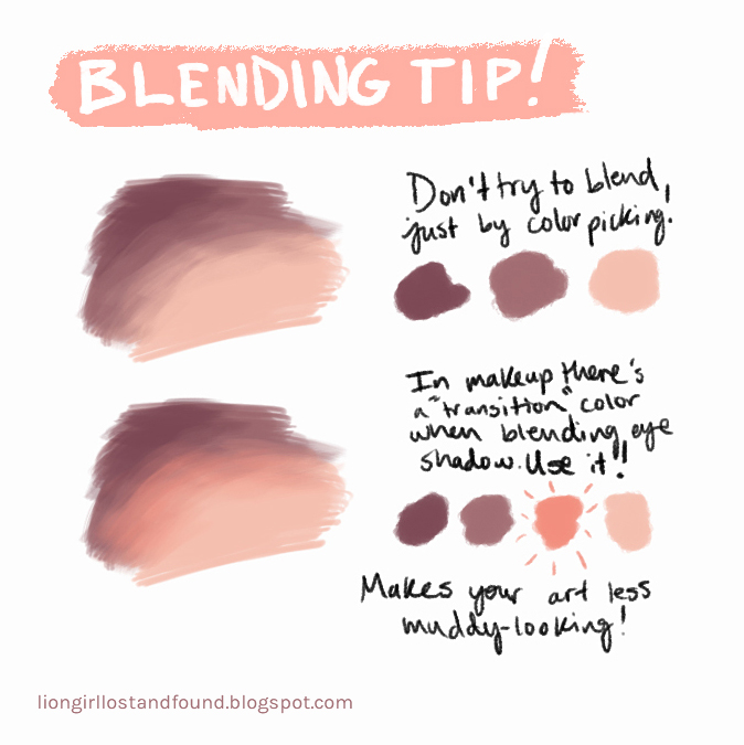
I've been learning and studying lots about color over the past few years; it's been my main area of improvement.
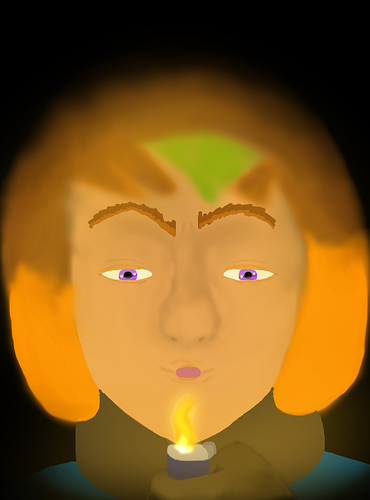
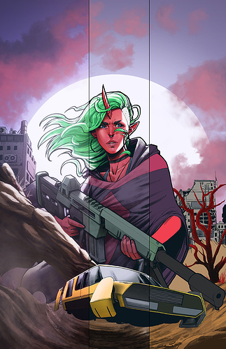
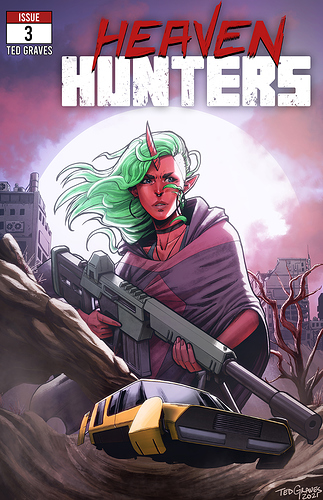
My current pet project is learning to create "atmosphere"...making a scene feel green or blue or whatever, but not just by making the scene monochromatic.

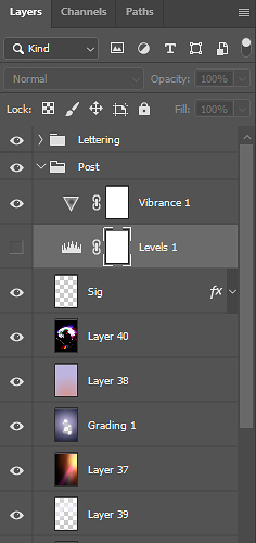
It's really hard...I know most digital artists would just use blend mode layers, but they usually don't work out well for me...and even when they do, if they don't turn out 100% right I never know how to tweak them to perfection. So I figure I'll just do the best thing for myself and learn the technique from scratch.

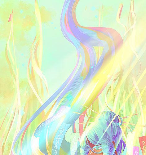
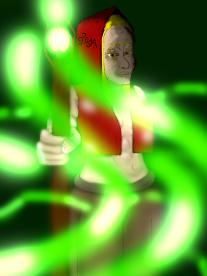
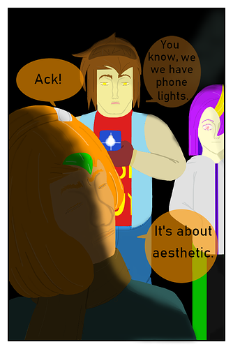
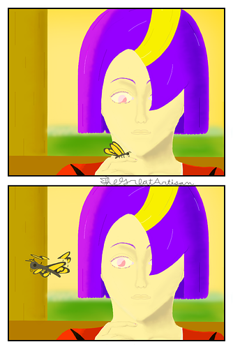
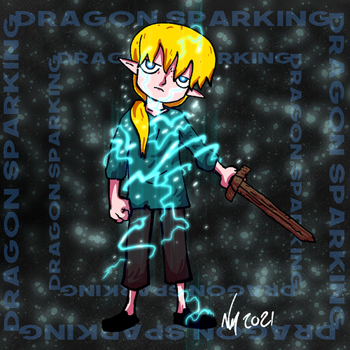
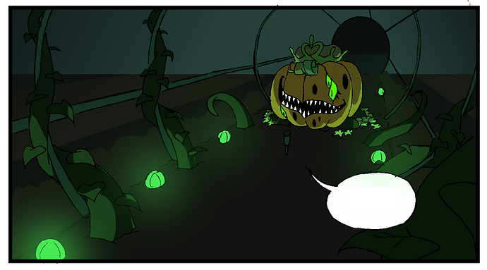
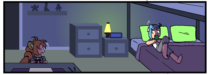
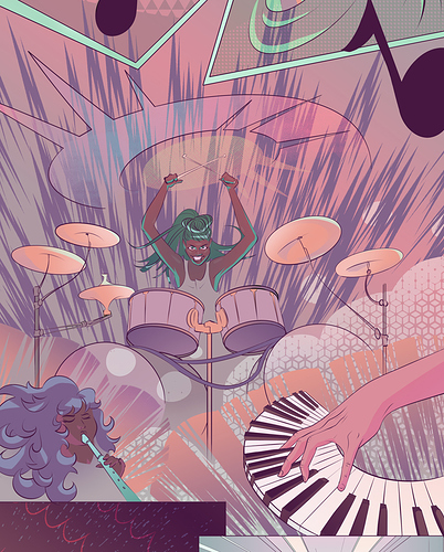
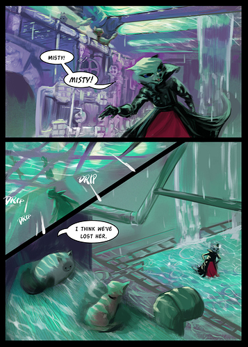
I do most of my color-picking experiments in my comics:

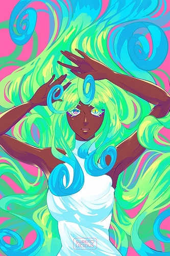
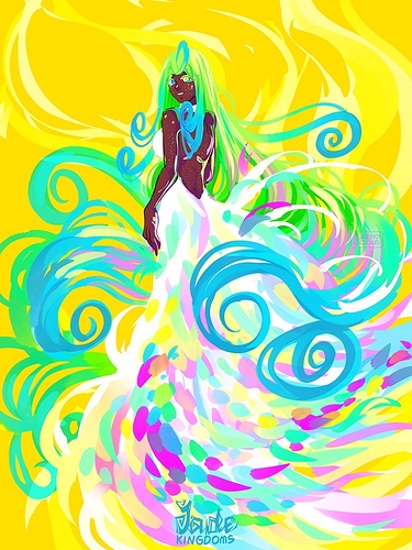
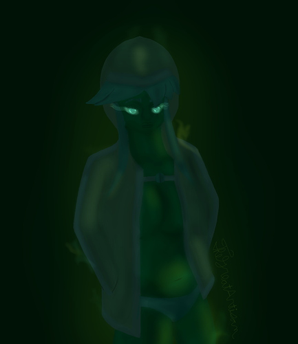
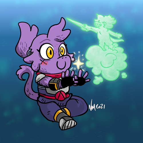
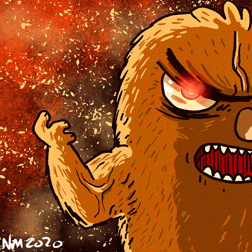
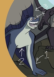
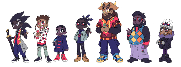
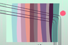
I think my most successful recent experiment, however, was with a group of character designs:

When I looked back at it the next day, for a second I thought something was wrong with my screen; all the colors were so consistently cool-tinted. Even now, the illusion persists a little...I think that's a good sign. :9
I can't wait until I finally get this, and can freely move on to the next color challenge. 'Cause there's always another one...colors, man...

I use limited color palates, always. Otherwise, you're going to have so many colors it gets overwhelming, and when doing comics, having too many choices leads to just stalling out because there's too many choices to make. So I had one short story comic where all the colors were based on this:

With that small red being the highlight, and with it I could make it all cohesive and nice.

And then when I've done page comics before that were painterly, I still keep it fairly tidy--not too many colors so that way the colors that are there seem vibrant and they have less of a chance of going muddy or confusing. That was one of the more difficult parts of doing a painterly comic, PS, managing the color without it all blending in a mush since you're lineless and so free.

like this is an unfinished page but the rest are still sleeping in their PSD documents and like I don't feel like opening photoshop but this example at least gets across how I designed color, although the shapes are still fuzzy on the edges.

Really it was just aqua and purple. A little bit of red for accent. You just don't need that many colors most of the time.

TYTY Kel :purple_heart:

Color is wild to think about. It fluctuates so much and even can look different depending on who or what is standing next to it or wearing it @.@. So much to consider when working in color and the wrong vs the right color combo for what you are working on can make such a drastic change in the atmosphere and feel of a pic, it's mind boggling for sure.

Yoooooo these examples of your coloring style for your work are bombastic though! So like I con totally see what you are talking about when wanting to keep the feel of summertime and youth, but there is that overlay of something eerie creeping in on each picture (well the middle one at the top is straight up scary town, but yeah hahah). Sure the elements of bones and mysterious fog add to this feeling, bit the way you played with the shadows and highlights without making glaring light spots really drives the point home that there be some scariness afoot. I also really like how the characters are looking right at and through you. Your color choices are doing a lovely job at making the characters feel grounded in something real while highlighting the surreal of what's going on around them shivers

Yooo I'm a fan of color coded characters, easier to cosplay and easier to keep track of colors that you know work for said characters. Less guess work is more artwork being made!

Looks quality A-F to mee. Look at them doe-eyes being mood set by the time of day :purple_heart:

The way you incorporate color alongside your beautifully dark-skinned characters is always such a magical sight to behind. The way you color is either perfectly crafted to your writing and world building in Jade Kingdoms1 or vice versa. Either way, it's just so magical to see how you have such a fine understanding of jewel tones and color highlights that work together and make your characters looks so elegant and otherworldly.

I love your take on switching up what's expected from a vibrantly colored world by mixing in the horrors that lurk with the same colors as the protagonist. It's totally surprising to see, but a neat take to the world you have crafted and makes you have to look beyond the surface to see what dubiousness lies beneath the bright lights.

That's what's up! Experimenting with color is a fantastic way to bring variety into your work. You go with being able to memorize your colors bc I need my palettes saved for reference haha.

Thanks for sharing!
:purple_heart:

Honey I'm blushing over here, thank you so much for seeing what I try to convey into this strange, yet magical world full of my wacky ideas. :green_heart:

That's what's up! It is pretty fun once all the linework stuff is done (and my colors are selected haha). Finding a style that works for comics that you can be happy with quality wise and the time investment it will take to complete a page in said style is a journey in itself for sure. I love to work more painterly, but it's just not time conscious for me when trying to complete pages :sweat_01:. The style I settled on has grown on me a lot though and I enjoy making the trippy color spots that cloak my characters :).

Your lighting looks fantastic in the examples of your work you have shown and I love how varied your light sources are too! Ok then, that's what's up! Instead of trying to change each color individually, you work with the lighting and shading source colors. Do you do this through overlays or airbrushing? I'm curious. I've been playing around with different ways of setting the mood that doesn't require so much individual color picking haha :purple_heart:

I love your approach to think about lighting so early in the planning phase too! It's such mood seter, and I can feel so many types of emotions radiating from your examples based on the lighting and what you chose to highlight in the scene. Lovely job!!

I doooooooo haha and I'm defiantly still evolving for sure :purple_heart: tyty!

Yooooo It's fantastic that you have found a system that works with your colorblindness, extra layers, and all lol! It works fantastically in your work so I'd say totally worth it. I love the use of color gradients to add consistency through a page and for setting the tone. It's such a simple thing, but it just really adds an element of atmosphere and mood that totally aids in setting the stage. I really need to play around with it more for moody scenes at least. I love how you really work color theory as a design element to make your work stand out too. Artistic License is a thing and I'm a fan of using it when it makes a scene look cooler. Be darned technically correct haha!!

Thank you for sharing about your process in-depth, It's been pretty dang insightful and just plain neat!

So excellent! I do both (although grayscale is actually way harder for some reason???) and your colouring is so gorgeous and vibrant. I’m not sure if you colour by paint brush or fill in the blank spaces with a paint can sort of tool, but something that’s drastically cut down on my colouring time is Krita’s smart paint bucket tool. Even though I don’t draw with fill bold lines, it always manages to fill in the drawing the way I intended. I definitely recommend it to anyone who spends more than an hour filling in colour blocks ^^

I think that's a pretty intuitive way to learn about color theory and what works with that. Drawing from nature is a fantastic resource for sure and if you are looking for any other resources on color and light, the twitter post I listed is fantastic, but in particular I would check out James Gurney's book Color and Light. It's a fantastic resources that works on many levels for folks working in color (he also makes blog where many chapters in the book are listed for free in the arhives) weather digitally or traditionally.

Ty for the :purple_heart: Marnsoa. Means a ton to m e :D!!