This is my thing to be honest. I don't like doing regular sandwich style critiques because I wanna be able to get into the nitty gritty of what's not working for you, and I feel like buffering it with fluff is often unhelpful.
So without reading ahead, I'm gunna comment some things that jump out at me as I read on.
Art section:
Episode 1:
Bridge is extremely flat, lacking 3 Dimensionality. The vertical pillars of wood on the railing should have a side view showing, especially given we're seeing it from underneath. Additionally, the horizontal arch that crowns the railing should have an "underbelly" plane. Be careful not to flatten simple 3D shapes like this, I see it happen a lot in various comics. The most basic touches of depth can make everything come to life.
Blued-out images in the bubbles under the bridge could use a little more attention tightening up some lines on them. Only because at first glance I did not recognize they were there, and they're hard on the eyes to read. This is a clarity issue so if the colours are muted, the lines need to be tighter, or at least have more general confidence of their specific placement. Or otherwise play with a bit more contrast. Up to you how you handle it.
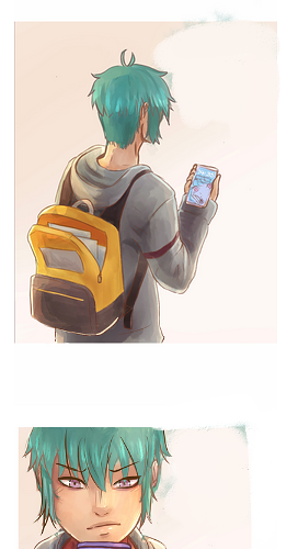
Again, falling figure under the bubbles has a bit of the same issue. I noticed this more than the bubbles, but using those cyan rim lights more liberally will really help that image grab more attention. Don't be afraid to pull the rim light towards the more neon range if you can, this is an image where you can use lighting and drama to it's full effect. If anything else, it will ensure readability.
Episode 2:
1st panel is a bit awkward framing with people being cut off on both the side and top. Maybe have the figure at the top of the stairs at least be in full frame, so that shot serves to contain something whole. If not that, a wider, zoomed out establishing shot would serve the second panel infinitely better.
Transition from 2-4 is awkward. No way for the audience to 100% tell who's feet that stop in the hallway belong to. It's sort of implied it might be the green haired boy's, but in the previous shot they're holding a juice box. Now it's changed to a bust shot of a person with a phone. As far as I'm concerned, I looked at some random person's feet and then the story actually began in panel 4.
The rest of the page, after some back and forthing of the panels, now it's clear the red and white shoes belong to someone who's going to trip over the MC. Something needs to change in the aforementioned panels to make this set up a lot more abundantly clear, which means somewhere there needs to be a full body, or something that's connecting a lot more details. Could be as simple as the wide angle establishing shot I mentioned for panel 1.
Panels 16 -18, bully's head is too large for his body. Watch proportions.
Episode 2:
Panel 1 again, while not as bad as the previous, is uncomfortably claustrophobic for the scene it's portraying. This is a classroom where a lot of "environment" is happening in the MC's world. Don't be afraid to use those establishing shots, it prevent a lot of your clarity issues.
(Story wise I'm not so sure why the MC wasn't able to make it relatively on time, he was only shown to drop a couple papers, and had to cover the same distance as the other students. It seems like being /that/ late is a little weird.)
That school table graffiti is so accurate it hurts.
Home scene shift - again - tightly framed, missing a lot of 3 Dimensions in objects like the table and shelves. Avoid awkward cropping, no need to cut a bit of the table off. Fabric such as the curtains and table cloth are very stiff, a couple fold indications in the cloth is all it needs. For curtains - don't make the folds 100% the same width. Make them hang naturally - which means imperfections. Again, tiny details like this are what bring worlds to life. Try drawing that cushion on the ground as a rectangular prism first structurally. It's missing a whole plane like the table and shelves.
Further panels have awkward tight cropping. Where the person says "Spirit counselling Lee", there's no reason to cut her foot off.
On Episode 4 now, feeling like a lot of what should be full body shots are avoided. This is what's causing the framing to feel uncomfortably close in on subjects all the time where it really doesn't need to be. Let your figures be smaller and let your environments take up some more weighting. Where the teacher is writing on the board is a good opportunity to re-establish this new environment by including some of the classroom around him.
Where he immediately asks Derrek to solve the problem, because of the framing, it's really getting into "character exist in a white void" territory. Cutting Derrek off at his ankles is an awkward point on the human body, and framing it so that only him and the MC exist is also very strange to look at.
Afterwards, Derrek returns to his desk and the teacher is cut off at a perfect 50/50 split. This is a no no. Either include 80% of his body at the very least, or don't include him at all. It's such an awkward position that you hardly notice him there, though he really should take up more weighting in this panel.
"Feathery Aid" has a lot more fullbody shots which is great. These aren't just for establishing environments - remember - these contain a ton of crucial details that the audience simply isn't privvy to in your previous episodes. It's not just who's shoes belong to which face, it's the entire body language and actions being carried by everyone at that current point in time. Waist shots and up are to close in on characters during more "focused" moments, but it's really difficult to read them or even have emotional impact at all if all of them are zoomed to some level. Another issue is that it feels like the only characters that ever exist in your comic are the ones the camera cares about in that moment - the rest of the world is a floating void that only exists when called into relevancy.
In closing:
*Do not be afraid of establishing shots
*Utilize more full bodies to carry the story. Remember, most of our communication is body language. Awkward cropping of body parts kills that crucial information.
*Don't be afraid to scale fullbody figures down, they don't need to command 80% of the frame. Let the world around them have some breathing space.
*Don't forget to give environmental props full 3 dimensions.
*Don't perfectly stage environmental props, "dynamic" drawing comes from drawing items naturally. Natural means imperfect. (Curtains won't fold up with the same perfect width between each one.) I refer you to the Etherington Bro's Twitter feed for an insane amount of dynamic drawing tutorials for the most random objects you can think of:
https://twitter.com/EtheringtonBros
*Avoid cropping panels on focal subjects. If a table is centered in frame, but it's leg is randomly cut off, it's strange. If it's a cupboard being cut off but a full body figure is perfectly within frame, it's fine. Make sure you compositionally are deciding what's being framed in scene and if it's important, don't randomly cut it off.
Story section:
I have to admit I find the whole premise of the story unbelievable. It's very odd to me that his classmates both do and don't care so much about the MC that they all hate/ ignore him but then also pay a lot of attention to tormenting/ disliking him. It's not really normal, even among teenagers. You might have one kid that's vicious, but these behaviours don't really come from nowhere. I find it extremely unlikely that he doesn't even have "neutral" acquaintances that don't think of him in any particular negative or positive light. Because the MC also doesn't stand up for himself or do anything about the situation, it's hard to really care about what's happening. I feel like you're being too heavy handed in trying to artificially drum up sympathy for the MC.
I suppose the main underlying point of why it's off-putting is the fact that it's painting an extremely negative (and therefore unrealistic) portrayal of the people around the MC. Like another mentioned, the average person would stoop to help someone pick up their items. Other people aren't adverse to calling people out for bad behaviour either. When I was a teen, I yelled at a kid for punching a kid sitting next to me on the bus. The kid stopped antagonizing him when he realized it wasn't going to score him any 'cool points' with peers. While a lot of bullying occurred at my school, even the more passive kids didn't like it and wouldn't associate with the asshole kids (of which there were very few) let alone also partake in bullying the victim. My friends group went out of our way to befriend a victim because we thought what was happening was bullshit. The way it's coming off is that his peers aren't really individuals with their own thoughts, beliefs and principals.
Edit: Keep in mind, I'm not saying you need to completely change the story. Just be aware that this is a very common cliche and therefore just needs a lot more attention to pull it off properly. You could have most of it stay the same with a few adjustments, having more context behind the bullying like revision studios pointed out is major. Another simple key would be giving the MC something redeeming we can latch onto right away. I'm not a fan of My Hero Academia but since it has a similar intro, Deku is this sort of passive- sort of not character. We can see he has a metric ton of inner strength which gives us a reason to care about him. He's not simply a victim of the world around him, despite the crushing reality he faces.