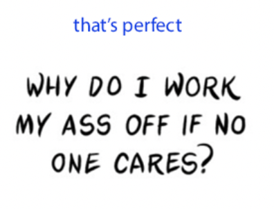
Hi! 
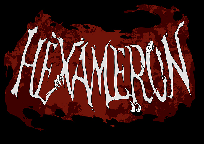
First thing it looks quite great already and adequate to the story.
My main concern is that the letters do not look like they are cut out from the cloak, but more laid on top of it. That's because of the black lining and black background behind the whole thing.
If you want to convey this idea more, I suggest you withdraw the lining, and put a shadow inside the letters to add volume.
Also the shape of the letters sometimes looks like torn fabric but sometimes like sharp bone shapes which are different materialities. Maybe it would look nice to add hanging threads and small hanging pieces of fabric? What about one or two little folds? Also you could overlay a fabric texture on the cloak so that it would be less flat and even.
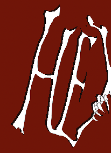
I tried the shadow thing quickly (and badly) on photoshop :
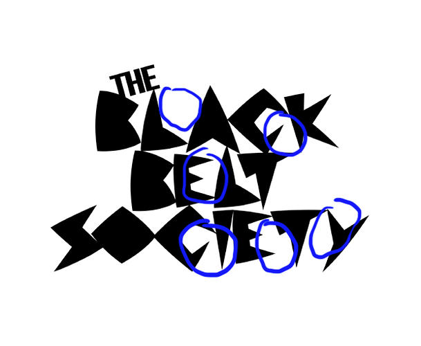
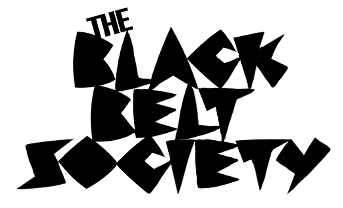
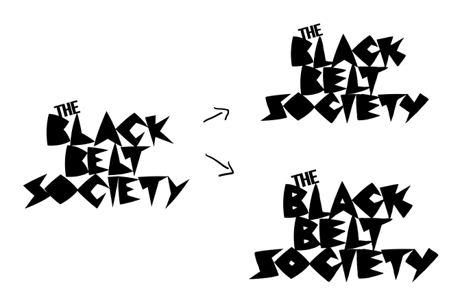
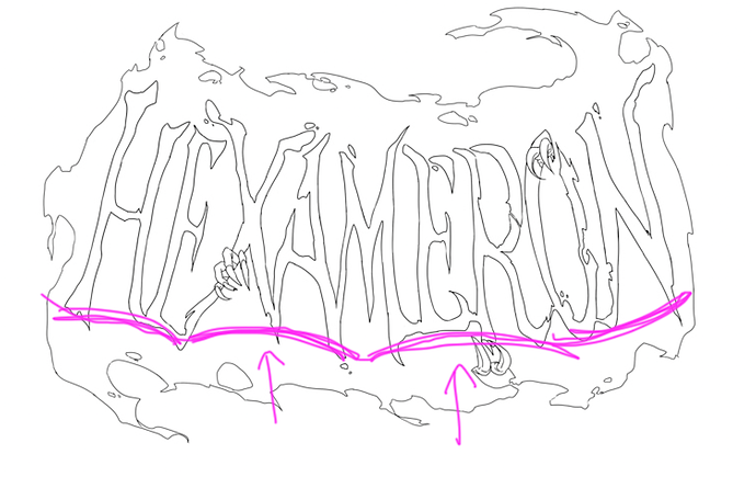
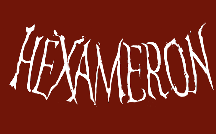
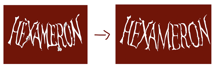
The shape of the word is unbalanced on the left side. That's not a big problem since the idea is to be irregular but why not fix it since I'm here aha.
We could improve the spacing. N is too bold. Also some letters like the "M" and "E"'s are a little bit too narrow compared to X /R / N that are wide, so I fixed them.
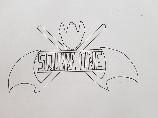
I withdrew the hands to focus on the letters. Maybe you don't need to have three of them and a bigger one would be enough?
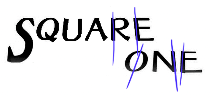
I tried damaging the letters more but it becomes hard to read because the letters are already very narrow so let's be reasonable with alterations so that we don't have too much stuff going on!
Voilà