OK! * cracks knuckles *
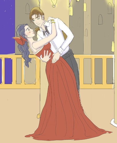
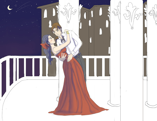
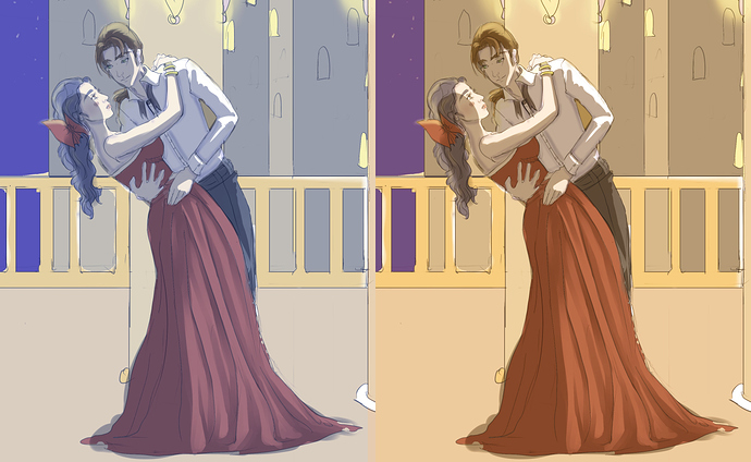
Personally, I am more of a 'dynamic, dramatic' colorist, so the first thing I did with the image was to lower the Output levels. I don't know what it's called in other art programs, but if it helps, this is what the window looks like in Paint.NET:
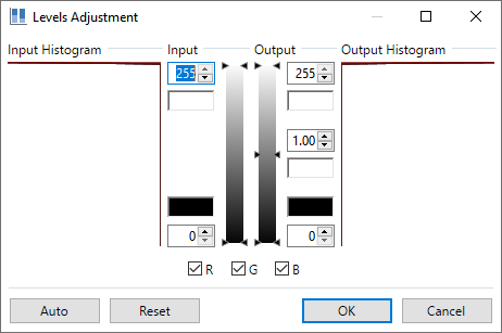
Lowering Output makes dark colors darker and more intense (conversely, lowering Input makes light colors lighter and brighter). It's a great general image editing tool; I use it for all my scans~
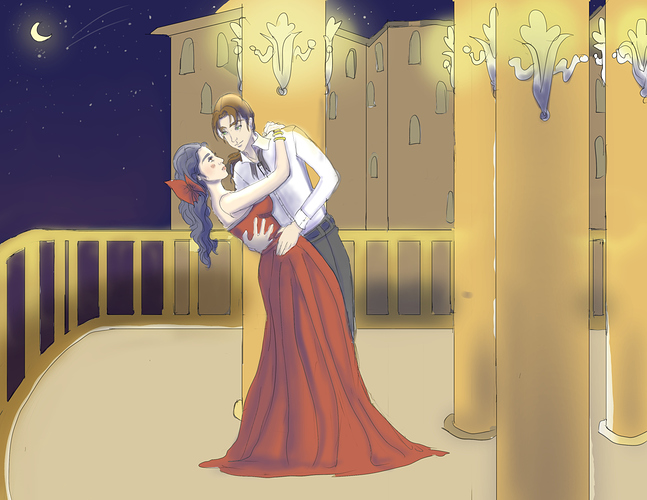
Anyway, that set the tone for the rest of the process: I noticed how the golden/yellow tones stood out from the dark sky, so I decided to try to 'warm up' the whole scene.
I started by putting that wacky pink gradient in the sky...in hindsight, it probably should've been a little more subtle. ^^; But the point was to imply that, somewhere far away, there were more warm-colored lights that tinged the atmosphere. Plus, it sets it apart from the rest of the scene, so 
After that, I used an orange overlay to tint the scene a tiny bit (I think the Blend Mode might have been Multiply, but I tend to pick them randomly so idk ^^; ).
All the rest of my work on the background was just using the fill tool to change the colors manually: I darkened the balcony elements that were further from the dancers, and I added some blue to the colors of the distant buildings, to both set them apart from the foreground and help unify them with the sky.
Then I added some gradients to help emphasize distance-- distance between the dancers and the edge of the balcony, and distance between the balcony and the other buildings.
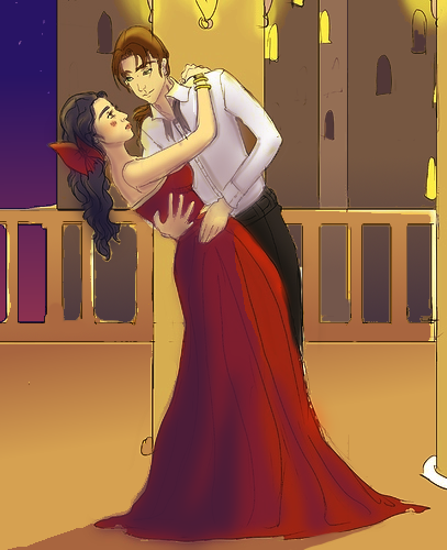
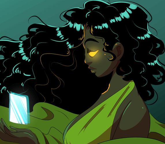
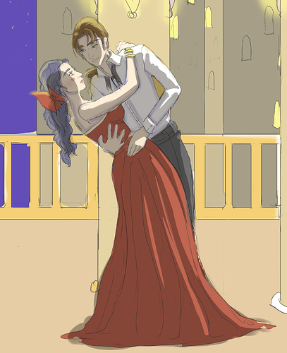
Before I talk about the dancers, I'm gonna go ahead and repost the image so no one has to keep scrolling back and forth:

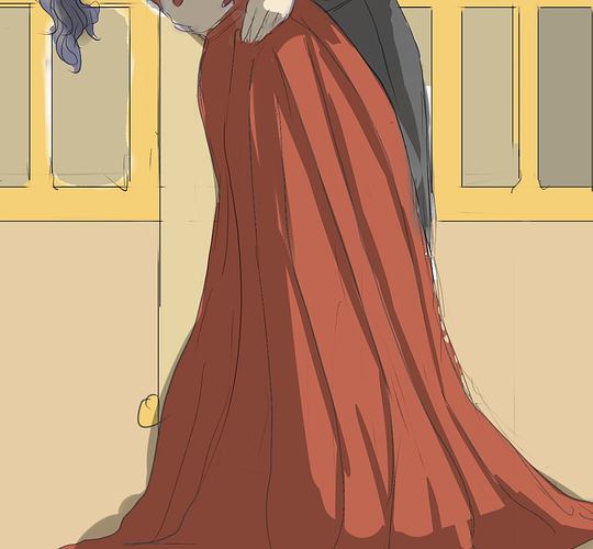
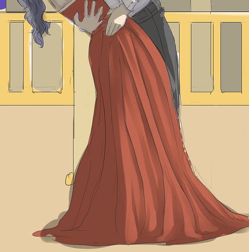
So the dancers...the first thing I noticed was the lady's brilliant red dress. And when I see red, my first instinct is to shade with purple.
Just FYI, blue is generally THE shading color, and a great shorthand for generating shade palettes is to (a) darken the base colors, and then (b) raise the Blue values a little. Or if you're me, raise the Blue values a lot. ^^ So I ended up with this saturated violet.
I applied it in 2 layers; one a little darker/more saturated than the other for the extremes of the shadow. Contouring is really important to make this work on clothes (and if it were my art, I would have tried to do a better job)...you have to use the shading to define the folds of the fabric and describe the material to the viewer. I imagined something kind of satin-y, which is a good fit for my saturated shades. ^^ And that's why I added that little highlight on her hip, although ideally I would have put in another spot or two, just so you wouldn't miss it.
After that I went for the skin: I darkened the base color and got a yellow-ish brown...but skin tones tend to look better if they've got some red in 'em somewhere, so I lowered the Green values to get a warmer temperature of brown and smeared that on, making sure to stick with the direction of light set by the dress.
The rest was just dabbing on a few dark splotches here and there...you'd be surprised how much you can improve a piece with just a couple of saturated dark spots. There's a spot on the back of the lady's head, on her ponytail (adds dimension), a spot on the gentleman's hip (emphasizes closeness of the two bodies) and a big splotch all over his shirt, with just a little contouring on his arm and in his armpit.
To be honest, he could've probably used another, darker layer of shadow on the inside where the lady is close to his chest, but I didn't think of it in time. =3=
Last, but not least, I grounded the dancers in the scene with that big ol' shadow at the bottom-- again, making sure to stick with the direction of light.
If you're wondering how I applied all these colors, it was kind of a frenzy of adding layers and blurring the shadows and playing with the transparencies to optimize them quickly (except for the shadow, which I drew directly onto the pic). ^^; But I decided to spend most of this post talking about the colors, since that is the topic at hand.
That looks a lot more interesting already. ^^ Good luck~