10 / 13
Aug 2020

I have been experimenting some with my art style for my comic and I need an opinion.

This is the new style:

This is my current style of the same character:

Which do you think is better and what should I continue with?

  • created

    Aug '20
  • last reply

    Aug '20
  • 12

    replies

  • 446

    views

  • 12

    users

  • 21

    likes

  • 4

    links

It's kind of hard to give a honest opinion about it, considering the first picture looks like a WIP while the latter one is actually finished :sweat:

I mean I don’t see too much of a difference besides the black “shading.” You should stick to whichever one you find best drawing.

I won't say the difference is really huge or anything. The coloured lineart is making art softer though, it's a bit of a different feeling. If you want everything more sharper and edgier, the black lines are probably better.

There's no right or wrong way to go about style but in terms of personal preference, I prefer the second(eyes open) more, as it has more contrast. One might fit your story better than the other though, depending on what type of tone you're going for.

The new one does look softer, it is somewhat hard to tell since the image is still W.I.P
The rough look of the current art style is pretty nice though; in my opinion, the new art style looks good.

I think black hard lines are better for this kind of comic. The soft color lines would fit on a slice of life or romance.

Here's my shoutout :smile:

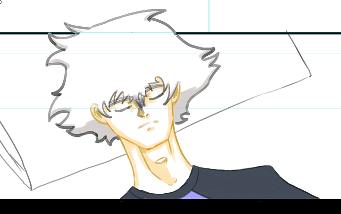
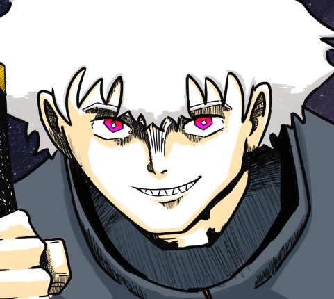
I have to say I like Your Current Art style better. much more detailed and interesting to look at! plus i feel it appears more professional :slight_smile:

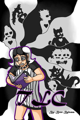
Now with that said you said we could shout ourselves out! so heres a bit about my comic TLC!

The comic is about a young girl that gets kicked out of an orphanage for her unpredictable powers and ends up getting taken in by a shapeshifter into a mish-mashed adopted family. she has to learn what it means to be herself, be part of a family, and uncover whatever the family's butler is hiding before its too late!

The comic has got aspects of modern fantasy, mystery, found family, slice of life and LGBT themes (mostly i later chapters). I'd probably rate it at PG-13 (specific Pages with PG-13 content are flagged as such in the episode tittles as well)

Heres the link if interested!

The black inks to me fit the shounen manga kinda feel of the comic you're making a lot better.

As a person who doesn't draw comics but have watched a lot of videos about them and artists... if the new style is FASTER to pump out and you like the look of it, go with it. If it's slower or finicky to refine or set up, dump it and save it for promos or something.

I think you should first of all do what YOU FEEL COMFORTABLE WITH .
As for my opinion I think you could honestly do both style ! Why not? The scenes looks differents :in the first drawing the character looks peaceful and the lines are softs as in the second it looks like there is some action going on he has colourful bright demon eyes and looks ready to fight so the dark lines are fitting.

I've been struggling with this too and im honestly going to do whatever I want ! I'm tired of trying to find the perfect aesthetic you should focus on creating your story and putting it out there ! In the worst case scenario you can always redraw your pages after ! Good luck ~~~