Hi, I took a look, there's a few things that I think can be improved.
For now, reading flow. Putting one 'though' box (or any dialogue box) on the right higher than the other. The question will be : "which box should I read first?"
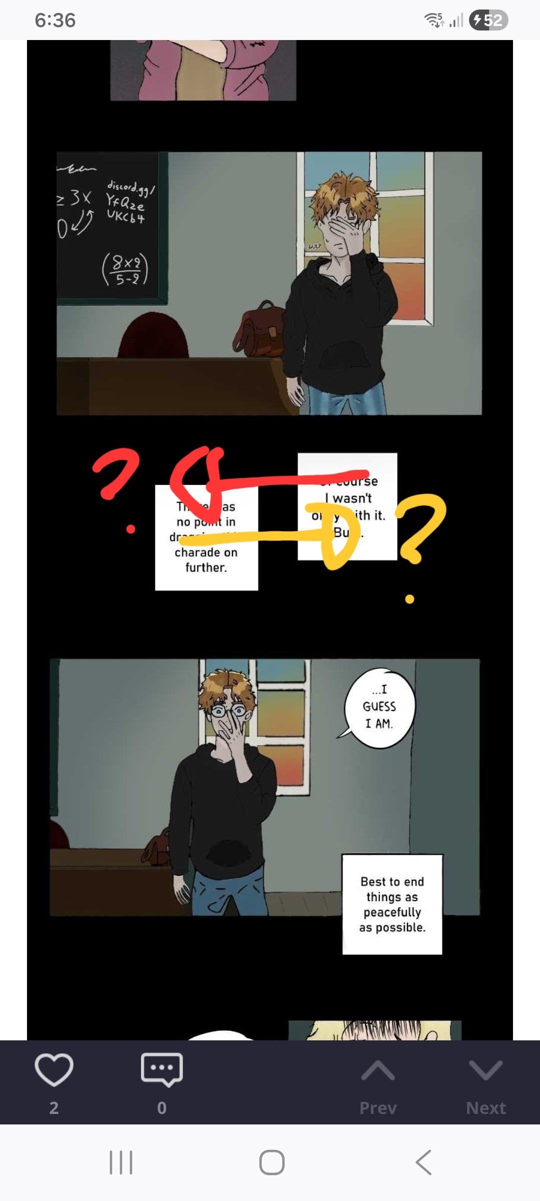
On comic, scroll or just traditional page, putting one dialogue box higher than the other mean you're reading it first, which you did correctly, but you also need to pay attention to the flow of eyes. when reading, if you put them too close together the question of "which box should I read first" will appear. So I suggest letting the two box a space to avoid confusion.
(This is not always the case but if it's always good to put the text you want to read first in the LEFT side first if he comic was intended to red from left to right and vice versa. It'll always depends on the situation, but it'll make the flow of the reading better)
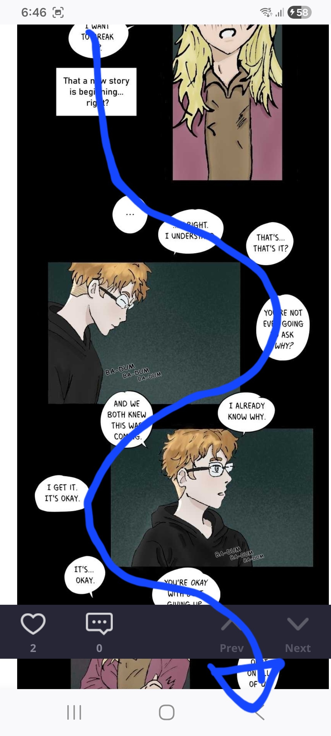
I do like how the flow in this particular screen shot since it have a good directional flow of where you're supposed to read it.
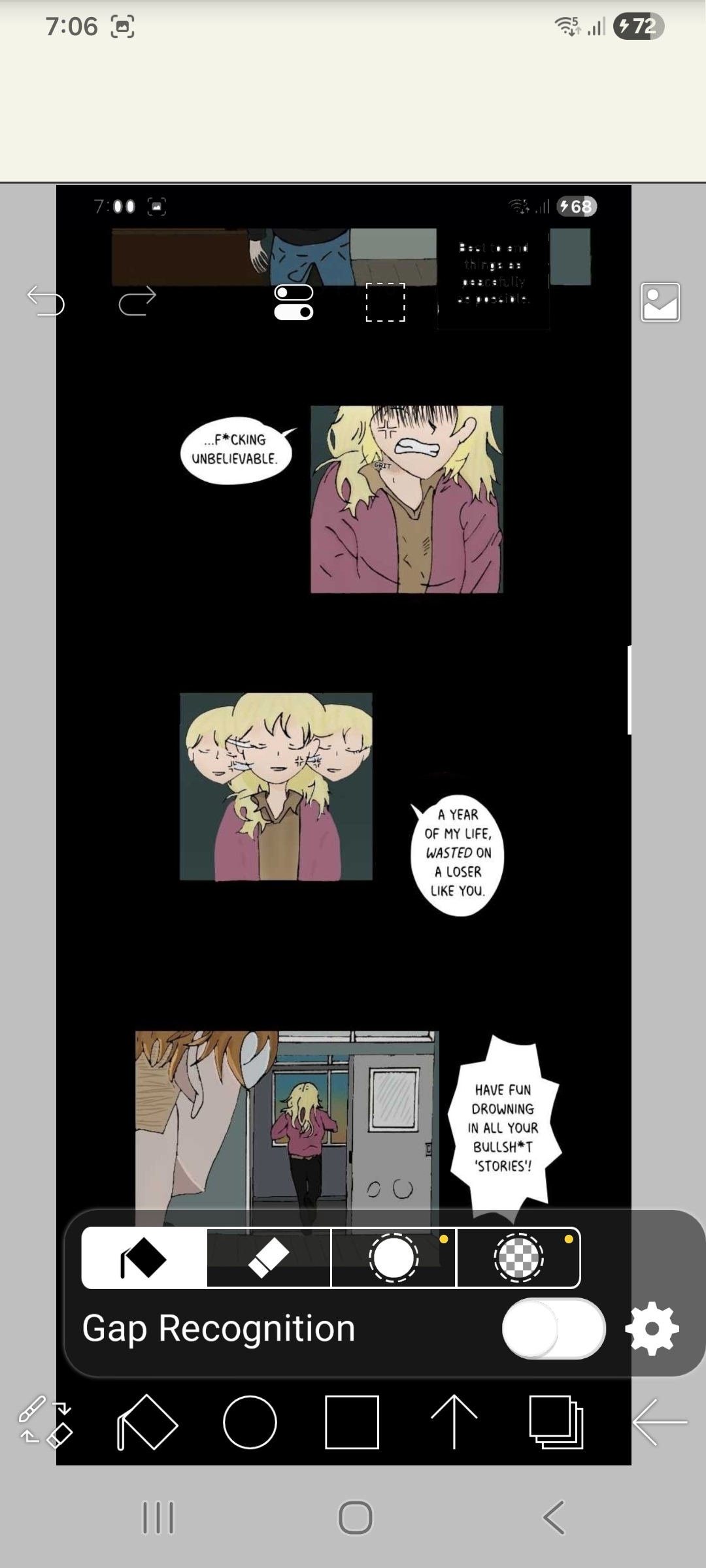
For this one, just a little nitpick of mine, so other people might not have trouble with it. But the there's two ways of reading these panels, and both doesn't feel good in my eyes.
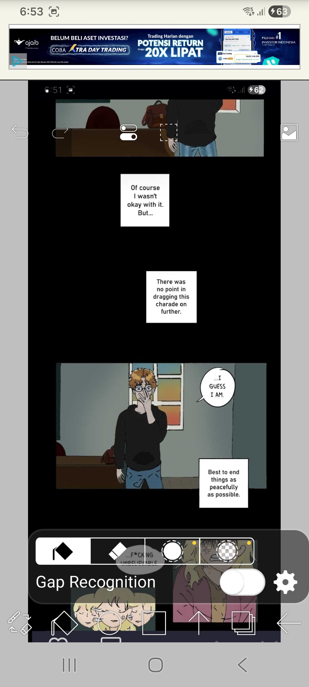
Since you're making a scroll comic, space is your friend! It's okay to let out more space when making it so the eyes won't feel to confused. (I hope you're fine with me making this s*itty edit)
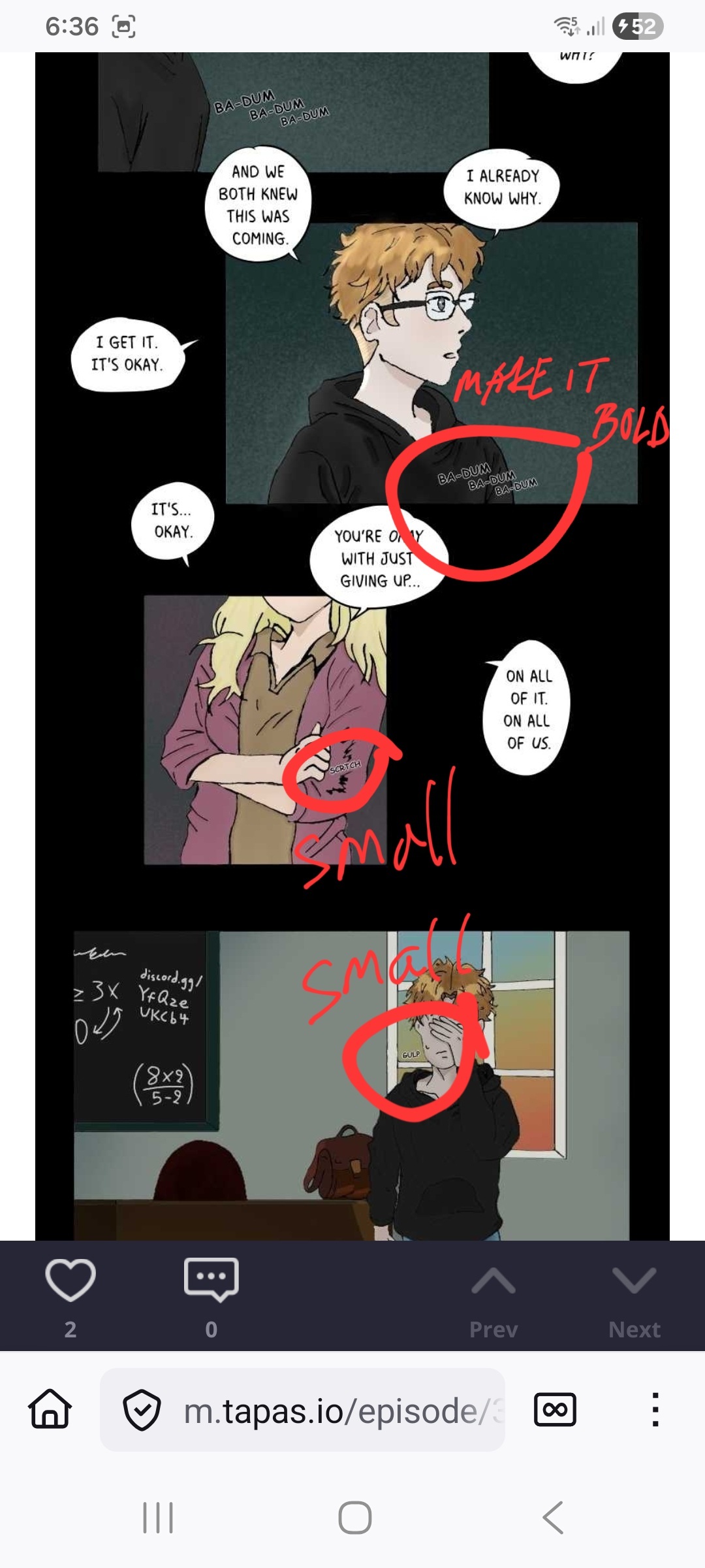
Aside from that it's probably just a little bit hard to see the sfx. It's good to make it bigger and bolder, or even in different fonts and color. I'm using phone to read this so I don't even see the bottom 'glup' until I zoom in. Small sfx wasn't Always bad, so always see the circumstances of wether it's needed or not! Always try to experiment with the sfx lettering, they can be fun sometimes. 
I can say that overall, most of the paneling is pretty good already, just give it more space, and pay attention to the flow of the reading more. 


