I suggest just adapting the square one. Move the square art down and in the blank space above, fill it with a color, give the title a treatment, and slap that title on top and center.
I can give you more specific suggestions if you'd like (if you share the art with me in a dm or something)
It just doesn't seem like a very good idea to me, unless they're really planning a comprehensive system of presentation. There are too many variations in production and creation, and fewer people than ever are designing their stuff for print for just so many very pragmatic reasons. Additionally, with the variety of formats out there -- of which a portrait-orientation rectangle is only one -- this whole thing seems designed primarily to force creators to go to this new formatting for one thing at one site.
If it had just been a larger square, most of us probably could have just used a larger-scaled image like the one we use for the Tapas site thumbnail, but it still doesn't tell much of anything about a comic, so it's absolutely going to need more comprehensive presentation for this change or we might as well just not bother.
It will be nice if we don't have to upload a thumbnail for every single update, because that was useless anyway and most of us just used the same thumbnail every time. But if it's just replacing that...well, it's not really much of an improvement. I need to see more details about this whole thing, and right now they've just essentially said "hey we're gonna force you to do this in the next few months, get excited!"
Having seen this kind of thing many, many times over the years in comics...eh. I'll wait to see, but I don't have high hopes for it.
And as noted, there are people who need the text, so it seems pretty inconsiderate to just remove that altogether.
I like the idea I just don't know how I will create one myself. I'm not an artist and right now the ones i create are really basic for my story. For something like that I would want a better cover that isn't basic or simply done. Something that could catch the attention of the readers. So i guess I need to start planning now what kind of cover I would like to make.
Having the Text underneath is nice, BUT I see a ton of series where the text title gets cut off anyway …
Well you can definitely use the cover on other sites too if you plan to upload to anywhere else. 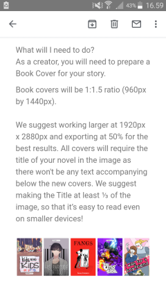
"We recommend working larger at 1920px x 2880px". If you use those dimensions, you can scale it down for Tapas but also use the same cover for, for example Amazon Kindle that apparently recommends 1600 x 2500 pixels for cover size.
@Kaylim
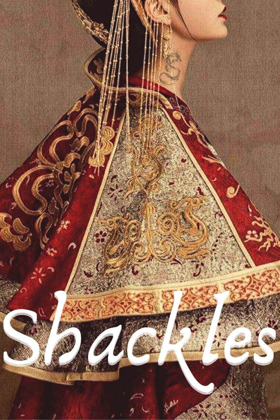
I don't know if this is helpful, but I also have a few covers I'd commissioned with Tapas's square format in mind; this is how I turned one of them into a rectangular cover (not sure if this is final yet, might still play around with it since I feel like the text isn't visible enough):
 5
5
 25
25
If this can't work with yours though (certain illustrations don't make much sense anymore once cropped), I agree with @joannekwan 's suggestion; I'll probably also be using this method for covers that can't be zoomed in on.


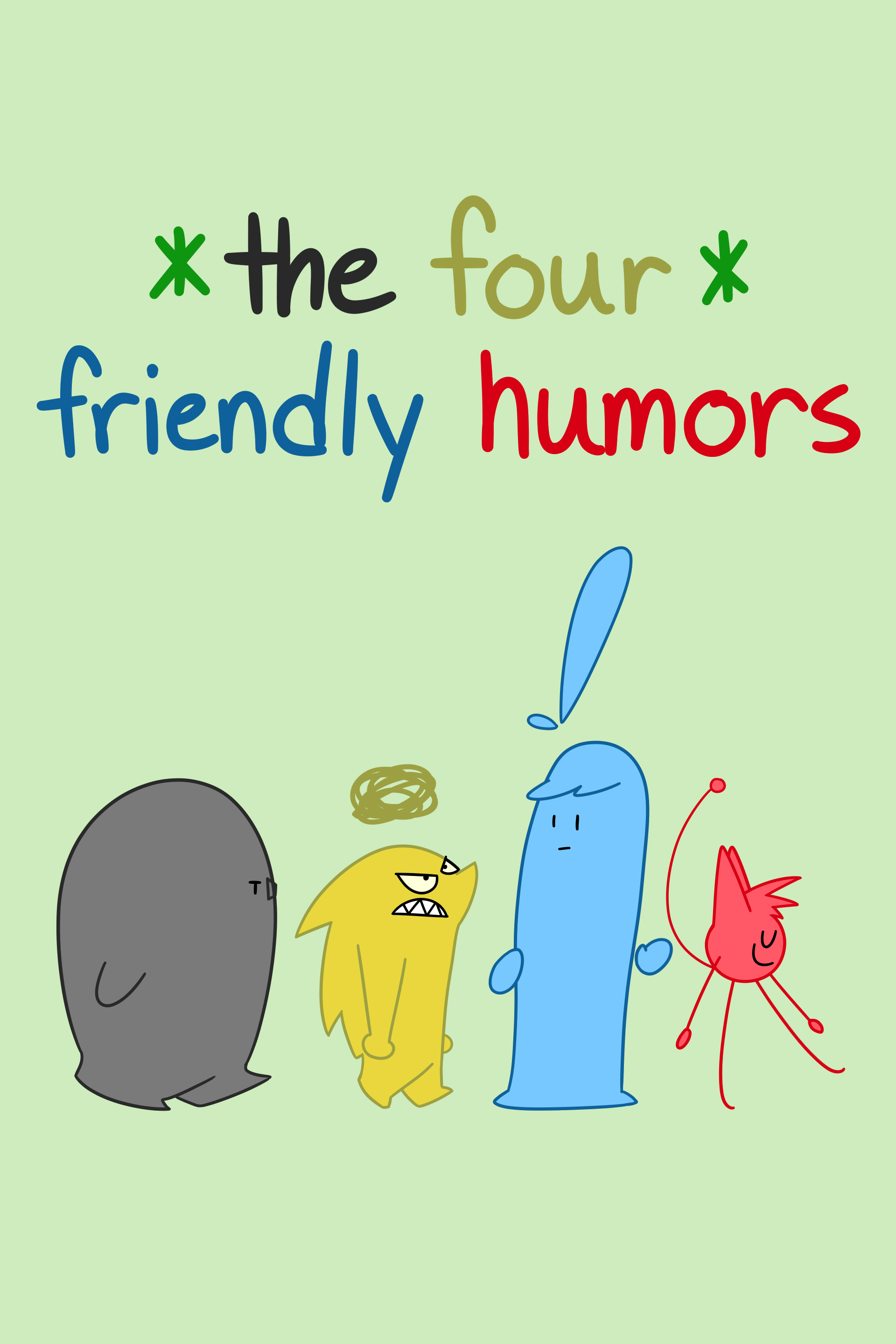
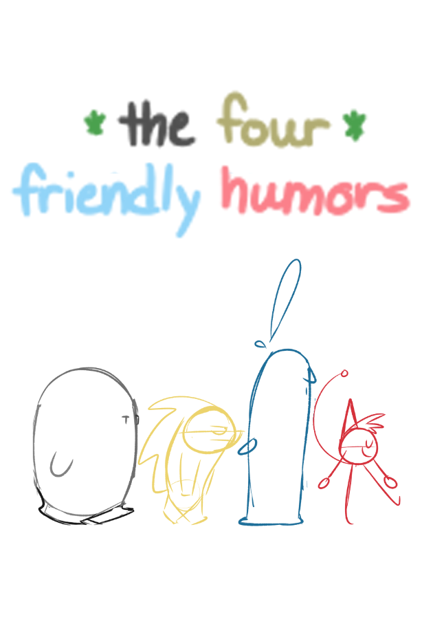
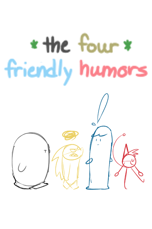
Alright so I finished a sketch for The Four Friendly Humors. I know its good to make more designs in order to get the best possible, but... idk i already like this. What do you guys think? What should I change to it (keep in mind this is a sketch; i do plan to add color and make the logo not blurry)
Being a comedic series, I think it fits! The more focus on the characters the better. If you want to try out other iterations, maybe keep their lineup but change the poses to have one turning their head, or looking back, that kind of stuff.
Wow I'm all for this change!  I was just contemplating how to simplify the cover image for my next story since my original idea for it was too complex. Luckily I hadn't commissioned an artist for it yet lol.
Meanwhile I just revamped my current cover image!
Btw does this mean the size of the thumbnail for each episode of the series is also of the new dimensions?

Is the book cover system mostly for an entire series (so sorta like the banner is used once etc) or does it sorta go along side with thumbnail images so you can do both per episode?
@Awesomeness_Studios It's looking pretty good now, displaying their personalities and a tiny hint of relationship right away!
Well, here's my tentative cover from the fixed up icon! I was going to fix that accursed bad profile view anyway based on the advice I got on another thread, but I also went and redid the effect a bit and mixed up the shading so it displays better at this size. I might still do a really nice one when I finish chapter one whenever that is, but right now the priority are the pages and not the promo art.(I could give him the cape, fix up the angle of his hat's brooch, make a cooler shattered background, but then I'm just spending an eternity better used on finishing a nice scene)
O_O... i'm so screwed, i have 2 "covers" but i personally dont like them QAQ... well tome for more work