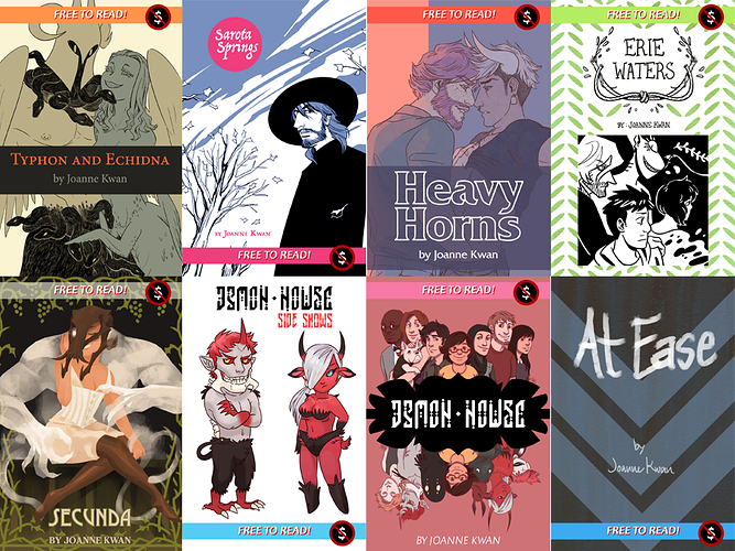
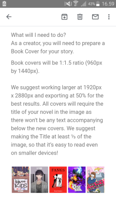
It just doesn't seem like a very good idea to me, unless they're really planning a comprehensive system of presentation. There are too many variations in production and creation, and fewer people than ever are designing their stuff for print for just so many very pragmatic reasons. Additionally, with the variety of formats out there -- of which a portrait-orientation rectangle is only one -- this whole thing seems designed primarily to force creators to go to this new formatting for one thing at one site.
If it had just been a larger square, most of us probably could have just used a larger-scaled image like the one we use for the Tapas site thumbnail, but it still doesn't tell much of anything about a comic, so it's absolutely going to need more comprehensive presentation for this change or we might as well just not bother.
It will be nice if we don't have to upload a thumbnail for every single update, because that was useless anyway and most of us just used the same thumbnail every time. But if it's just replacing that...well, it's not really much of an improvement. I need to see more details about this whole thing, and right now they've just essentially said "hey we're gonna force you to do this in the next few months, get excited!"
Having seen this kind of thing many, many times over the years in comics...eh. I'll wait to see, but I don't have high hopes for it.
And as noted, there are people who need the text, so it seems pretty inconsiderate to just remove that altogether.