There are some aspects of it I actually like, but I feel like the UX design isn't well considered.
In concept, I like that it now separates out messages into tabs. I like that now promo messages aren't in my main messages and I like that I can now use tabs to sort between different types of reader activity. This is actually a useful change for people with thousands of subs and strong engagement, especially if they also have a lot of pages. Comments or donations can get lost when there are lots of likes to scroll through.
I'm ambivalent about it showing premium content. The app has been like that for ages. I wish that the default category clicking my inbox was Activity rather than Gifts or Messages, because most desktop users are creators first and readers second, so it would simply make more sense to have it default to activity when clicked.
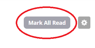
I'm not so keen on the handling of notifications. I don't think the number of notifications should include "Messages", and if it does, it should at least have the feature where the notification can be cleared in a more intuitive way than having to go to that tab and click "mark all as read". It wasn't obvious I had to go to the tab because those messages weren't marked as being a different type of messages from the ones in my Activity inbox, so of course I assumed all messages would be cleared, because all messages are listed as a single number. It would be more intuitive if they were two numbers indicating how many of each category of message is waiting.
I also feel like with how frequently the Tapas system puts out notifications that advertise premium series, having it treat them all as notifications requiring clearing from the inbox is...a lot. It's a bit too much in terms of how often it shows a notification, and how many it adds up to, leading to everyone seeing a whopping 75 notifications when the system launched.
A good idea or two, in terms of sorting messages and bringing Desktop messages closer to the app... but I feel like the User Experience needs work. It isn't clear how to use it, and the frequent messages being given the same urgency as activity feels irritating.