@Rob012
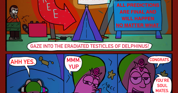
Okay, so this was a joy to read because of the commitment to detail and the likeable characters. I will say for myself that it was a little difficult to read the dialogue due to the accents but that's not a point against the work. Story-wise, we are in the starting chapters but I'm already attached and interested to see where things will go.
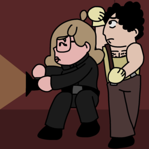
I do appreciate the detailed art and the intricate character designs. Each of them are distinctive and recognizable. My qualms are with the line art and the shading. Pertaining to the line art, from what I can tell, you're not adjusting the width of the brush you're using depending on perspective. Meaning that, you may be using the same maybe like 10 to 15 pt (or whatever size you use, I'm just guessing) brush whether something is far away from the camera or whether something is close to the camera. Consider using a thinner brush overall, somewhere in the 5-10 pt range, and also an even thinner brush for things far from the camera and small details. This can help blend drawn elements with the background.
Also, I think you use black as your shading color. While there's nothing inherently wrong with using black (it's great for dramatic lighting) for other instances of shading it can be quite muddy. Black could probably work in nighttime scenes, but you could always use a dark, slight desaturated purple. And during the day, instead of using plain black, you could use a blue shade. If you look outside on a sunny day, you can notice how cool toned the shadows actually are.
Anyway, I hope this helps, you have a great comic here.