@faisalhussein394
These things really do just come down to preference as I was extremely overwhelmed with the story and art of Abbasia. I chose to read that over Mukhtar as it is a newer project.
I'll be honest, I didn't read episode 2, the events before the current timeline, because of how information dense it was. I won't deny it's importance, mainly because I didn't read it so I cannot judge, it would be a hard sell to read all of that for anyone who just wants to get into the comic. But, to be fair, maybe that's not the type of audience you're looking for. And the story is fine so far; granted it's too early to say much past that.
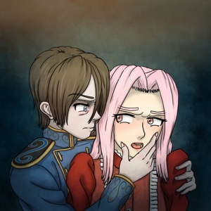
I will say though, if you're going to be packing that much backstory and context in episodes like that, maybe keep the dialogue more natural and realistic. The first page has our two characters expounding their status to one another like they are aware there's a third party watching who isn't privy to that information.
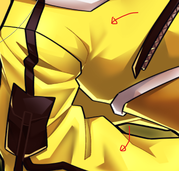
Onto the art. It very detailed and nicely drawn. My only critique are in how you choose to shade the art. Despite having shading, most of the time things look particularly flat. This is due to a specific lack of light source in most scenes and the choice to use black or grey to shade with. I noticed in page one of the prologue that it's hard to tell where the light is coming from since almost every line on the characters or the background has a dark band of shadow adjacent to it. Supposedly, the light is coming from above, but Duha doesn't cast a shadow on Akif despite laying on top of him. If I was going to offer a solution, it would be just to not have shading in non-dramatic scenes like the opening. In episode 8, when Duha and Akif almost get crushed, the shading actually does work there. Or, if you want to shade every panel, choose a light source beforehand so you know where the shadows will cast. If light is coming from the left, then shadows will be on the right.
At least art-wise, I hope this helps!