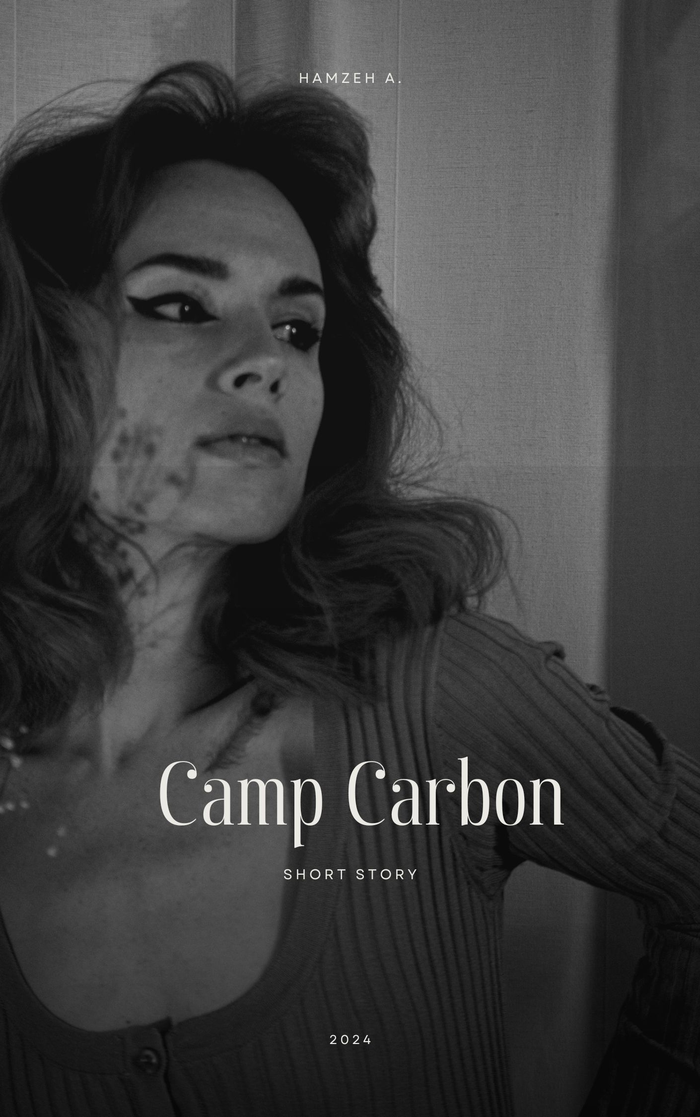
I made myself a rule before I started against using black and white pictures for book covers, and for photography too, to the limit of using high nested distortion, though this time, I didn't want to go too high on paranormal blue activity line for book cover, and I'm out of idea for distortion (red), and definitely not going green (carpet lol). What do you think?
