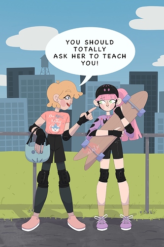
The art is looking nice and balanced - the colours work nicely and the lines are super clean! The only issue is that word bubble. I really struggled with them starting out and honestly word bubbles are way harder than they look. Take your time making them.
I think the word bubble is a bit too uniform... Using a circle tool for them isn't a good idea because circle tool balloons take up too much space and look strange over hand-drawn art.
I think if it had an outline, and was a bit tighter around the text, it might be a bit less oppressive - at the moment it's kind of covering up your art!
A good idea is to use a "continuous curve" or "polyline" tool to make something that's still round and smooth, but more fitted to the shape of the text.
Oh and one more thing - try orientating the text so it makes a smooth round shape. Try keeping hte top and bottom lines for either 2 words, or 1 long word.
Instead of:
YOU SHOULD
TOTALLY
ASK HER TO TEACH
YOU!
Try something like:
YOU SHOULD
TOTALLY ASK HER TO
TEACH YOU!
You might find it takes up less space and reads a bit easier!