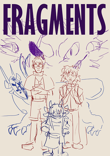
It's fine as it is, but I think there's a lot of covers out there with characters standing straight for a class picture. If it is a class of people that would stand for a picture, then that could work great. But, if you put diagonal shapes in your work, it'll bring more interest to the eye. Also, these covers will be pretty small, so you may want less characters. Right now there's five all stacked on top of eachother, which doesn't make a very clear silhouette and which will sort of blend into one complicated mass when it's all said and done.
But, if you do contrast and color correctly, it won't feel like you have 5 different characters competing for space, so maybe it'll be fine? I'm just imagining that while doing the shadows and different colors, you'll make a lot of orphaned patches and too many competing contrasting parts so there won't be a focal point.
Also, I don't see what your comic is about from the cover. Like maybe a fantasy? but it could be sci fi, too. I would want a little more hint as to what your story is and what the main drama is about.
Long story short, I'd focus on one or two elements, because right now there's so many.