The text size is very small on mobile, and often you have long paragraphs of words, making it doubly hard to read.
Comparing the text size of your comic vs random ones from Tapas, from my phone:
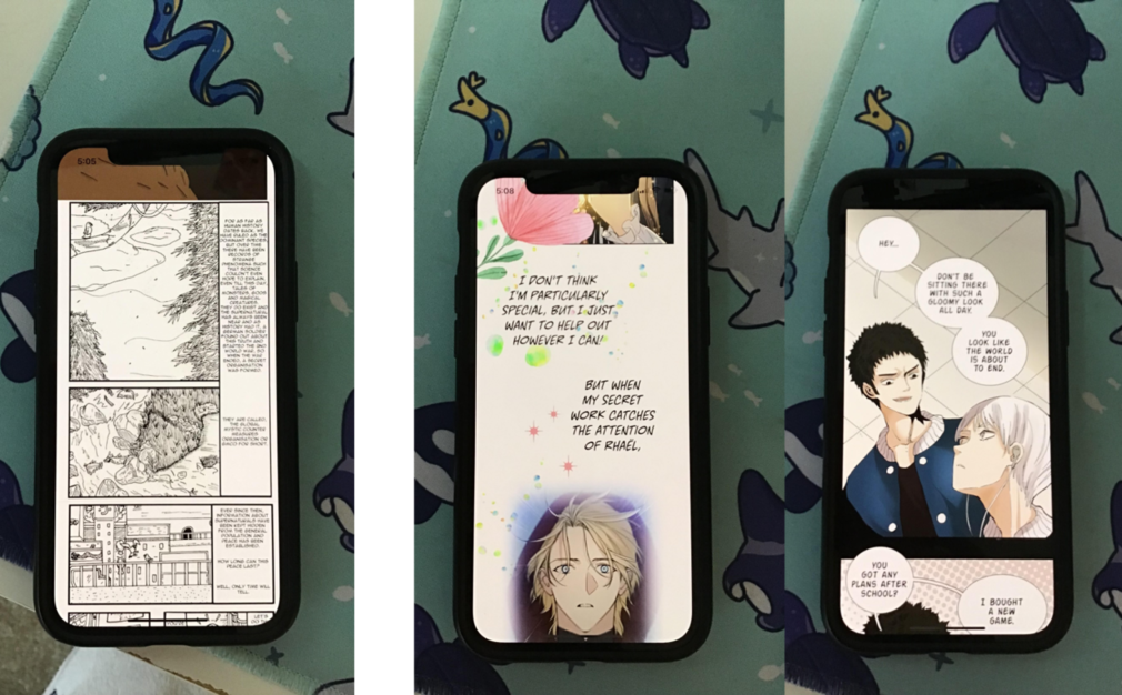
That giant block of tiny text will chase away most mobile readers (and mobile users make up most of Tapas' readership) 
And sometimes, the text is hard to read even on a desktop.
Since a font size varies on the canvas size and DPI, what you can do is take a screenshot of a comic that's easy to read on mobile, overlay it on your canvas, and try to match the font size.
My overall suggestions would be:
1) Find ways to condense the dialogue.
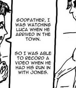
For example, reducing the first page's
For as far as human history dates back, we have ruled as the dominant species, but over time there have been records of strange phenomena such that science couldn't even hope to explain, even till this day, tales of monsters, gods and magical creatures. they do exist and the supernatural has always been near and as history had it, a German soldier found out about this truth and started the 2nd World War, so when the war ended, a secret organization was formed.
They are called, the Global Mystic Counter Measures Organization or GMCO for short.
Ever since then, information about supernaturals have been kept hidden from the general population and peace has been established.
into something like:
Throughout human history, we ruled as the dominant species. Yet records of inexplainable phenomena persisted, from magical monsters to divine beings.
The discovery of the supernatural by a German soldier ignited World War II, leading to the secret formation of the Global Mystic Counter Measures Organization (GCMO) after the war's end.
Its purpose: to conceal the truth and prevent global hysteria.
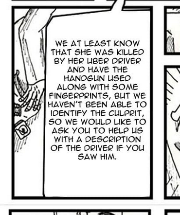
Or this panel's long run-on sentence of a dialogue:
"We at least know that she was killed by her Uber driver and have the handgun used along with some fingerprints, but we haven't been able to identify the culprit, so we would like to ask you to help us with a description of the driver if you saw him."
into:
"She was killed by her Uber driver.
We have the handgun and some fingerprints but we can't identify the culprit. Could you help us by describing the driver, if you saw him?"
2) Increase the text size.
An example of a manga-style series here: https://tapas.io/episode/345468
To me, this font size is still tiny on mobile but it's not too unreadable.
Note the short, punchy sentences and how each sentence tends to get its own space. Also note the consistent font sizes, except maybe in big important panels where font gets bigger for impact.
(IMO this series' lettering isn't the best, so look for other series, too).
You can also try uploading each page as its episode (example: https://tapas.io/episode/2997450) so stuff doesn't look as crowded and intimidating.
3) Super vertical text is hard to read in English.

I'd recommend staying away from narrow vertical boxes like this one. Those boxes work fine in Japanese where text can be read up and down, but not in English where we read left to right.
Fatter boxes like this one read easier:
Also try to stick to one shape of balloons for consistency, as right now I see a mix of tall balloons and wide balloons.
Another potential option is to format the pages you upload to Tapas to be more vertical-scroll friendly, such as putting more gutter space between the top/bottom of panels (and upload the original manga format in platforms that are more page-format friendly, like globalcomix.) But this does requires additional time and effort.